Showing posts with label inspiration. Show all posts

20 November 2015

Downton Abbey infographic

Informal infographic

Initially my idea was to focus on the scandals of Downtown throughout the series. However, there were just too many to include, so then I focused on just those concerning the family who lived above stairs. Even those were too numerous! I eventually chose to focus on the loves of the three Downtown daughters, Lady Mary, Lady Edith and Lady Sybil.

I wanted to make it interesting to people who hadn't followed the whole series, or to those like myself that had watched every episode but forgotten lots of the detail.

The infographic is sized for iPhone 5 and above, at 640px wide, as this kind of trivia is most often viewed on mobile devices while passing the time.

I researched colours used in the 1920s in interiors, and found the following image, along with the typefaces and glyphs (Nouvelle Vague Black,  Diehl Deco, Gill Sans and Nouveau Rocco Deco - glyphs).


The colours and imagery will reflect the era (from 1912-1925), embracing the Art Nouveau, but also the stately home feeling, but also incorporating a lot of typography and modern language. I used photographs as a useful reminder of the characters over the last 6 years.

All my information came from here: http://downtonabbey.wikia.com/wiki/Downton_Abbey_%28programme%29

My finished infographic:


11 November 2015

Waterstones campaign

I decided to discard my ideas for a bag for life as I wasn't happy with how they were developing. I have revisited my concepts for a scratch and sniff gift tag, which I have developed further and will be continuing with for this assignment.


23 October 2015

Mailers - inspiration

Mailers from Boden and White Stuff, self-generated photo


These two mailers were sent to me by Boden and White Stuff over the last couple of years. These companies are really inventive with their mail shots.

The first one is from Boden. A paper envelope shaped like a camera with a tab on the side invites you to pull. This reveals a double sided sheet advertising their sale, mimicking the pulling out of old style Polaroid Instamatics. This idea works well for Boden as they rely heavily on their retro styling and old school imagery.

The second piece is from White Stuff. They sent out a thick card in A5 with pop-out cocktail toppers, which suited their catalogue theme, being summer holidays. Although not amazingly practical, it is a fun idea, and very engaging.

22 October 2015

Waterstones - Concepts

Bag for life

I have further developed my plans for a bag for life as a giveaway with cookery books from Waterstones (perhaps if you buy 2). The first is a bag in the style of a wood-framed blackboard, with a velcro-detachable panel to write a shopping list on. A white wipeable chalk marker would be included with the bag, and food illustrations would surround the blackboard on different styles of background, for instance a gingham tablecloth, a wood table, hessian or a marble worktop. The write on panel would look like a menu, with areas to write meals for the week and sections for the different types of groceries.


Lunchbox bag

My second option is for a single book purchase the customer would get a insulated lunch box carrier, joined at the sides with velcro, which opens to form a wipeable picnic mat to put your lunch on at your desk or in the park.


Inspiration


I will take inspiration from the food illustrations below and will experiment with watercolours and with creating flat images in Illustrator. I like the idea of using white and black gel/paint/marker pens over the illustrations.


18 October 2015

Environmental typography

When typography is placed in the environment, extra layers of meaning are connotated from the space, atmosphere and tone of the situation. Doing so provides the written words with an additional narrative or story. The environment can be outside, or inside, and means placing the typography anywhere other than on paper.

Exampes of designers' work


The word Descend, below, is created from duck tape stuck onto the treads of the steps by Becky Obenhaus. The simplicity of application and materials, compared with the straight word modern sans serif typeface and the direction of the type, when placed on the stairs, combines to make the instruction superfluous, but amusing. It would also lead you to wonder what is down there?
ttp://www.thestlouisegotist.com/sites/www.thestlouisegotist.com/files/imagecache/portfolio_work_image/portfolio/Becky%20Obenhaus/IMG_4594.jpg


The work below, from Nicole Dextras, a Canadian designer, was created on the shores of Lake Ontario. The letters stand 6" high and are carved in ice. Is the word a noun, or a verb? It was created in a response to the artist's feelings about estate agents selling land "with a view". It could mean so many different things, depending on your politics and your interpretation.

http://nicoledextras.com/portfolio/social-typography/views/


My design


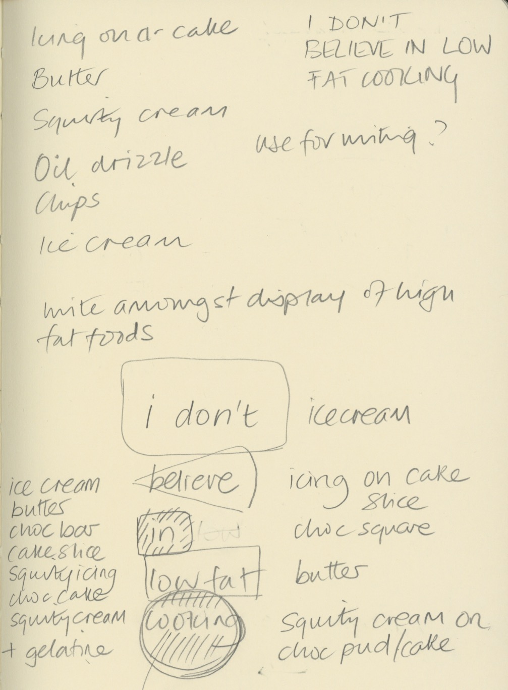
My ideas were loosely based on my cookery book theme for Waterstones. I chose a quote from Nigella Lawson - "I don't believe in low fat cooker" and sketched out some ideas of how I could produce an environmental design piece for these words.


My thoughts were to carved the letters into butter, ice-cream and chocolate, and use icing and squirty cream to write letters onto other high fat food. The idea was to underline the deliciousness of naughty foods, and support Nigella's view that a little of what you fancy does you goo.

Once I tried this idea out, I discovered that writing in ice-cream was not so simple - the ice-cream I bought was quite fluffy in texture and it was not possible to carve it legibly. I also struggled with the chocolate icing on cheesecake as the icing was too runny to write small enough. Some lettering ended up looking better directly on the worktop.


I experimented with lighting, thinking the carved letters would look most effective if lit from the side, but in fact the shadows cast elsewhere detracted too much from the design.

I shot at F8 to ensure everything was in focus when shooting from fairly close range, particularly when photography from an angle.


The image above contains words in the chocolate and butter, which I felt were not clear enough. My final image is below. Photoshop was just used to lighten up the mid tones and enhance the contrast very slightly.


My final image (above and below). I think it reflects what I was setting out to do. The crumbs and splatters of food were to represent the food being irresistible, along with the cheesecake on spoon waiting to be eaten. I replaced the words in and low fat, with icing and cream, which I think make the typography flow better. I wrote Nigella's name in a rounded type, to reflect Nigella's curvaceous figure that she is well know for, which ties in with the anti-stick-thin ethos of her recipes. The colour of the type was creamy yellow, to tie in with ice-cream and butter. I'm not sure whether the rule around the edge adds anything to it.


14 October 2015

Modernism

International/Swiss Style

We were tasked with researching one area of Modernism. I decided to focus on International Style/Swiss Style.

International Style developed after WWII, originating in Switzerland as Swiss Style (1950s) but soon becoming adopted by many large US corporations as part of their identity. It took its cues from De Stijl, Constructivism, Bauhaus and the New Typography, but without the political influences.


Jan Tschichold, film poster, 1927


Students of the Bauhaus, Max Bill and Theo Ballmer, along with Jan Tschichold (a German refugee) were the founders of the Swiss Style. At first Tschichold dictated that very strict rules should be applied to all typography - flush left, sans serif, etc, which then became popular. However some years later he decided his views were too dictatorial and changed his ideas about what the ideal style was, and later became a serif type designer. Many of his contemporaries felt he had betrayed them.

Akzidenz Grotesk, the typeface on which Helvetica (formerly Neue Haas Grotesk) was based, was the most popular typeface. For many graphic designers, it was the only typeface they ever used. It was revered for its functionalist style, with no political connotations from Constructivism or the Bauhaus. Being politically neutral was key to International Style.

In 1957, Adrian Frutiger designed the type family Univers, which was the first of it's kind to have a numerical reference system defining weights and widths of the typefaces.


Josef Muller-Brockman designed the poster below, which includes key features of Swiss Style - a grid system, curves, and asymmetrical text.


Josef Muller-Brockmann, Beethoven, 1955


Brockmann believed that you should never use more than one typeface, and even then only 2 sizes were allowed, and that text should always be horizontal.

In 1951 HfG (University of Design) was founded by Bill, Aitcher and Scholl who were the first to teach semiotics in relation to graphic design. As a result of this, their graduates found they were in demand. They designed logos for Deutsche Bank, Lufthansa, and the pictogram based designs for the 1972 Munich Olympics.

Jan Tschichold was recruited by Penguin Books in 1947. After rejecting his New Typography dogma, he set some loose design rules in place - Penguin Composition Rules, and established what is now the Penguin style.

Another proponent of International Style was Alan Fletcher, who designed the V&A logo, and co-founded Pentagram.

In the USA, corporations raced to adopt International Style which reflected their aggressive ideals of capitalism. Paul Rand was its most famous designer of corporate identities. His worked includes the IBM logos, and those for UPS and Yale. Paul Rand's website says the following about logo design:

The effectiveness of a good logo depends on:

a. distinctiveness
b. visibility
c. useability
d. memorability
e. universality
f. durability
g. timelessness

It says “We care.”

Paul Rand http://www.paul-rand.com/foundation/thoughts_logosflags/#.Vh4XoHg0O9o

Paul Rand, logos for IBM, 1956-1990


7 September 2015

Museums and Shows

New Designers 2015

During the summer, I went to New Designers. I decided to visit during the first week as I really wanted to see the textiles and surface pattern designers. The volume and quality of the work on display was overwhelming, but inspiring too.

Fashion and Textile Museum

I visited the Fashion and Textile Museum in London which was featuring an exhibition about resort wear from 1900's to present day. It was interesting, but the museum is really small. Their next exhibition is going to be Liberty's of London which I will be going to.

Geffrye Museum

This museum in London is quite out of the way but had lots of interesting furniture and textiles from the homes of the middle classes from 1600-present. The 1950's room set was my favourite, with the mid-century modern furniture. Unfortunately lots of it looks very similar to what I grew up with in the 1970's. I think people kept their furnishings for much longer in those days.

18 May 2015

Start Me Up

I bought a fabulous book on branding which has just been published called Start Me Up. It's 256 pages of branding porn for the graphic designer, and the paper smells all inky too. Lots of useful into for my studies.


17 May 2015

Stamp design

Hat-trick Design (http://www.hat-trickdesign.co.uk) used hand drawn type combined with photography to create a distinctive range of Royal Mail stamps to commemorate 50 years of the Royal Shakespeare Company. Insertion is used for the different styles of type making the stamps look casual and engaging, with the words flowing around the images. The black and white colour scheme adds to the intensity of the designs.


Another of their stamp designs, for the Olympics,  uses 50p coins as a template for pointillist style imagery:


Generative design

Holger Lippmann is one of a group of digital artists who use computer algorithms to create their designs which are then printed for exhibition. I'll let him explain:

the e-pastel TAR_GRID series consists of a X Y axis grid of bezier vector curves. a seperate vector curve class defines all vector properties such as color, transparency and/or stroke weight. to later position them within different grid arrays. different keyboard input values are used for a layered image build up; coloring, sizing, transparency, count and density of star pedals

Complex but fascinating: http://www.lumicon.de/wp/


Lomography - analogue to digital

Lomography is an analogue photography craze that has a huge online following. The company have recreated, or sourced, cheap retro plastic cameras (Diana, Lomo, etc) and expired film, and used all their faults (light leaks, colour casts, vignetting, etc) as a marketing tool to make people want buy into retro look so popular now.

But many of these people still want digital image manipulation so combine their love of film with all its quirks, and the flexibility of Photoshop, by shooting on film and scanning their images to edit them further. 

There are a huge array of apps available to recreate a similar look digitally with a camera phone, but it doesn't quite get there. Instagram is the most popular. Will people still love this faux-retro effect in 10 years or will they wish they took all the shots without those dubious digital filters?


Eloise Renouf - Illustration to print

Eloise is a successful designer and illustrator whom I admire. Her work begins with sketches and paintings which are then manipulated in Illustrator to create contemporary prints, cards and fabrics designs:

Andrea Lauren - hand printing to digital print


Andrea Lauren is a printmaker I have followed on Instagram and on her blog for sometime. She uses linocut and screen printing to create her initial motifs for fabric, cards and print, and these are manipulated in Photoshop and Illustrator before being printed digitally.

andrealauren.com


30 March 2015

Art Deco Patterns

Gordon's Gin

I'm considering creating an Art Deco pattern to be used as a background to the text on the rear of the Gordon's Gin bottle, and then perhaps distressing it.

The following are images of Penguin Classics books by F Scot Fitzgerald which are from that era.


I want the pattern to link to the Art Deco lines of the architecture on the front label of my bottle design.


10 March 2015

Woodcut art and design

We looked at the images produced by woodcut artists in today's lecture. The image is carved in a block of wood and used for relief printing. This was most common way to produce artwork for print during the time of the Guttenburg press.

Vincent Van Gogh produced many woodcuts, and it was a popular way to experiment.

The first two images below were by Paul Bloomer and Maurice De Vlaminck. Although the first image is very naive, I prefer its simplicity. I particularly like the way the sun is depicted with circular carving lines around it. Reduction carving of woodcuts can produce omplex multicoloured images, by taking a print from the first cariving, then carving out the parts you want to remain in that colour, taking another print and so on. Because there is no going back, it is also know as suicide printing. Angie Lewin, a printmaker who produces such work, made the third print from woodcut, below.


2 March 2015

Gordon's Gin research

Ghost typography

I have found some imagery of ghost typography on the internet. I am considering using this style of photography/illustration for my bottle packaging. I have taken photos previously, around London, of ghost typography, although I didn't know what it was called!

These are images from Google:


These are some images of peeling paint and other textures, found on Google, that I may incorporate into my design.  

I'm thinking that I might use film to photograph interesting textures, around the Southwark and Clerkenwell areas of London where the distillery was originally located. I will redesign the logo as the script style of font does not reflect the style I want to create. I want the product to reflect it's historical provenance, but also to be more modern and edgy.  I plan to hand drawn the typography to go on the label. 

Some examples of hand drawn typography I have created, based on letterpress type, that I may use:


24 February 2015

Gordon's gin packaging assignment

I am considering using my own photography for the Gordon's Gin packaging. I took the first photo on the South Bank outside the National Theatre. I edited the hue in Photoshop to reflect the green of the glass bottle, and mimic the purple of the Juniper berries it is flavoured with.

The fifth photo has been edited to contrast with the green of the bottle, and the sixth is of a speeding tube training, again with the hue changed.

I want to use images that reflect the provenance of the drink - London Dry Gin,  but without being overtly obviously of London.


14 February 2015

Gordon's Gin mood board 1

Packaging assignment

I have decided to look at producing a new label for Gordon's based on the botanical ingredients. Drawing inspiration from tattoos, I'm considering doing a stylized hand drawn line drawing of the ingredients, on a transparent background which weaves in and out of the brandname, covering the front face of the bottle. The colour scheme would be green and deep blue, bringing together the iconic green glass of the bottle, and the juniper berries, and reflecting the natural ingredients which make the distinctive flavour.


11 February 2015

Drinks packaging assignment

For the drinks packaging assignment I have chosen Gordon's Gin. It has been in production since 1769 and is a London Dry Gin. There are 3 other variants - Elderflower, Cucumber and Sloe.

Gordon's is a very traditional looking product, aimed at 40+ regular gin drinkers. I would like to develop packaging which would also appeal to a younger market without alienating its loyal customer base.


I created a mind map of my initial thoughts about Gordon's Gin. I will draw some thumbnails of my first ideas: botanicals, London skyline, history and London imagery.


Insertion techniques

We looked at different methods of integrating text into an image, and making it look like it is an integral part, rather than something that has been placed on top of an image.

In the first image, the text is simply aligned with the dominant diagonal of the image, enhancing the movement and dynamic style of the picture. The white of the type is repeated in the white building roof to the left which ensures there is rhythm and balance.


The  numbers placed on the front of the rock faces below, have shadows, texture and contours to make them appear as if they have actually been painted on the rocks, rather than added digitally.


In the image below, the picture has been cropped very creatively, and the figure at the top appears to be floating on the typography. The type has been made to appear very grainy, like the photo, and integrates well in the negative space.