Showing posts with label typography. Show all posts

17 May 2015

Stamp design

Hat-trick Design (http://www.hat-trickdesign.co.uk) used hand drawn type combined with photography to create a distinctive range of Royal Mail stamps to commemorate 50 years of the Royal Shakespeare Company. Insertion is used for the different styles of type making the stamps look casual and engaging, with the words flowing around the images. The black and white colour scheme adds to the intensity of the designs.


Another of their stamp designs, for the Olympics,  uses 50p coins as a template for pointillist style imagery:


23 February 2015

Metaphoric type

Metaphoric type means using type to illustrate the word, phrase or prose being communicated. It can be a visual pun or an illustration.

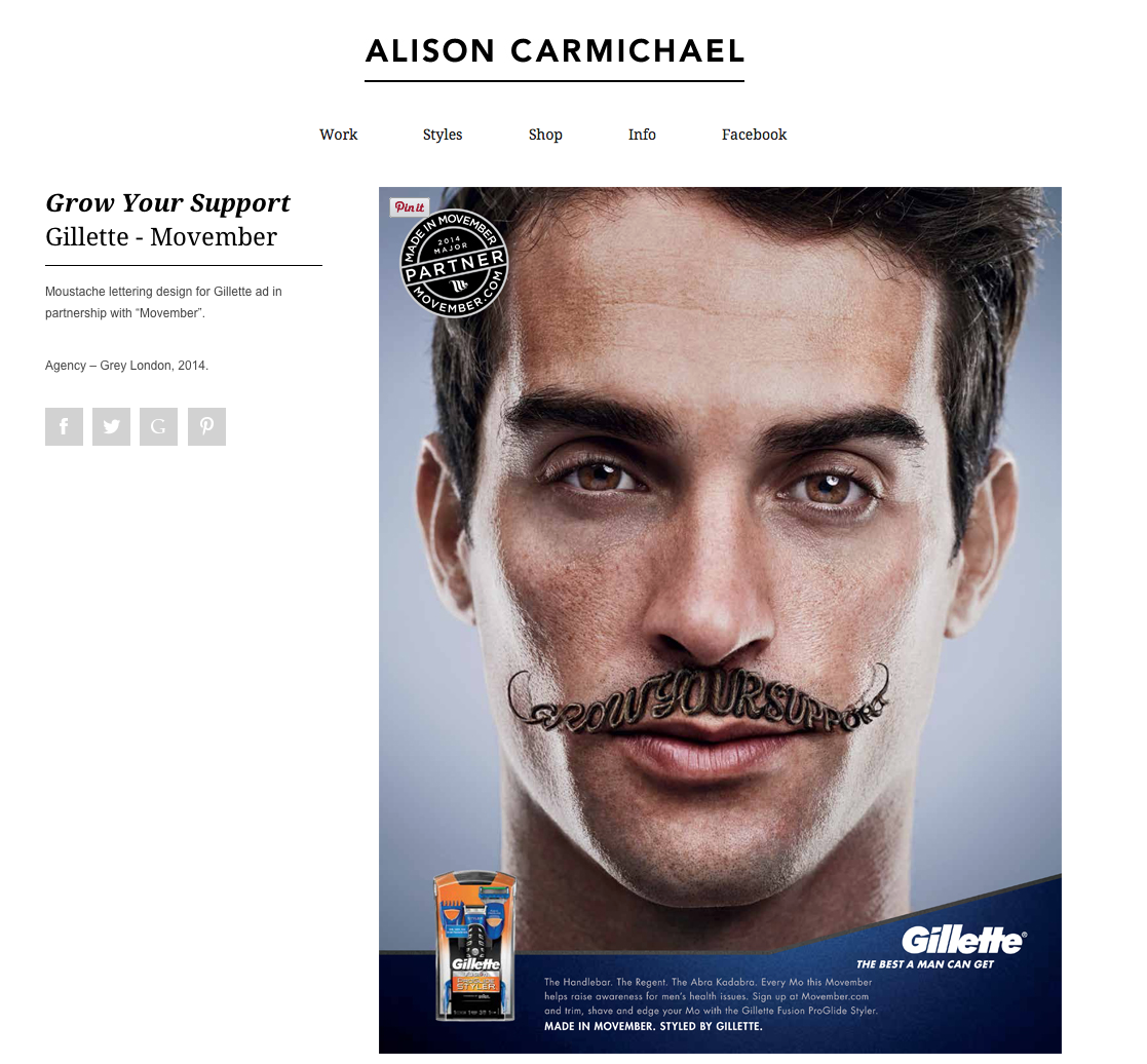
We looked at the work of some graphic designers who produced examples of metaphoric type, including Alison Carmichael:


The first example, above, uses a cracked ice stylised font to symbolise the word cough - icy, cold, broken, rough. A cough is a difficult word to illustrate as typography, but she has communicated the essence of the word. In the second image, Carmichael writes the words Grow your Support in the shape of a moustache in a very hairy type.

I used Illustrator to create a flat colour illustration of Oranges and Apples. I chose a rounded font which I then expanded. I reshaped the letters to look as round as possible without loosing their legibility. I then supplemented the letter with a naive leaf and stalk, and dots to suggest skin on the oranges. I hand drew the word "the" with the pencil tool.


I then hand drew my interpretation of the word dyslexia. I wanted to communicate feelings of confusion, anger, frustration and helplessness that often affects dyslexia suffers. I used a brush pen for the muddled up letters and then drew dots of varying densities over the page, with darker areas around the dark areas of letters to look like destruction. The idea of making the dots denser at the bottom was to infer the weight of their disability that suffers of dyslexia may feel.



27 January 2015

Re-appropriation


Re-appropriation is the use of an item that was originally created for one purpose, to make something completely different.

We looked at the blog of Austin Kleon who is the author and designer of Newspaper Blackout. I created the example below:


I was rather underwhelmed by his work and mine! However, some of his other books look interesting.  Steal Like an Artist quotes "What is originality? Undetected plagarism", and continues to state the case that norhing is original, and everything created is something which came before, but assembled in different ways.

Another design was created, following Kleon's methods less closely.


6 January 2015

Breaking the grid

Composition, not grid based graphic design

David Carson's style influenced my poster design for Skate at Somerset House. In Photoshop I cropped the image, desaturated it and added a large amount of noise. I imported the image into InDesign and created a panel of type with negative line spacing to add texture across the centre of the image. I then arranged the fonts across the image. Skate at Somerset House was set in a very graphic style of typeface. My design does not have that same chaotic rawness that is key to Carson's style.


1 January 2015

Hand drawn typography

I have been experimenting with brush lettering for one of my posters. The best brush pen, out of the dozen or so I have bought, is the Pentel Brush Pen.


23 December 2014

Type and layout assignment 3 - hand drawn type

Hand drawn typography inspiration

I really love the look of hand drawn typography, and calligraphy.  I'm not so keen on the very perfect styles, which take years to master, but the more informal characterful type, as show below.


http://typophile.com/node/88004


https://dribbble.com/shots/1422318-Begemot-Calligraphy-Logo

I love the huge contrast between the thick and thin strokes in the two pieces above, and will try out various techniques to achieve something similar. I will use a ruling pen and a Pilot Parallel pen.


http://www.flickr.com/photos/luca-beanone-barcellona/5859864506/in/set-72157627020568080/

To try out the technique above I need to use a straight edge calligraphy pen. I like the use of two colours and the informal style and combination of fonts.


http://www.pinterest.com/pin/18155204717369050/

I really like the splatters and uneven letter forms above, either created, I imagine, with a ruling pen or a handmade cola pen on rough watercolour paper.


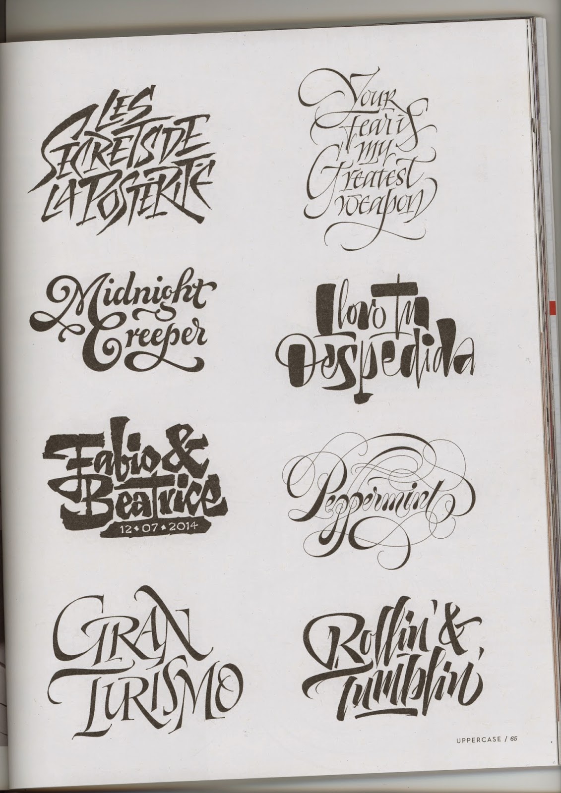
The above piece is by Seb Lester from the cover of the latest Uppercase magazine.  It is created in the Copperplate style with an oblique pen holder and nib. I really like the rhythm and the smooth curling letter forms of this work. I intend to try this technique as well, although I suspect it will take a huge amount of practice.

These below are from Uppercase issue 23, by Pietro Piscitello.  I like the second down on the right - the contrast of thick/thin strokes make a really eye catching font with lots of character.


29 November 2014

Repeating patterns

Creating patterns

In Illustrator we practised creating patterns.

Steps to create the book cover below were:

Creating a pattern by scribbling with the pencil tool, select it then choose Object, Pattern, Make. Choose overlapping tiles and change the width and height, click done.  The I created the text and filled it with the pattern created.  I then drew a wedge shape with the pend over the text, selected them both then Object, Envelope Distort, Make with top object.  I then reflected the text by Object, Transform, Reflect.


11 November 2014

Hand drawn typography

A scan of the hand drawn typography we did in class, before scanning and editing in Illustrator and Photoshop:


After using live trace, expand, and live paint in Illustrator, printing it out, screwing it up, then editing in Photoshop and adding noise:


5 November 2014

Destroyed typography

Digital destruction

I started off with the alphabet in Century Gothic.  I then scribbled over the letters with a fine black pencil, a thicker black brush, and a white brush.  I then added dots of black and white.