Showing posts with label designing. Show all posts

12 December 2015

4 December 2015

Waterstones gift wrap


Gift wrap

The design below was created in Illustrator to be used to create gift wrap. This will be used by staff in store to wrap books in exchange for presentation of the gift tag and mailer. The colours were chosen from those used in the mailers/tags. All the graphics in the design below are taken from the gift tags. Some (spoon, whisk) were copied and rotated to make a flower.


20 November 2015

Downton Abbey infographic

Informal infographic

Initially my idea was to focus on the scandals of Downtown throughout the series. However, there were just too many to include, so then I focused on just those concerning the family who lived above stairs. Even those were too numerous! I eventually chose to focus on the loves of the three Downtown daughters, Lady Mary, Lady Edith and Lady Sybil.

I wanted to make it interesting to people who hadn't followed the whole series, or to those like myself that had watched every episode but forgotten lots of the detail.

The infographic is sized for iPhone 5 and above, at 640px wide, as this kind of trivia is most often viewed on mobile devices while passing the time.

I researched colours used in the 1920s in interiors, and found the following image, along with the typefaces and glyphs (Nouvelle Vague Black,  Diehl Deco, Gill Sans and Nouveau Rocco Deco - glyphs).


The colours and imagery will reflect the era (from 1912-1925), embracing the Art Nouveau, but also the stately home feeling, but also incorporating a lot of typography and modern language. I used photographs as a useful reminder of the characters over the last 6 years.

All my information came from here: http://downtonabbey.wikia.com/wiki/Downton_Abbey_%28programme%29

My finished infographic:


15 November 2015

House style

It is important to consider the audience when creating designs, and be able to appeal to a broad demographic, or a smaller-subset of your target audience, but still adhere to your house style. For instance, at Christmas, the following audiences need to be considered: families, religious people, children, secular audiences, those without children, etc. Different imagery and styles can be used to infer thoughts of food, gifts, religion, parties, homeless, elderly, etc. The style and colours of an image can infer expensive, friendly, trashy, loud, stylish, etc.

Below are screen shots of pages from my Waterstones book showing how I created 4 posters and an invitation.


14 November 2015

Infographics - when not to use pie charts

Pie charts

Pie charts can make data really difficult to interpret, particularly when 2 sets of data need to be compared, when shown as a 3D pie, or when too many figures need to be shown.

This image below is a good example of when not to use pie charts. It needs a key, and is difficult to compare the data from both years.


The data relates to the number of programs produced by each TV network over 2 years, and whether they were male or female, white or non-white.

Style and tone

Questions to answer before designing:

1 - What is the information trying to show? (factual)
Highlight the vast differences between men and women, white and non-white directors for the US TV networks.

2 - What is it trying to say? (emotive)
That these differences are wrong, there should be much more of a balance. It is trying to make people agree with the author's point of view and make them feel angry or appalled.

3 - Is there a hook?
I decided to use the heading "Racial and gender inequality in US TV networks". Words highlighting the emotive subject of gender and race will automatically draw attention.

4 - How else can you visualise the data?
I wanted to make the actual figures virtually unnecessary, and make it easier to compare the figures at a glance.

Choosing colours to represent white and non-white people is quite emotive in itself. I didn't want to choose white and black, as not everyone who is non-white is black. I thought about using grey for non-white, however this could infer that non-white people are grey/dull in personality, which I wanted to avoid. I therefore decided to use shades of grey for both categories. I wanted the inequality of both sex and ethnicity to be the defining feature of the infographic, so used flat bright colours with lots of contrast.

The typeface choice was easy - Helvetica. I selected this ubiquitous font as it did not want anything to distract from the shocking data.

I wanted to represent the data with icons, so created them in Illustrator with shape, shape builder and pathfinder.

I created the first set of icons with the height being mathematically proportional to the figures, by creating the icons and changing the height in pixels to the number of directors. When all were created, I then selected them all and scaled them to size as one, thus maintaining their proportions. 


When I began creating the next section, the absolute numbers were smaller. I could have used percentages, but that would have distorted the figures, making the small networks appears as it they had the same numbers of directors as the smaller ones, which I wanted to avoid. I therefore decided to represent the directors with an icon per director.


For the final section, I used area so used the square root of the number of directors, creating blocks for each one, before scaling them all together, to retain proportionality.


Final complete infographic is shown below.


22 October 2015

Waterstones - Concepts

Bag for life

I have further developed my plans for a bag for life as a giveaway with cookery books from Waterstones (perhaps if you buy 2). The first is a bag in the style of a wood-framed blackboard, with a velcro-detachable panel to write a shopping list on. A white wipeable chalk marker would be included with the bag, and food illustrations would surround the blackboard on different styles of background, for instance a gingham tablecloth, a wood table, hessian or a marble worktop. The write on panel would look like a menu, with areas to write meals for the week and sections for the different types of groceries.


Lunchbox bag

My second option is for a single book purchase the customer would get a insulated lunch box carrier, joined at the sides with velcro, which opens to form a wipeable picnic mat to put your lunch on at your desk or in the park.


Inspiration


I will take inspiration from the food illustrations below and will experiment with watercolours and with creating flat images in Illustrator. I like the idea of using white and black gel/paint/marker pens over the illustrations.


9 October 2015

Infographics for entertainment

Great British Bake Off

We were asked to produce an entertainment based infographic for The Great British Bake Off. After brainstorming the statistics available to include, I decided on:

Age, gender, occupation, average viewing figures and subsequent book deals.

I sourced my research as follows:

Age, gender and occupation:

https://en.wikipedia.org/wiki/The_Great_British_Bake_Off#Series_6_.282015.29
accessed on 09/10/15

Average viewing figures:
http://www.theguardian.com/media/2015/oct/08/the-great-british-bake-off-final-nadiya-jamir-hussain-gbbo (the Wiki ones were different)
accessed on 09/10/15

Book deals:
http://www.google.co.uk/url?sa=t&rct=j&q=&esrc=s&source=web&cd=7&ved=0CFAQFjAGahUKEwiW8ei6tLXIAhVBiw0KHWo6Ca4&url=http%3A%2F%2Fwww.lovefood.com%2Fguide%2Fchefs%2F17807%2Fgreat-british-bake-off-winners-where-are-they-now&usg=AFQjCNG6xVchC-0ZpIcU3ZZM7HXDP--tZw&sig2=pxXylYpkJNmKQiJ-kSMqgw
accessed on 09/10/15

I looked at other infographics about Bake Off, and particularly like this one:


The colours are very inkeeping with the series, and the imagery used fits well (bunting, tent, cakes!). It is not overloaded with information and contains factual information such as viewing figures, and more light-hearted stats like number of cup cakes.

Source:
http://infographicjournal.com/wp-content/uploads/2015/06/The-Great-British-Bake-Off-Infographic1.jpg accessed on 09/10/15

Considerations when creating an infographic are:
Audience
Format - screen, print, landscape, scolling?
Tone of voice
Colours
Grid
Image style - type, format
Charts, graphs
Hierarchy
Typography

We started out by drawing some roughs and thumbnails and getting feedback from our peers:

I compiled by figures into an Excel spreadsheet, and used it work working out average ages (I could have just used a calculator...). I then looked at the type of imagery I wanted to include.

The feedback I got from the group was:

Consider using a story book theme with a fairy tale script in a drop cap, keep it simple, use pastel colours.


I created all elements of the design in Illustrator, including the graph and cupcakes.

When scaling the cupcakes part of the infographic, I sized them in mm according to their viewing figures in millions, e.g. 12.3mm = 12.3 million. Then, providing they are all scaled together, their sizes are all mathematically proportional.


My final design is for A3 print. The idea was to represent the contestants' journey from prior to the series, to what happened beyond it. The cream line is the path, supposed to mimic butter cream icing piping. The outside pattern was created to look like a polka dot table cloth. I chose to put the elements inside a carrier bag, a mixing bowl, an Aga and a cake, designed to infer the journey of the cake, mimicking that of the contestant. The colours are ice-cream shades which I felt were appropriate for this informal infographic. I chose an informal hand drawn typeface for the titles, and Helvetica Neue for the rest. I think they complement each other well. Helvetica Neue works well at small sizes due to its large x-height.

In hindsight, I don't think the age graph fits very well with the rest of the design as a bar graph is too formal. A pie chart would have worked better - one for women's age ranges and one for men's.

Class feedback was as follows:
Make the path element more obvious by perhaps a reflected s-curve
Show numbers with proportions, professions could have been shown like this


1 October 2015

Pictograms and Callligrams

Pictograms

We were tasked to create a pictogram for 3 aspects of curling, in 20 minutes. These were my (unimpressive) designs:


Pictograms are usually in one colour, and are symbols or shapes which represent a recognisable thing. They are often stylised and are commonly used in infographics. Pictograms are multi-lingual.

Calligrams

Calligrams are typography distorted into the shape of an image - something simple like the word apple in the shape of the fruit, or something more complex like the image below (from etsy.com). The typography can be hand drawn, or created in Illustrator freehand with the pen or pencil, or by distorting type (e.g. with type of a path and envelope distort).


26 September 2015

Stencils

Stencils in advertising

I really like this method of advertising - the stencil is applied to the pavement with a chalk spray which can be completely removed. The simply typography works well for a stencilled design on a rough surface like paving. Anything complicated would be lost, unless it were huge, which would be impractical.


Waitrose Fairtrade Tea

We were tasked with creating a stencil for a poster to promote a fair-trade tea brand of our choice. Below is one of Waitrose's adverts (http://www.waitrose.com/shop/ProductView-10317-10001-145696-Waitrose+fairtrade+green+tea+bags). I also wanted to try another style so I selected Clipper who also make fairtrade tea products. I looked at their websites and chose a slogan which fitted in with their advertising.


I mind-mapped a few word associations with tea, and sketched some thumbnails, below.


I decided I wanted to incorporate the texture of the tea bag, and couldn't find a suitable photo online, so I scanned a tea bag and used that image.  For my other poster, I chose to use a tea stained background. For both posters, I cut my stencils from stencil film and experimented with sponging tea coloured ink, and white opaque ink. 


I produced 4 posters in Indesign, which I stencilled over, producing the 4 designs below. I think the tea coloured stencils work best, and I prefer the single tones of the Clipper poster, bottom left, as it looks warm and comforting, just like tea. The Waitrose poster works well without the stencil.


24 September 2015

Use of shadows

The Secret Garden book cover


We were asked to design a book cover using a shadow as the primary feature of the design. I chose to illustrate the cover of the book "The Secret Garden" by Francis Hodgson Burnett. The book is about a lonely child, Mary, who finds solace in a secret garden she discovers in the home of her extended family where she is sent to live when her parents die in the early 1900's.

I looked on Amazon at different book covers for the book, and at different ways of using shadows.

I also investigated artists who use shadows, and remembered seeing a BBC documentary about Tim Noble and Sue Webster who create sculpture installations from found items which look like nothing until light is directed at them from a certain angle, and the shadow created can be seen (see below). It works because the resulting shadow is so surprising, and it is fascinating to think about how it is actually produced. It also makes a statement about waste and what we throw away in Western society, and how what one person sees as rubbish can be reused.

Youngman (http://www.timnobleandsuewebster.com/youngman_2012.html)


My idea was to use shadows in a positive way to symbolise light, warmth, and a new day. I wanted to use a keyhole surrounded by darkness, and when you peer through it you can see a sunny yellow garden and a long shadow cast from the swing in the garden. Swings also represent childhood and joy. My initial ideas are shown as thumbnails below.


I then looked on Google at different ways of drawing a swing - rope swings and frame ones, tyres and wooden seats. I wanted the design to look quite graphic with lots of contrast.

I was particulary inspired by this image (http://www.katespapercreations.com/2014/01/3d-shadow-box.html):


My idea was to update the cover to appeal to a more modern audience, but still retain the Edwardian feel of the novel, so I chose a cursive script to relate back to those times when children were taught to form letters in a standard way and everyone's writing look the same. I found lots of examples on dafont.com which were suitable http://www.dafont.com/theme.php?cat=602&page=3&text=The+Secret+Garden.

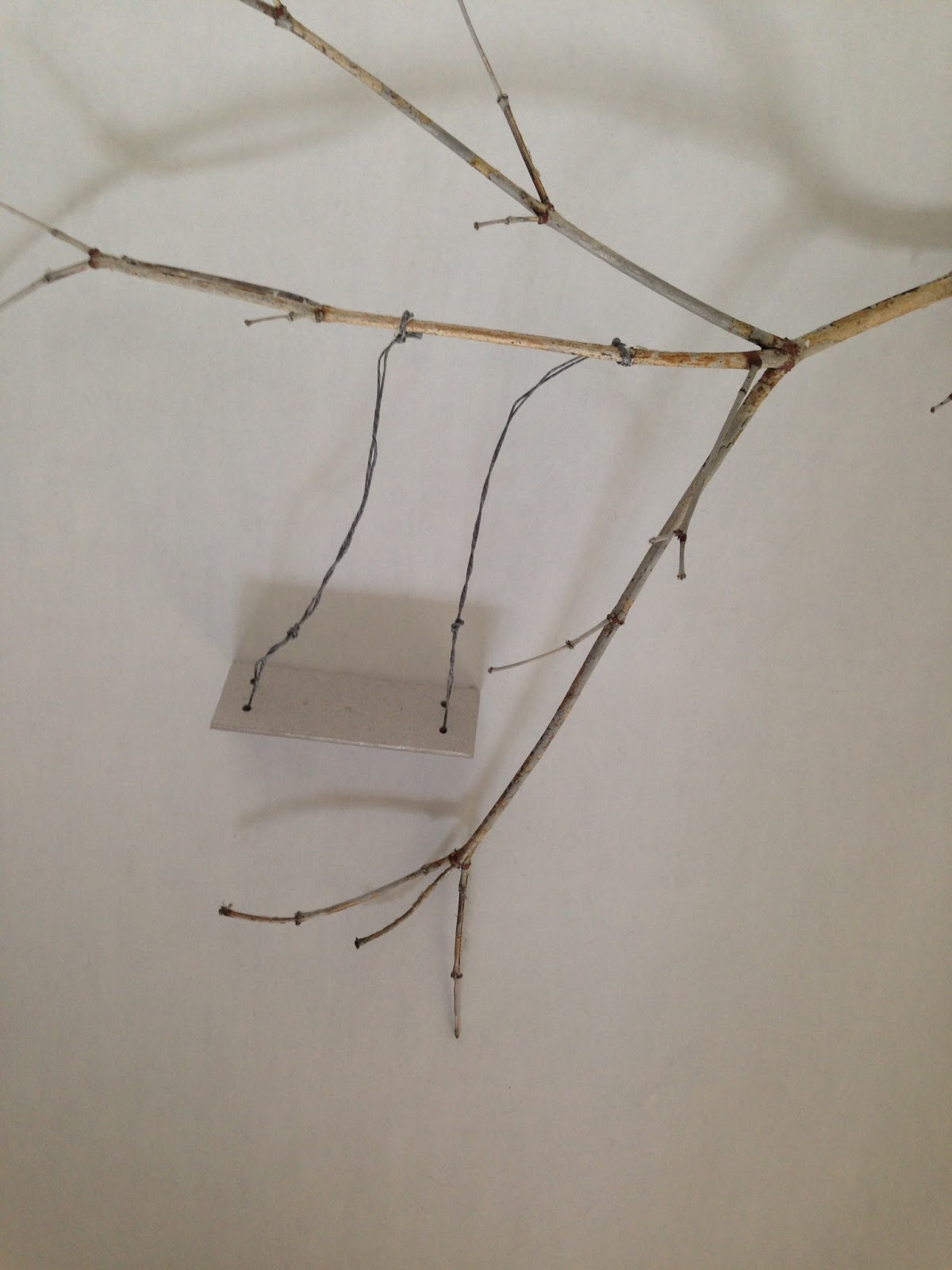
Initially I thought I would use Illustrator to draw the keyhole shape and add the photo of the swing and shadow in the hole, but decided to try to photograph the keyhole and swing together. I created a rough mock up of the keyhole shape cut from card (in 2 sizes) and the swing (card, waxed string, twig from the garden), to ascertain that the sizes were roughtly correct, and took some test shots. As these sizes worked, I then cut the keyhole from black card and experiemented with the positing of the light to cast an effective shadow. I tried to get the shadow to appear non-threatening and cheerful and evoke a feeling of warmth and sunlight.

My "studio" setup:


The swing and branch:


Some of my final shots before processing in photoshop:


I used a wide aperture (F2) to get the keyhole blurred but the swing in focus. The lamp was adjusted to make the shadow appear soft and less threatening.

Yellow was chosen for the only colour, because of it's connotation with sunlight, happiness, warmth and protection - the feelings that Mary has when in the Secret Garden.

I created several versions of the cover:

My favourite are the bottom two. However, I do quite like the top right design as it looks quite Penguin-esque. On the bottom left, I like the black and white with the bright yellow and the handwritten script. The typeface brings a more modern and friendly feel to the novel, and the yellow keeps the image from looking sinister. The bottom right cover has a photo of old script overlaid (suggested by Gemma!), and works well to bring another layer of interest and makes the image look more sunny. It contrasts well with the sans serif font, but the style of text could make the subject matter seem, incorrectly, for an older audience.

I made one final book cover which I think is the best because the typeface is friendly, but hints at a time when handwriting was more calligraphic, the yellow is sunny but not too orange, and the placement of the title is informal.  The author's name at the bottom is in Times New Roman which is easy reading for its target audience, but contrasts well with the title typeface. The white type looks interesting against the black and yellow. I think this is the best (of my covers) of a design which juxtaposes a shadowy photograph with a friendly feminine typeface, preventing the design from appearing ghostly.


23 September 2015

Paper challenge

With 30 minutes, we were tasked with creating a 3D form from a flat sheet of paper. I decided to cut out a sheep silhouette and represent the fleece being spun into fibre to create a hank of yarn:


11 September 2015

Online courses

Skillshare courses

Over the summer I subscribed to Skillshare who have a many useful courses for surface pattern design, amoungst other subjects. Skillshare courses are purchased via a monthly fee so I subcribed when they had a special offer on in August and September. I completed the following courses:

Introduction to surface pattern design: creating and mixing patterns (Jenna Fry)
Introduction to surface pattern design: learn AI: create patterns (Bonnie Christine)
Surface pattern design 2: design a collection (Bonnie Christine)
Design and bind your own creative portfolio (Bonnie Christine)
Pattern design 1: creating inspiring repeats (Elizabeth Olwen)
Pattern design 2: a creative look at a full collection (Elizabeth Olwen)

These courses consist of up to 20 modules, with lots of video content and are taught by lecturers (Jenna Fry), and established surface pattern designers.

7 September 2015

Scarf samples printing

I found another printer called RA Smart (who I discovered when talking to a silk scarf seller in Borough) who sent me a whole batch of samples which are suitable for scarf printing as the design shows through on the reverse of the fabric. Other printers I have found were not able to provide this, even though they used the same method of printing, and said that they could, but their samples showed otherwise.


From the dozen or so fabric samples I received from RA Smart, I chose to try printing on 100% wool, 96gsm. I chose the wool because, unlike the silks I was considering, the weave is slightly uneven, providing some texture and shading to the design. I also prefer the feel, as it does not feel cold against the skin like silk. It will be interesting to compare them with similar prints I have on silk.

RA Smart's costs are much higher than other companies, with a separate price for printing, for the substrate and for file set up.  In one metre of fabric I have managed to get 2 full sized scarves plus 10 samples.

The designs I uploaded are shown below.


17 August 2015

Scarf samples

I have received back my sample designs printed on three different fabrics, at different saturation levels. Despite assurances from the printing company (BeFabBeCreative), and the fact that they use reactive dyes, none of the designs showed through totally on the other side of the fabric, and are therefore not suitable for scarves. I'm going to try another company.  I have also learned that some designs are going to need to be enlarged quite a bit to look effective, and some colour combinations don't work successfully when printed onto fabric.


20 July 2015

Pattern collection lookbook

After working through online tutorials and e-courses on surface pattern design, I have created a lookbook which features 4 designs in 3 different colourways. I will be ordering samples printed on cotton lawn, cotton habotai and silk habotai.


3 June 2015

Patterns with photos 2

The original photo, taken in Shad Thames, with the reflected and rotated tile and and resulting pattern. I can't stop making these....


2 June 2015

Patterns with photos

Photoshop patterns

I have been experimenting with making patterns from photos and scans. This one is of Pussy Willow, reflected, rotated, and merged with various layer blends. I really like the fact that you can still make out what it is, but the image looks totally different and the colours blend in a really interesting way.

The pattern tile:


The pattern:


The original scan: