Showing posts with label reading. Show all posts

4 October 2015

Cultural impact reading material


Thanks to Natalia, my stepdaughter, I have plenty of reading material on the subject of semiotics and cultural impact!!


3 October 2015

Semiotics

Denotation, connotation and myth (Daniel Chandler)

Notes from the above book, chapter 7

Barthes' theories of semiotics are summarised in this chapter.

1st order of signification (denotation-literal) = sign (the signifier and the signified). For instance a picture of an apple (the signifier) and apple (the signified). REPRESENTATIONAL

2nd order of signification (connotation-interferred) = denotive sign (perhaps denoting fruit, healthy, fresh) = signifier making an individual signified (if on a sign outside a shop, signifying a green grocer). EXPRESSIVE VALUES


In photograhy the denotation is what is photographed, the connotation is how it is photographed.

There is no definitive distinction between denotation and connotation. Connotation is totally subjective and is determined bycodes the interpretter has access to.

Changing forms of the signifier (with the same signified) can generate different connotations.

Barthes' theory of myth is the 3rd order of signification. This is a combination of the denotation and connotation - it "points out and notifies", "helps us understand and imposes". These concepts are are culturally variable. MYTHOLOGICAL/IDEALOGICAL

See the image of the young black French soldier:


Myths are extended metaphors. They turn a shared concept into something natural, automatic: "it goes without saying". To analyse your own culture, you need to be aware of your own cultural values.

In summary, for an image of Marilyn Munroe:
Orders of signification
1st: photo of Marilyn (signifier), Marilyn (signified)
2nd: glamour, beauty
3rd: myth of Hollywood, build you up - knock you down

18 May 2015

Start Me Up

I bought a fabulous book on branding which has just been published called Start Me Up. It's 256 pages of branding porn for the graphic designer, and the paper smells all inky too. Lots of useful into for my studies.


15 October 2014

Week 1

Swiss Design


Wim Crouwel's work was discussed in the class, and after reading the class notes about him, I decided to investigate Swiss Design further.  Swiss Design has so many aspects that appeal to me.  The mathematics and controlled order of grids, and simplistic minimalist sans serif typefaces.  Crouwel's New Alphabet is fascinating in its design, although limited in its application. 

I read Grid Systems by Hans Muller-Brockman.  It is very useful for helping to understand the intricacies and possibilities of how applying different types of grid can aid design.  Some of the methods for developing a grid seem really complicated, but the principles are easy to follow.  I definitely want to apply his grid format to work I create.


I watched the film Helvetica, a documentary about the history of the typeface.  What I found most interesting was the attitude of Wim Crouwel, when he said that when you write the word dog, it doesn't need to bark, meaning the typeface doesn't need to be expressive, that is what words are for. Massimo Vignelli stated that he only uses 3 typefaces! I love the simplicity of the film poster, but I prefer Helvetica in lower case.  To me the upper case characters look ungainly.


Reading

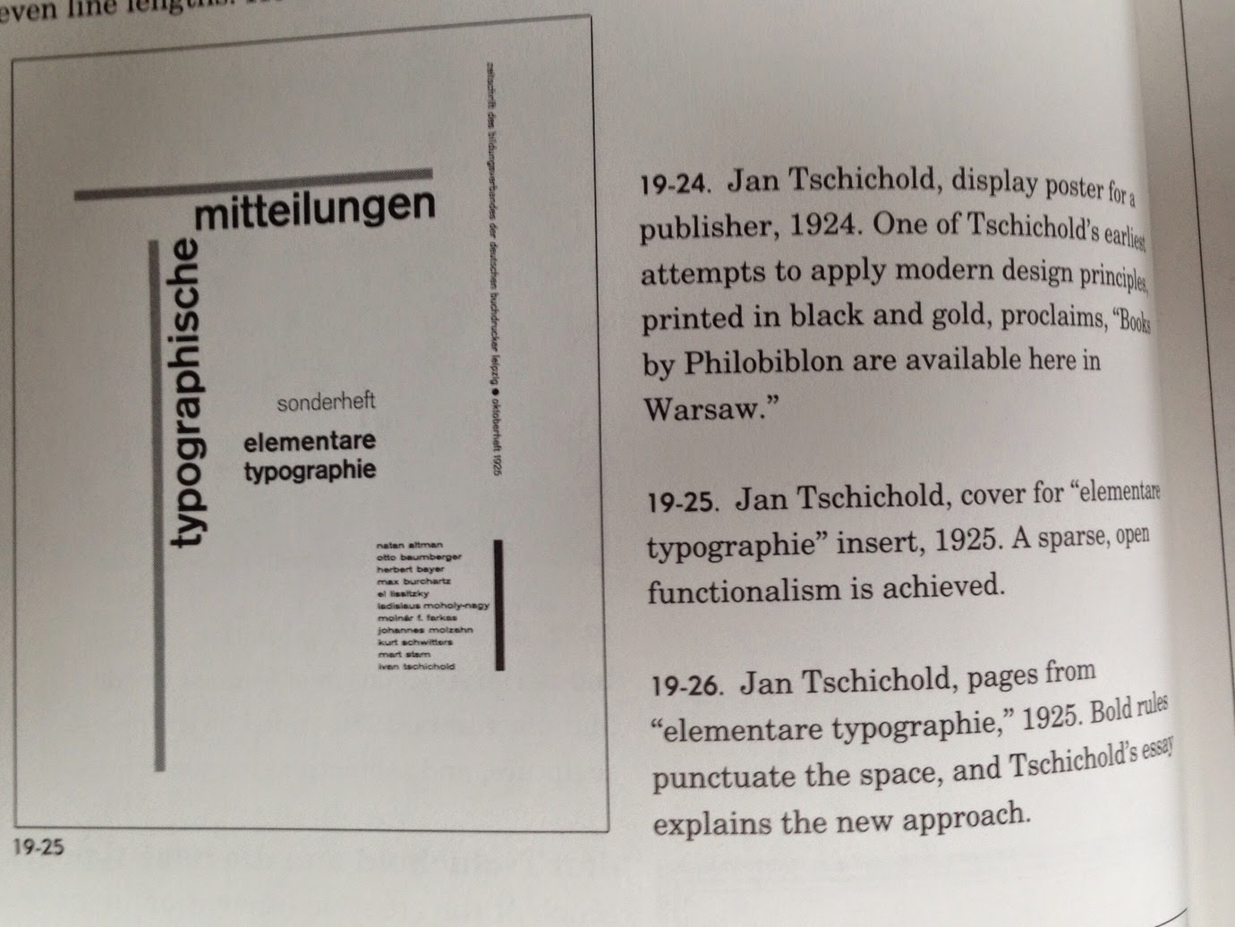
The New Typography - Jan Tschichold


I enjoyed this book, although it was rather a dry read.  His ideas are very prescriptive - every design should be done on specified paper sizes, only with certain fonts and with images that comply to his strict rules.  Since writing this book in 1928, Tschichold changed his mind about many of his design rules, but it is a fascinating read and has some ideas for layouts that I want to try out.

In this layout I love the use of horizontal and vertical rules which frame the page and the layout of the text.


The use of colours overlaying the image really focuses the eye on the grid layout.


13 October 2014

Pre-course preparation 1


Reading


Throughout the summer I studied 7 books from the Basics Design and Basics Graphic Design series:

Basics Design 01 Format, Gavin Ambrose & Paul Harris
Basics Design 02 Layout, Gavin Ambrose & Paul Harris
Basics Design 03 Typography, Paul Harris
Basics Design 07 Grids, Gavin Ambrose & Paul Harris
Basics Design 08 Design Thinking, Gavin Ambrose & Paul Harris
Basics Graphic Design 02 Design Research, Neil Leonard & Gavin Ambrose
Basics Graphic Design 03 Idea Generation, Neil Leonard & Gavin Ambrose


I read all of the above books and made notes on them. I feel that they have all helped me gain a good basic understanding of some of the areas of graphic design so I will not be starting the degree coursework completely ignorant. 


Other books I borrowed from the library and read:

Graphic Design : a user’s manual, Adrian Shaughnessy
Type & typography, Phil Baines & Andrew Haslam
100 ideas that changed graphic design, Steven Heller and Veronique Vienne

Some of these  books I found very engaging, others less so.  Graphic Design ; a concise history was really interesting as I had no knowledge of this area at all.

100 ideas that changed graphic design is an amazing resource for layout ideas: