For my presentation on Marimekko, I spent a lot of time tracking down relevant material.
There was not a huge amount available on the college Journals database, just a couple of reports, but I found relevant background material on Scandinavian design which was very interesting for putting design into context.
I bought two books about Marimekko which contain lots of detailed information. Marimekko: Fabrics, Fashion, Architecture is an interesting collection of essays, and Patterns: Marimekko is a brilliant visual resource. Both have lots of relevant content.
I then looked at information online, including Marimekko's own website and some of their retailers.
The popular press had some published articles on the internet on Scandinavian design history which I can use.
Finally, I looked at the company's financial statements.
Showing posts with label poster assignment research. Show all posts
Showing posts with label poster assignment research. Show all posts
20 April 2015

9 January 2015


Poster 5
Post-modernism - David Carson inspired design
After this week's tutorial, I decided to experiment with the designs we had studied, to see if I could design a poster to replace my fourth one which I was not happy with. My chosen quote is "don't mistake legibility for communication".Inspiration for my work is my poster for Skate Somerset House, from the tutorial, which given the time constraints, I thought was quite successful:

Other illustrations of the quote found on Google images:

I really like the way he uses type as a textured background in Ray Gun:

The red and black of this poster are really stiking, combined with the hand drawn typography, and the multiple layers:

I considered how you could illustrate the quote, and decided that a handprint would work well as it relates to STOP, along with a no entry sign.
I wanted to include some of my hand drawn type, below.

1 January 2015
Hand drawn typography
I have been experimenting with brush lettering for one of my posters. The best brush pen, out of the dozen or so I have bought, is the Pentel Brush Pen.


23 December 2014
Type and layout assignment 3 - hand drawn type
Hand drawn typography inspiration
I really love the look of hand drawn typography, and calligraphy. I'm not so keen on the very perfect styles, which take years to master, but the more informal characterful type, as show below.

http://typophile.com/node/88004

https://dribbble.com/shots/1422318-Begemot-Calligraphy-Logo
I love the huge contrast between the thick and thin strokes in the two pieces above, and will try out various techniques to achieve something similar. I will use a ruling pen and a Pilot Parallel pen.

http://www.flickr.com/photos/luca-beanone-barcellona/5859864506/in/set-72157627020568080/
To try out the technique above I need to use a straight edge calligraphy pen. I like the use of two colours and the informal style and combination of fonts.

http://www.pinterest.com/pin/18155204717369050/
I really like the splatters and uneven letter forms above, either created, I imagine, with a ruling pen or a handmade cola pen on rough watercolour paper.

The above piece is by Seb Lester from the cover of the latest Uppercase magazine. It is created in the Copperplate style with an oblique pen holder and nib. I really like the rhythm and the smooth curling letter forms of this work. I intend to try this technique as well, although I suspect it will take a huge amount of practice.
These below are from Uppercase issue 23, by Pietro Piscitello. I like the second down on the right - the contrast of thick/thin strokes make a really eye catching font with lots of character.
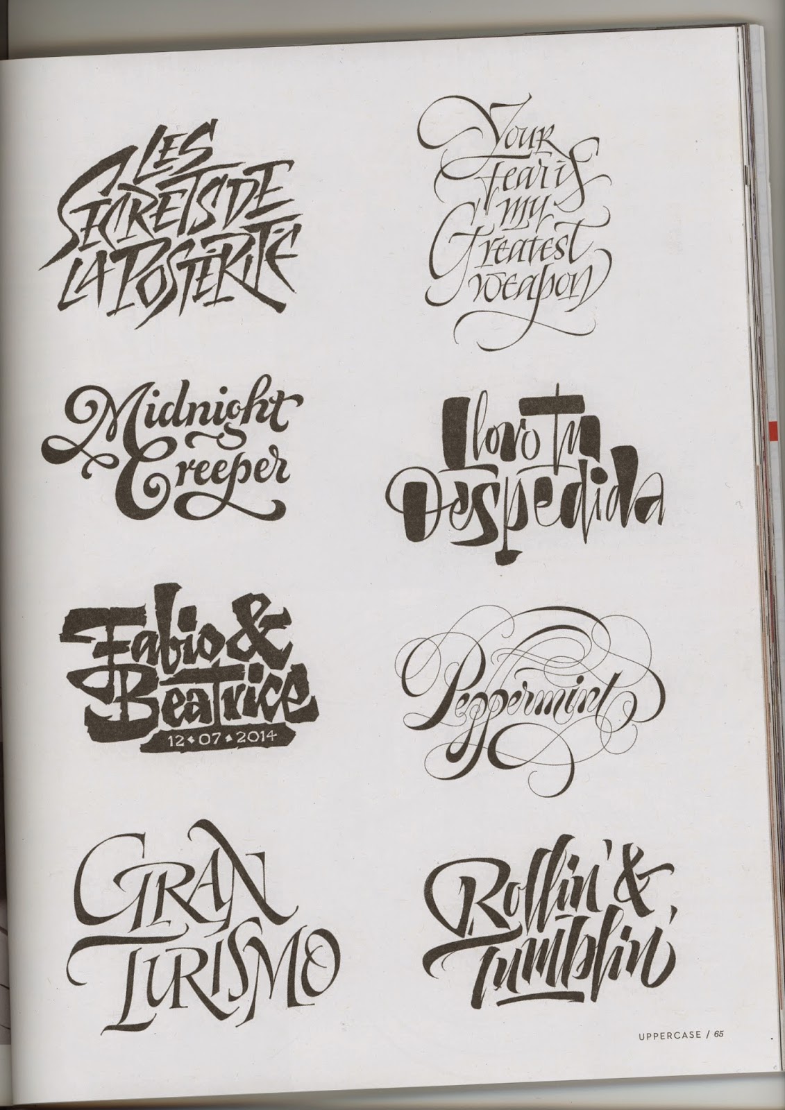
22 December 2014
Type and layout assignment 4 - fools
Eric Gill quote poster
For my 4th poster I chose to use the quote by Eric Gill, "There are now about as many different varieties of letters as there are different kinds of fools". Gill Sans was his most famous typeface which he designed in 1926. It was used extensively by newly nationalised British Rail in the 1940s onwards. Now the government and the Church of England, amongst many other British institutions use it as their corporate font.
My ideas are sketched below:

ww
I selected the poster below as my design inspiration, featuring another, later font by a different designer.

http://webexpedition18.com/articles/55-surprisingly-beautiful-typography-posters-and-desings/
I absolutely love everything about this album cover design and want to incorporate the feel and colour palette into my design:

http://www.flickr.com/photos/klausspecktur/461973984/
The poster below is a modern day example of, in my opinion, a simple idea brilliantly executed.

http://www.pinterest.com/pin/12314598957155787/
I am going to incorporate the common background colour from these pieces in my design.
Colour schemes from the 40s and 50s when Gill Sans was widely adopted:

19 December 2014
Type and layout assignment 2 - grids
Poster 2 research - grids
I wanted to use imagery to convey the idea of a graphic design grid, but without being too literal. I had the idea that I could use the words National Grid (a play on the electricity distribution system of the UK) over a map of the country. I wanted to include a reference to one of the forerunners of the graphic design grid, Wim Crouwel, so I chose to use his typeface, New Alphabet.

Some inspiration I chose to use was this image:

Another gridded image I like is below. I would like to incorporate the feel of this piece in my design.

Something I found on Pinterest which is similar to what I want to do.

Wim Crouwel's new alphabet harks back to one of the founders of the modern grid and is the typeface that I want to use for my design.
I researched which colours to use to represent the 4 countries of the UK, and looked at their official flags. Scotland was dark blue, England red, and wales was red on green, so I chose green. Northern Ireland doesn't have it's own flag, but flies the Union Jack, so I chose white to represent it.
8 December 2014
Type and layout assignment 1 - flow
Poster 1 research - flow and visual hierarchy
I thought of 5 ideas for posters so decided to research and develop them all and then select the best 4 ones to work up to final pieces for the brief. The audience for these posters is graphic design students
like myself so I wanted to pick imagery and typefaces that I thought might
appeal to them.
When reading a page that is text heavy page with little or no
points of interest, the Western eye typically reads down from top left to
bottom right (Gutenberg diargram). Further research suggested that the eye
enters top left and reads in an F
pattern or Z pattern across the page.
Within a graphically designed page, the eye is lead by the visual hierarchy of the document. It is up to
the designer to decide on the flow which is appropriate for the piece, and
direct the eye accordingly.

Generally there should be 3 elements to a poster – headline, content and call to action. Saturated, hot colours advance, cool colours recede. Contrast, repetition, alignment and proximity contribute to defining a hierarchy.
The rule of thirds grid, and the rule of odds, contribute to visual
harmony. Placement and shapes produces movement. Triangles are more dynamic that squares,
which are more dynamic than static circles.
I considered how best to illustrate the title I had chosen, ‘let it flow’. I could choose a font which imitates flow, eg a molten liquid style font or dripping, but these are rather obvious and did not look sharp enough. I decided to use an image of something that flowed so I researched images for liquid, molten metal, magma, and place this into the type of the title.
I decided not to actively look at what others might have done to illustrate this concept as I didn't want to be overly influenced by them. I then collected inspiration and assets for imagery, fonts and colours.
The following are possibilities for placing into the title type. The gold image could be used if the colours are converted - either to greyscale or the colours of my palette. These images are from Flickr creative commons.


I considered what sort of fonts would be demonstrate the
feeling of the piece. Factual, serious
but slightly quirky. I decided using a
image to fill the text was suffiently quirky and wanted a bold font to showcase
the image, but one with strong lines. A charge font from Hypefortype was considered, along with Age and AT Babyfat, both of which are free fonts.


The image below gave me inspiration for my design.

After collecting this material, I was ready to work on my poster design.

Subscribe to:
Posts (Atom)