Showing posts with label Adobe Photoshop. Show all posts

1 December 2015

Waterstones Project

Scratch and sniff gift tag and mailer

I have completed my designs for mailers and gift tags, shown below. The mailer is folded in half vertically, to contain the gift tag (front and back shown). The scratch and sniff panel is contained on the largest icon on the front of the gift tag, and the aroma relates to a recipe typical of the author. The photo texture on the gift tag infers the author's style of cookery.

They will be circulated in magazines, and sent to potential customers. In addition, they will be hung from a Christmas tree in the store window display, and a larger tree outside the store will have them displayed as decorations, so people can remove them to use. They can be exchanged for £1 discount from the author's book, and free gift wrapping.

I still have to create the gift wrap, and do a mock up of the Christmas tree, with additional decorations relating to Waterstones.


Finally, I moved the address and stamp to the back, and changed the brown (chocolate) which looks a bit dull, to purple, which still infers luxury and links to chocolate with Cadbury's.


15 November 2015

House style

It is important to consider the audience when creating designs, and be able to appeal to a broad demographic, or a smaller-subset of your target audience, but still adhere to your house style. For instance, at Christmas, the following audiences need to be considered: families, religious people, children, secular audiences, those without children, etc. Different imagery and styles can be used to infer thoughts of food, gifts, religion, parties, homeless, elderly, etc. The style and colours of an image can infer expensive, friendly, trashy, loud, stylish, etc.

Below are screen shots of pages from my Waterstones book showing how I created 4 posters and an invitation.


5 November 2015

Character-based posters

Celebrity chefs

We were asked to design 4 posters representing 4 authors or books, where the focus is on the character, not the story or the subject. We look at Stylorouge's work and how they achieved this with the iconic poster they designed for Trainspotting. It was ground-breaking at the time (in the 1980's) as previously all film posters had a visual hierarchy of characters, with full colour, overlapping images. It spawned a million immitations. It worked so well because nothing like it had been done before with most films having stereotypical charcter shots, overlapping and arranged in hierarchical fashion. It shows all the charcters at an equal level of importance and focusses on them as people and characters.


I created posters for 4 celebrity chefs. I used high resolution photos from the internet, removed the backgrounds with a combination of Photoshop tools, and used threshold to achieve the look I wanted. I then used InDesign to layout the designs. I used American Typewriter for their names, and Antique Olive for the body copy. I felt these typesfaces complmented each other well. I chose orange as it contrasts well on the black and white areas of the images. The taupe sidebar was chosen to bring some warmth and contrast to the design. There is a clear hierarchy in the typography. The Jamie Oliver poster is the least successful as I could not find picture of him with suitably dark shoulders, with his head at the right angle.


My final design was changed by removing the sidebar, creating a box around the body copy and adding a visual full stop (the orange rectangle) which also acts as repitition. I think the designs now look more striking with improved contrast. The black box under the text makes the type legible now.


23 October 2015

Marketing brochures

Hampshire County Council brochures

I recently created the branding for Hampshire County Council's children's homes. There are soon to be 8 children's homes owned by HCC and I was tasked with creating a brand for them. I created logos for all the homes, and 40-page brochures for each of the homes (see below). For the remaining children's homes, I will endeavour to take the internal and external photographs of the building myself, as the styling of the photos needs to be improved. The brochures were printed by our in-house print shop. I was really pleased with the results, and the Service Manager and children's homes managers gave me positive feedback. I have also designed flyers, certificates and leaflets.

HCC children's homes handbooks, designed by myself


18 October 2015

Environmental typography

When typography is placed in the environment, extra layers of meaning are connotated from the space, atmosphere and tone of the situation. Doing so provides the written words with an additional narrative or story. The environment can be outside, or inside, and means placing the typography anywhere other than on paper.

Exampes of designers' work


The word Descend, below, is created from duck tape stuck onto the treads of the steps by Becky Obenhaus. The simplicity of application and materials, compared with the straight word modern sans serif typeface and the direction of the type, when placed on the stairs, combines to make the instruction superfluous, but amusing. It would also lead you to wonder what is down there?
ttp://www.thestlouisegotist.com/sites/www.thestlouisegotist.com/files/imagecache/portfolio_work_image/portfolio/Becky%20Obenhaus/IMG_4594.jpg


The work below, from Nicole Dextras, a Canadian designer, was created on the shores of Lake Ontario. The letters stand 6" high and are carved in ice. Is the word a noun, or a verb? It was created in a response to the artist's feelings about estate agents selling land "with a view". It could mean so many different things, depending on your politics and your interpretation.

http://nicoledextras.com/portfolio/social-typography/views/


My design


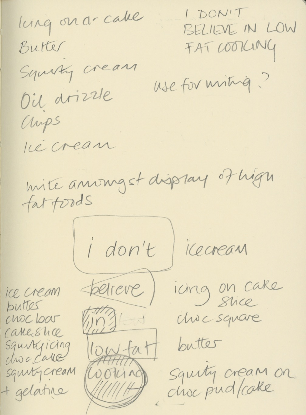
My ideas were loosely based on my cookery book theme for Waterstones. I chose a quote from Nigella Lawson - "I don't believe in low fat cooker" and sketched out some ideas of how I could produce an environmental design piece for these words.


My thoughts were to carved the letters into butter, ice-cream and chocolate, and use icing and squirty cream to write letters onto other high fat food. The idea was to underline the deliciousness of naughty foods, and support Nigella's view that a little of what you fancy does you goo.

Once I tried this idea out, I discovered that writing in ice-cream was not so simple - the ice-cream I bought was quite fluffy in texture and it was not possible to carve it legibly. I also struggled with the chocolate icing on cheesecake as the icing was too runny to write small enough. Some lettering ended up looking better directly on the worktop.


I experimented with lighting, thinking the carved letters would look most effective if lit from the side, but in fact the shadows cast elsewhere detracted too much from the design.

I shot at F8 to ensure everything was in focus when shooting from fairly close range, particularly when photography from an angle.


The image above contains words in the chocolate and butter, which I felt were not clear enough. My final image is below. Photoshop was just used to lighten up the mid tones and enhance the contrast very slightly.


My final image (above and below). I think it reflects what I was setting out to do. The crumbs and splatters of food were to represent the food being irresistible, along with the cheesecake on spoon waiting to be eaten. I replaced the words in and low fat, with icing and cream, which I think make the typography flow better. I wrote Nigella's name in a rounded type, to reflect Nigella's curvaceous figure that she is well know for, which ties in with the anti-stick-thin ethos of her recipes. The colour of the type was creamy yellow, to tie in with ice-cream and butter. I'm not sure whether the rule around the edge adds anything to it.




11 September 2015

Online courses

Skillshare courses

Over the summer I subscribed to Skillshare who have a many useful courses for surface pattern design, amoungst other subjects. Skillshare courses are purchased via a monthly fee so I subcribed when they had a special offer on in August and September. I completed the following courses:

Introduction to surface pattern design: creating and mixing patterns (Jenna Fry)
Introduction to surface pattern design: learn AI: create patterns (Bonnie Christine)
Surface pattern design 2: design a collection (Bonnie Christine)
Design and bind your own creative portfolio (Bonnie Christine)
Pattern design 1: creating inspiring repeats (Elizabeth Olwen)
Pattern design 2: a creative look at a full collection (Elizabeth Olwen)

These courses consist of up to 20 modules, with lots of video content and are taught by lecturers (Jenna Fry), and established surface pattern designers.

20 July 2015

Pattern collection lookbook

After working through online tutorials and e-courses on surface pattern design, I have created a lookbook which features 4 designs in 3 different colourways. I will be ordering samples printed on cotton lawn, cotton habotai and silk habotai.


3 June 2015

Patterns with photos 2

The original photo, taken in Shad Thames, with the reflected and rotated tile and and resulting pattern. I can't stop making these....


2 June 2015

Patterns with photos

Photoshop patterns

I have been experimenting with making patterns from photos and scans. This one is of Pussy Willow, reflected, rotated, and merged with various layer blends. I really like the fact that you can still make out what it is, but the image looks totally different and the colours blend in a really interesting way.

The pattern tile:


The pattern:


The original scan:


17 May 2015

Eloise Renouf - Illustration to print

Eloise is a successful designer and illustrator whom I admire. Her work begins with sketches and paintings which are then manipulated in Illustrator to create contemporary prints, cards and fabrics designs:

16 May 2015

Gordon's Gin assignment


I've finished my packaging project for Gordon's Gin and included ideas of two of their other flavours - Sloe and Elderflower.


20 April 2015

Momento Mori and Vanitas

We were shown examples of art using skulls, in particular Momento Mori and Vanitas. Momento Mori means remember one day you will die, and Vanitas is an art movement that highlights the objects you can't take with you when you die. Both use skill imagery. Skulls can be a signifier for pirates, poison, death, danger, rebellion, Day of the Dead etc, and are found in many areas of art including popular culture, band art and tattoos.

This image is called Vanitas by Antonio de Pereda y Salgado and features skulls together with all the valuables that the person collected during their lifetime.


The above image by David Bailly (1650) is meant to communicate the stupidity of spending money on consumerist items and hobbies and is a reminder that you cannot take these items with you when you die. Most of this style of painting are dark and sombre and are easy to recognise as Vanitas.

We had to design two images, one reflecting a positive use of skulls, and one a negative.

For the positive I produced a pattern, which unless viewed closeup, is not clear what the imagery is. It could be a flower motif, and works quite well, I think.


6 April 2015

Shop window display

Design with materials assignment

I finished the majority of items for my assignment today, and took photos to use in a mockup using Photoshop and Illustrator. All but the wooden cabinet were made by me (!).


30 March 2015

Digital collage

We experimented with a digital collage effect in class. I adapted the concept to my London imagery for Gordon's Gin.

The placement of the typography symbolises smoke coming from the chimneys of Battersea Power Station. I will develop this concept further to see if I can create a useable packaging label for Gordon's.

This concept could be developed for their other gin based products by using different shapes representing different London buildings, and different colour palettes.

The image was produced in Photoshop with various shapes (set to pixel, overlay), overlapping each other. The magic wand was used to select shapes, a layer of texture was selected, then select, inverse, delete. This filled each shape with the texture. A layer of handwritten text was added over the whole image and then I placed a stormy sky underneath everything. Each of the layers were adjusted for colour, opacity, levels, etc.


This works better as the text has room to breathe, and is not fighting with the imagery underneath. The typeface is Gill Sans, but has been stretched. I need to look at something more geometric that reflects the Art Deco architecture of the Oxo Tower and Battersea Power Station. The sky contrasts better with the buildings as it has been desaturated.

21 March 2015

Gordon's Gin experiments

Some further ideas I have been experimenting with for the drinks packaging assignment:

This woodcut style sketch incorporates the Oxo Tower, The National Gallery and Battersea Power Station. I tried to do an Art Deco style sky, but  it was too dominant, and I'm not happy with how it turned out.


I used photography layered in Photoshop to create grungy effects, reflecting the industrial heritage of the drink, and updating the brand to appeal to a younger consumer. This image gives a leather like effect which would work well with the clear glass bottle, and looks quite subtle and interesting.


The effect below is much lighter and brighter but still retains the texture and image, but looks more summery, and the imagery is much clearer.

9 March 2015

Woodcut style illustration

In class we had a go a designing a beer pump clip in a woodcut illustration style.

First we drew a black and white line drawing which was then filled in with different marks and lines, representing movement and texture.


In Photoshop the contrast and brightness were increased. Layers of textures were added - I chose a concrete texture and pebbledash. The layers were set to multiply, but others work too. Fonts were added and rasterised (Layer, Rasterize Type), and everything was aged with a brush (splattered shape), to tone everything down and chop bits out. A layer of creased black paper was added (use Multiply) and only the white creases show.

The pen tool was then used (I didn't have time to do this), to create the shape of the label and cut it out. Then path was converted to a selection.

Another option was to convert the image to greyscale, then monotone.


My other option which probably looks better on screen that if it were printed:


8 March 2015

Surface pattern design


Fabric design


For a shop visual merchandising project I am creating 4 elements, one of which is a fabric panel. The fabric can also be used for furoshiki (fabric wrapping) and making a Japanese inspired origami bag. I designed lots of fabric tiles within an orange and teal colour scheme, below. I think the orange ones are more successful, and the first couple in the teal panel are the least (these are the first ones I created).


24 February 2015

Gordon's gin packaging assignment

I am considering using my own photography for the Gordon's Gin packaging. I took the first photo on the South Bank outside the National Theatre. I edited the hue in Photoshop to reflect the green of the glass bottle, and mimic the purple of the Juniper berries it is flavoured with.

The fifth photo has been edited to contrast with the green of the bottle, and the sixth is of a speeding tube training, again with the hue changed.

I want to use images that reflect the provenance of the drink - London Dry Gin,  but without being overtly obviously of London.