Showing posts with label design for print. Show all posts

12 December 2015

4 December 2015

Waterstones gift wrap


Gift wrap

The design below was created in Illustrator to be used to create gift wrap. This will be used by staff in store to wrap books in exchange for presentation of the gift tag and mailer. The colours were chosen from those used in the mailers/tags. All the graphics in the design below are taken from the gift tags. Some (spoon, whisk) were copied and rotated to make a flower.


1 December 2015

Waterstones Project

Scratch and sniff gift tag and mailer

I have completed my designs for mailers and gift tags, shown below. The mailer is folded in half vertically, to contain the gift tag (front and back shown). The scratch and sniff panel is contained on the largest icon on the front of the gift tag, and the aroma relates to a recipe typical of the author. The photo texture on the gift tag infers the author's style of cookery.

They will be circulated in magazines, and sent to potential customers. In addition, they will be hung from a Christmas tree in the store window display, and a larger tree outside the store will have them displayed as decorations, so people can remove them to use. They can be exchanged for £1 discount from the author's book, and free gift wrapping.

I still have to create the gift wrap, and do a mock up of the Christmas tree, with additional decorations relating to Waterstones.


Finally, I moved the address and stamp to the back, and changed the brown (chocolate) which looks a bit dull, to purple, which still infers luxury and links to chocolate with Cadbury's.


15 November 2015

House style

It is important to consider the audience when creating designs, and be able to appeal to a broad demographic, or a smaller-subset of your target audience, but still adhere to your house style. For instance, at Christmas, the following audiences need to be considered: families, religious people, children, secular audiences, those without children, etc. Different imagery and styles can be used to infer thoughts of food, gifts, religion, parties, homeless, elderly, etc. The style and colours of an image can infer expensive, friendly, trashy, loud, stylish, etc.

Below are screen shots of pages from my Waterstones book showing how I created 4 posters and an invitation.


11 November 2015

Waterstones campaign

I decided to discard my ideas for a bag for life as I wasn't happy with how they were developing. I have revisited my concepts for a scratch and sniff gift tag, which I have developed further and will be continuing with for this assignment.


5 November 2015

Character-based posters

Celebrity chefs

We were asked to design 4 posters representing 4 authors or books, where the focus is on the character, not the story or the subject. We look at Stylorouge's work and how they achieved this with the iconic poster they designed for Trainspotting. It was ground-breaking at the time (in the 1980's) as previously all film posters had a visual hierarchy of characters, with full colour, overlapping images. It spawned a million immitations. It worked so well because nothing like it had been done before with most films having stereotypical charcter shots, overlapping and arranged in hierarchical fashion. It shows all the charcters at an equal level of importance and focusses on them as people and characters.


I created posters for 4 celebrity chefs. I used high resolution photos from the internet, removed the backgrounds with a combination of Photoshop tools, and used threshold to achieve the look I wanted. I then used InDesign to layout the designs. I used American Typewriter for their names, and Antique Olive for the body copy. I felt these typesfaces complmented each other well. I chose orange as it contrasts well on the black and white areas of the images. The taupe sidebar was chosen to bring some warmth and contrast to the design. There is a clear hierarchy in the typography. The Jamie Oliver poster is the least successful as I could not find picture of him with suitably dark shoulders, with his head at the right angle.


My final design was changed by removing the sidebar, creating a box around the body copy and adding a visual full stop (the orange rectangle) which also acts as repitition. I think the designs now look more striking with improved contrast. The black box under the text makes the type legible now.


23 October 2015

Waterstones Bag for Life

I experimented with a couple of ideas for the illustrations for my bag for life. These are just rough concepts:

This illustration for my bag was quickly created in Illustrator with the blob brush and shape tools. The black panel would be fixed with velcro to the bag and could be written on with a wipeable white chalk pen.


The image below is a quick watercolour sketch in line and wash on NOT watercolour paper. It would be used in the same way as the Illustrator sketch above.


In the image above, I hand drew some type with a white gel pen. I quite like the effect on this sketch, and think I will explore this technique further. The white hand writing on the blackboard is not part of the design, and the background has printed too dark.

Marketing brochures

Hampshire County Council brochures

I recently created the branding for Hampshire County Council's children's homes. There are soon to be 8 children's homes owned by HCC and I was tasked with creating a brand for them. I created logos for all the homes, and 40-page brochures for each of the homes (see below). For the remaining children's homes, I will endeavour to take the internal and external photographs of the building myself, as the styling of the photos needs to be improved. The brochures were printed by our in-house print shop. I was really pleased with the results, and the Service Manager and children's homes managers gave me positive feedback. I have also designed flyers, certificates and leaflets.

HCC children's homes handbooks, designed by myself


Packaging - the delivery medium

Postcard mailer and tea towel wrapping

We were asked to consider the different mediums that can be used to deliver a product - bags, envelopes, boxes etc.

Bags are the method shops employ as free advertising when you buy from a store. It's a signpost to other shoppers that their store is in the vicinity. You are the walking advertisement.

Packaging also has negative connotations - it creates litter, it goes into landfill - non-biodegradable packaging in particular.

We were asked to create 2 concepts for envelopes, incorportaing an element from our assignment on a Waterstones envelope.

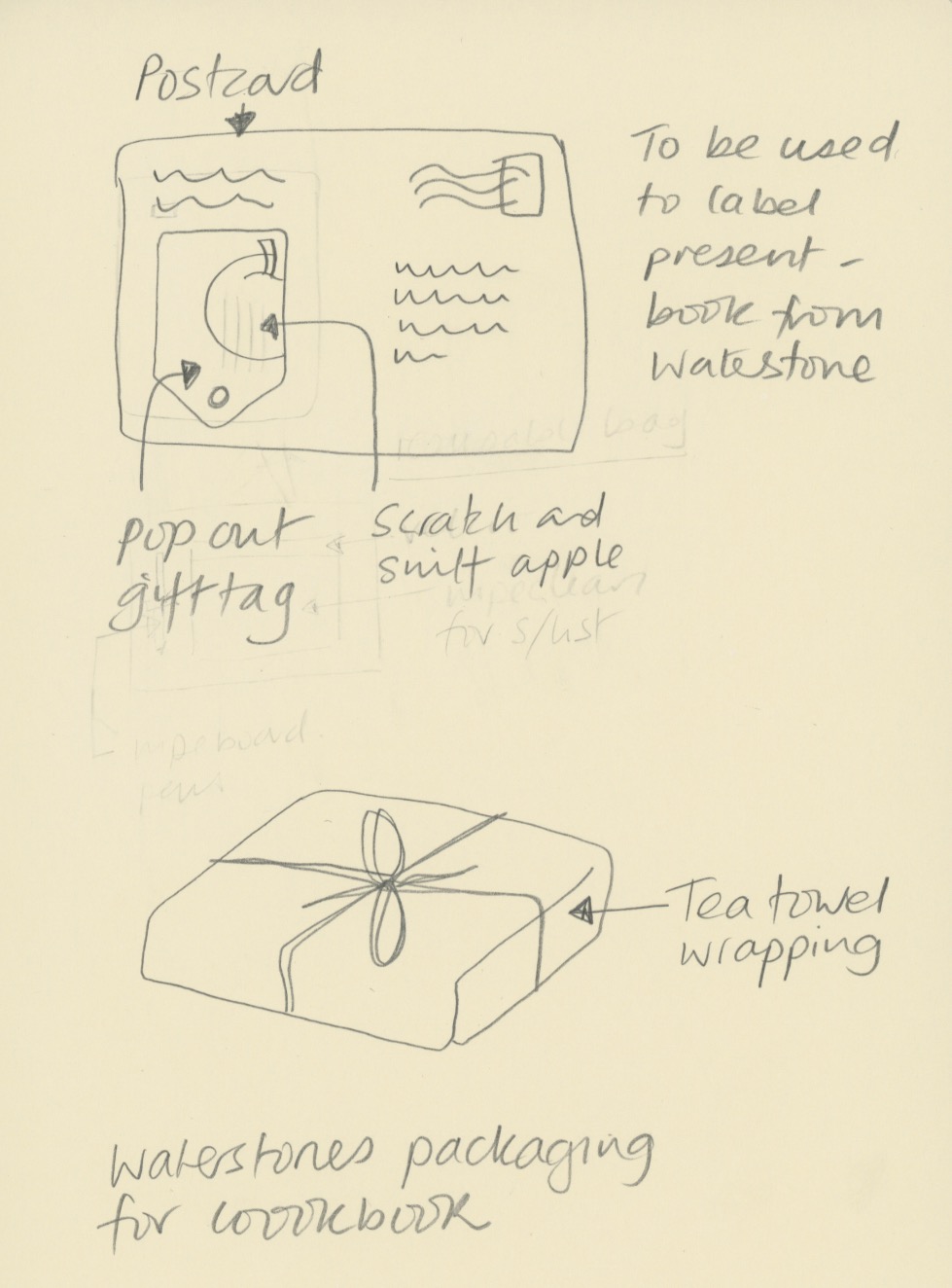
I sketched out two ideas, below. The first idea was for a mailer to prospective customers in the form of a postcard. This would include a pop out gift tag which customers could take into Waterstones to get a discount on their cookbook purchase. The tag could be attached after the parcel had been gift wrapped by Waterstones, and has a scratch and sniff panel relating to one of the recipes in the book on promotion.

The second idea was to use a promotional tea towel as gift wrap for a cook book purchase. Alternatively an apron would work too. The illustration/pattern could be related to the cook book promotions.

Mailers - inspiration

Mailers from Boden and White Stuff, self-generated photo


These two mailers were sent to me by Boden and White Stuff over the last couple of years. These companies are really inventive with their mail shots.

The first one is from Boden. A paper envelope shaped like a camera with a tab on the side invites you to pull. This reveals a double sided sheet advertising their sale, mimicking the pulling out of old style Polaroid Instamatics. This idea works well for Boden as they rely heavily on their retro styling and old school imagery.

The second piece is from White Stuff. They sent out a thick card in A5 with pop-out cocktail toppers, which suited their catalogue theme, being summer holidays. Although not amazingly practical, it is a fun idea, and very engaging.

22 October 2015

Waterstones - Concepts

Bag for life

I have further developed my plans for a bag for life as a giveaway with cookery books from Waterstones (perhaps if you buy 2). The first is a bag in the style of a wood-framed blackboard, with a velcro-detachable panel to write a shopping list on. A white wipeable chalk marker would be included with the bag, and food illustrations would surround the blackboard on different styles of background, for instance a gingham tablecloth, a wood table, hessian or a marble worktop. The write on panel would look like a menu, with areas to write meals for the week and sections for the different types of groceries.


Lunchbox bag

My second option is for a single book purchase the customer would get a insulated lunch box carrier, joined at the sides with velcro, which opens to form a wipeable picnic mat to put your lunch on at your desk or in the park.


Inspiration


I will take inspiration from the food illustrations below and will experiment with watercolours and with creating flat images in Illustrator. I like the idea of using white and black gel/paint/marker pens over the illustrations.


18 October 2015

Minimalism

Minimalism in graphic design can be defined as using the simplest design, with the least number of elements required to communicate a message. Simple tools, simple message.

We started by listing all the positive imagery that McDonalds conjures up:

Golden Arches
Ronald McDonald
McFlurry
Milkshake
Red and yellow
Happy Meal
I'm lovin' it
Etc

We then pared this list down to the items which were exclusively McDonalds, and would be instantly recognizable. Perhaps only the yellow McDonalds M, Ronald McDonald and I'm lovin' it. However when two of these elements are combinded, McDonalds would certainly be signified, for instance, combining a milkshake with a straw and the colours red and yellow. This means somethings to a very wide audience, and in the case of McDonalds, to most of the world. This is so, because the McDonalds products are entrenched in our cultural mythology. 

Sometimes, words alone can be enough. It's all about the audience.

Research


We looked at film posters and book covers created in the minimalist style. 

Memoirs of a Geisha is so successful because it relies really on just one element, the red lips.


I really like this Titanic poster for its simplicity. The placement of the liner in front of the negative space of the iceberg works very effectively. Their relatively small size on the poster infers how small humans are when nature decides to strike. Titanic in large type represents the enormity of the event.


My work


I chose to design posters for the TV series Outlander as it has some imagery in it which, when paired, would signify Outlander to those who has seen the series, or viewed trailers. 

I listed the obvious images from the series:

Tartan
The stones
Medicine
200 lashes - scarred back
Scotland
The Laird's deformed legs

I decided that combining a quote from the series, together with tartan and another graphic element would work well.

I created the tartan by making a pattern from the swatch on a tartan manufacturer's website:
http://www.kilts-n-stuff.com/outlander-products/outlander-tartans/.This is combined with a simplistic representation of the standing stones which are constantly referenced in the series.

I think this poster works well, as the words and tartan represent a Scottish origin, and the standing stones would be recognised by a fan of the series. The type was placed in short lines in large type as a reflection of the simple statement that the words represent. The sentiment is firm and non-debatable.


I don't think this poster works as well. The red was meant to represent blood on Jamie's back after being inflicted with 200 lashes. I don't think it works though. I spent some time trying to improve it, and swapped the tartan for a skin coloured background but didn't feel this worked either.


The above poster is my final design, and one which, when I sketched the thumbnails, I thought would be the least successful. However, I actually think it works the best. Anyone who has seen the series would recognise the Laird's legs, inflicted with Toulouse Lautrec syndrome. The tartan legs, cut off at the top of the page look like he is walking menacingly across a darkened room, and the writing in red communicates a sinister feel. I wrote in a small point size as the words are spoken softly, but menacingly. The black negative space is another element that makes this poster work well. It adds to the drama.

The typeface chosen for all the posters was a celtic one, which I thought trod the line between stylistic aesthetics and legibility well. The words are obviously Scottish so the tartan could be overkill, except patten has the immediacy that words do not.


Environmental typography

When typography is placed in the environment, extra layers of meaning are connotated from the space, atmosphere and tone of the situation. Doing so provides the written words with an additional narrative or story. The environment can be outside, or inside, and means placing the typography anywhere other than on paper.

Exampes of designers' work


The word Descend, below, is created from duck tape stuck onto the treads of the steps by Becky Obenhaus. The simplicity of application and materials, compared with the straight word modern sans serif typeface and the direction of the type, when placed on the stairs, combines to make the instruction superfluous, but amusing. It would also lead you to wonder what is down there?
ttp://www.thestlouisegotist.com/sites/www.thestlouisegotist.com/files/imagecache/portfolio_work_image/portfolio/Becky%20Obenhaus/IMG_4594.jpg


The work below, from Nicole Dextras, a Canadian designer, was created on the shores of Lake Ontario. The letters stand 6" high and are carved in ice. Is the word a noun, or a verb? It was created in a response to the artist's feelings about estate agents selling land "with a view". It could mean so many different things, depending on your politics and your interpretation.

http://nicoledextras.com/portfolio/social-typography/views/


My design


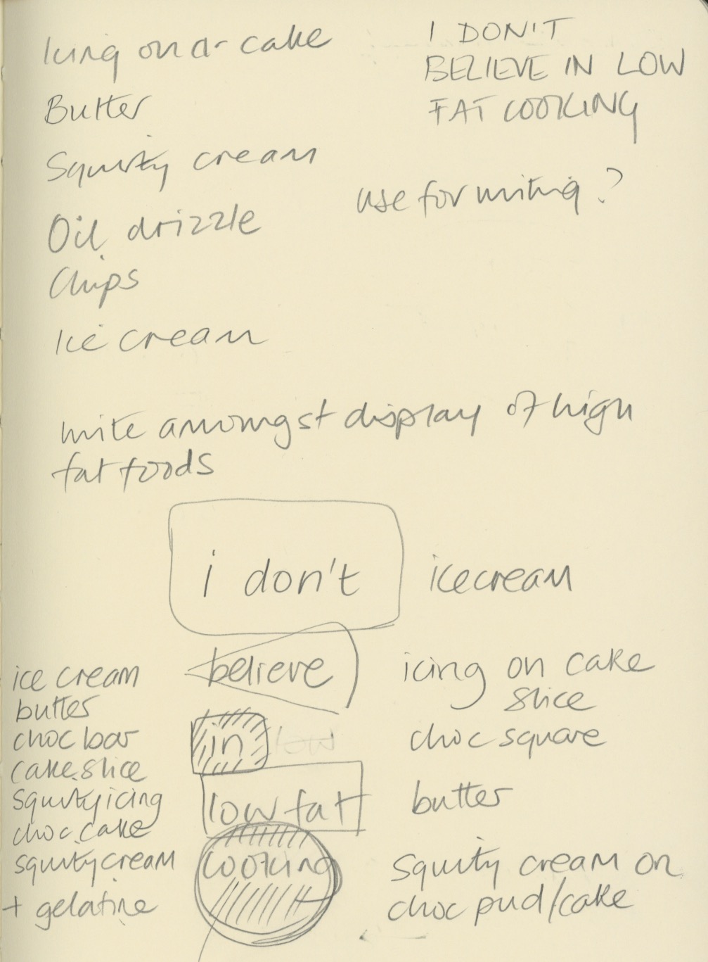
My ideas were loosely based on my cookery book theme for Waterstones. I chose a quote from Nigella Lawson - "I don't believe in low fat cooker" and sketched out some ideas of how I could produce an environmental design piece for these words.


My thoughts were to carved the letters into butter, ice-cream and chocolate, and use icing and squirty cream to write letters onto other high fat food. The idea was to underline the deliciousness of naughty foods, and support Nigella's view that a little of what you fancy does you goo.

Once I tried this idea out, I discovered that writing in ice-cream was not so simple - the ice-cream I bought was quite fluffy in texture and it was not possible to carve it legibly. I also struggled with the chocolate icing on cheesecake as the icing was too runny to write small enough. Some lettering ended up looking better directly on the worktop.


I experimented with lighting, thinking the carved letters would look most effective if lit from the side, but in fact the shadows cast elsewhere detracted too much from the design.

I shot at F8 to ensure everything was in focus when shooting from fairly close range, particularly when photography from an angle.


The image above contains words in the chocolate and butter, which I felt were not clear enough. My final image is below. Photoshop was just used to lighten up the mid tones and enhance the contrast very slightly.


My final image (above and below). I think it reflects what I was setting out to do. The crumbs and splatters of food were to represent the food being irresistible, along with the cheesecake on spoon waiting to be eaten. I replaced the words in and low fat, with icing and cream, which I think make the typography flow better. I wrote Nigella's name in a rounded type, to reflect Nigella's curvaceous figure that she is well know for, which ties in with the anti-stick-thin ethos of her recipes. The colour of the type was creamy yellow, to tie in with ice-cream and butter. I'm not sure whether the rule around the edge adds anything to it.


16 October 2015

Waterstones reserach

In order to concept, design and produce a promotional campaign to encourage people to buy books form Waterstones, I started off by deciding on my research methods.  They will include:

Visiting and photography some Waterstones stores.
Considering a primary research survey.
Researching who, when and why people buy books, and why they choose to buy them online or from bricks and mortar stores.

I decided to focus on cookery books and tie this in with a Christmas campaign. Cookery books are mostly bought by women, for themselves or as gifts, according to research I found.  I felt that people needed a reason to go into Waterstones, instead of buy from Amazon. I think mind mapped some thoughts about what prompts people to buy cookery books.


Most of the cookery books sold are those from celebrity chefs or from as a TV spin-off which can be ascertained from looking at Amazon's and Waterstones' top sellers lists.

I though about focusing my campaign on 4 recently released books, one each weekend of the main shopping weekends before Christmas. For the 4 books chosen, they are the same or only a £1 or £2 more expensive in Waterstone than on Amazon.The 4 books come from different market sectors - comfort food, healthy eating, lifestyle and simple cooking.

My ideas for tempting people into the store are:

Free gift wrapping
A giveaway associated with cooking - reusuable grocery bag (now they are chargeable), tea towel or apron
The smell of food
Money off vouchers

I thought of the advertising slogan "Cooking the books", which links food and books.

Ideas to concept

1. Scratch and sniff postcards/gift tags and wrap

Scratch and sniff technology on postcards, with pop-ut gift tags, to use along with matching gift wrapping when you buy in store. Using food stains found on well loved cookbooks (greasy fingers, curry powder, flour, fat spray, red wine glass ring, chocolate, tomatoes. The books would be wrapped in paper and tied with bakers string and the gift tag attached, to look like a parcel from a 50's grocer's store. The postcards coudl be given away in food magazines, in supermarkets, and sent out as mailshots.

2. Reusable carrier book bag

Giveaways by promoters wearing aprons and carrying reusable carrier bags. The reusable bags would be made as follows:

As this type of bag wouldn't hold very much, I thought about making a single compartment bag, which looks like a book. The bag for life could have a free recipe card or recipe printed on each for each book. Alternatively, the image could be an open book, and space to write your shopping list on the outside, with a wipeoff pen. There could be a pocket to hold the receipe card.

3. Food samples

3. Free food samples of receipes in the books, in boxes like miniature copies of the books, given away around the shopping malls containing a Waterstones store.

Recipe cards

4. Recipe cards (from the featured books) with scratch and sniff panels.


10 October 2015

Book layout

Waterstones book

We were tasked with designing 3 layouts for a double and single page spread, considering all the levels of type hierarchy that would be needed.

I used many of my design books for inspiration, with particular reference to Fifty Typefaces that Change the World (Walters 2013), and Thinking with Type by Ellen Lupton (2010). I have also looked at the styles used in my cookery books and magazines such as Kinfolk.

Below are two pages from Kinfolk Volume 12 (Ash and Verdugo 2014). I love the calmness created by their centre aligned type and font combinations. Although the typeface is very small (6-7pt?) is still still legible. The passe partout border compliments the type very well, fitting with the slow paced aesthetic of the magazine. They also use full bleed colour background for some pages of text which is very effective and helps with the pace of the magazine.


I considered the benefits of using columns or a grid. I then looked at fonts which I thought worked well together, which were different enough to create contrast, along with the sizes of the typeface. I then thought about how I would lay out a standard set of pages, and what colours to use. I decided to use grey as it goes with any colour of imagery, but I may introduce colours on some pages. I chose to use rules for some added interest.

I chose to work with a 6 column layout to give flexibility across the pages for different layouts, depending on the number of images and the length of the body copy. I experimented with layouts based on the gold section and have decided to go with a symmetrical layout, but to combine this with left and right aligned text (not centred).

Colour will be monochrome, initially, with perhaps some subtle colours added depending on the image colours.


Layout one

This is my first design. It was inspired by the layouts in Basics Design 07:Grids (Ambrose and Harris 2012), although the font choices are my own. I chose Droid Serif for the heading and subheading, Antique Olive for the large body copy, and Franklin Gothic Book for the body copy. I wanted to use 3 fonts which complimented each other, by combining a serif and sans serif. I decided 10% black border as a graphic device  and a 3 column layout for ease of reading.


Layout two

This layout looks more contemporary, and is inspired by layouts in 100 Ideas That Changed Graphic Design (Heller and Vienne 2012). The bold rule really draws the eye to the title, and allows the heading typeface to be smaller than without it. The combination of users of two different serifs for large and main body copy and and sans serif heading compliment each other well. I'm not so keen on the italic type used for the running head.


My version below, uses the Antique Olive family for all text except the running head and the picture captions, which are in Droid Serif Roman and Italic. I like this bold layout, again using 3 columns, and with the use of rules rather than the border (layout one).


Layout three

This is my preferred layout, in part because it uses only serifs. Bree, a slab serif, is used for the heading and subheading, and Droid Serif for the remaining type. Droid is an easy to read typeface, its serifs leading the eye gently across the page.


Further development

I am considering creating a square book but will apply the above template for layout three to the new format, with some slight changes. I will work out the margins based on the golden section. Some images will be full bleed and others with a passe partout. The reason for choosing a larger book is to be able to use plenty of white space and give the images (particularly the featured images) room to breathe.

References
AMBROSE, G and HARRIS, P (2012) Basics Design 07: Grids. 2nd ed Lausanne, AVA Publishing SA
ASH, R (2014) The Case for Crying. Kinfolk Volume 12 p123
HELLER and VIENNE (2012) 100 Ideas that Changed Graphic Design. London, Laurence King Publishing Ltd
LUPTON, E (2010) Thinking with Type. 2nd ed New York, Princetown Architectural Press
VERDUGO, A (2014) The Case for Crying. Kinfolk Volume 12 p122
WALTERS, J L (2013) Fifty Typeaces that Change the World. London, Conran Octopus Ltd

2 October 2015

Using pictograms/calligrams

Change for Life

We were asked to re-work a poster from the Change for Life campaign, using their logo and with either a pictograms or calligrams. The body copy needs to be the same, but the colours and typeface can be changed.

I chose to create a poster to replace this one:

Change for Life - Don't let drink sneak up on you poster


My poster is below. I am not happy with the layout, but I like the pictograms. I think it would be improved by using the correct display font, which I could not find. I needed more time to work on it!