Showing posts with label idea generation. Show all posts

20 November 2015

Downton Abbey infographic

Informal infographic

Initially my idea was to focus on the scandals of Downtown throughout the series. However, there were just too many to include, so then I focused on just those concerning the family who lived above stairs. Even those were too numerous! I eventually chose to focus on the loves of the three Downtown daughters, Lady Mary, Lady Edith and Lady Sybil.

I wanted to make it interesting to people who hadn't followed the whole series, or to those like myself that had watched every episode but forgotten lots of the detail.

The infographic is sized for iPhone 5 and above, at 640px wide, as this kind of trivia is most often viewed on mobile devices while passing the time.

I researched colours used in the 1920s in interiors, and found the following image, along with the typefaces and glyphs (Nouvelle Vague Black,  Diehl Deco, Gill Sans and Nouveau Rocco Deco - glyphs).


The colours and imagery will reflect the era (from 1912-1925), embracing the Art Nouveau, but also the stately home feeling, but also incorporating a lot of typography and modern language. I used photographs as a useful reminder of the characters over the last 6 years.

All my information came from here: http://downtonabbey.wikia.com/wiki/Downton_Abbey_%28programme%29

My finished infographic:


11 November 2015

Waterstones campaign

I decided to discard my ideas for a bag for life as I wasn't happy with how they were developing. I have revisited my concepts for a scratch and sniff gift tag, which I have developed further and will be continuing with for this assignment.


6 November 2015

Infographics styles

We were asked to consider how we would format 4 styles of infographic.
1 What to do when you wreck your car
2 The science of sleep
3 The internet of things
4 Sourcing sustainable fish

For each infographic, you need to consider the audience, the format, the purpose, any existing house style, tone of voice, colours, grid, image style, hierarchy, typography and colours. My artboards, below, were created in Illustrator and show colour swatches, typefaces for 3 levels of hierarchy, and the style of imagery to be used in a mini style guide format.


23 October 2015

Packaging - the delivery medium

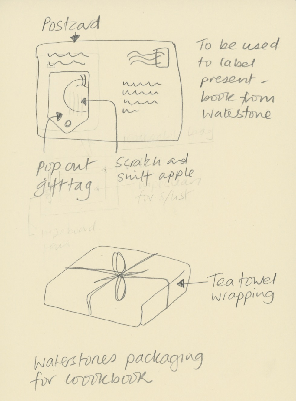
Postcard mailer and tea towel wrapping

We were asked to consider the different mediums that can be used to deliver a product - bags, envelopes, boxes etc.

Bags are the method shops employ as free advertising when you buy from a store. It's a signpost to other shoppers that their store is in the vicinity. You are the walking advertisement.

Packaging also has negative connotations - it creates litter, it goes into landfill - non-biodegradable packaging in particular.

We were asked to create 2 concepts for envelopes, incorportaing an element from our assignment on a Waterstones envelope.

I sketched out two ideas, below. The first idea was for a mailer to prospective customers in the form of a postcard. This would include a pop out gift tag which customers could take into Waterstones to get a discount on their cookbook purchase. The tag could be attached after the parcel had been gift wrapped by Waterstones, and has a scratch and sniff panel relating to one of the recipes in the book on promotion.

The second idea was to use a promotional tea towel as gift wrap for a cook book purchase. Alternatively an apron would work too. The illustration/pattern could be related to the cook book promotions.

22 October 2015

Waterstones - Concepts

Bag for life

I have further developed my plans for a bag for life as a giveaway with cookery books from Waterstones (perhaps if you buy 2). The first is a bag in the style of a wood-framed blackboard, with a velcro-detachable panel to write a shopping list on. A white wipeable chalk marker would be included with the bag, and food illustrations would surround the blackboard on different styles of background, for instance a gingham tablecloth, a wood table, hessian or a marble worktop. The write on panel would look like a menu, with areas to write meals for the week and sections for the different types of groceries.


Lunchbox bag

My second option is for a single book purchase the customer would get a insulated lunch box carrier, joined at the sides with velcro, which opens to form a wipeable picnic mat to put your lunch on at your desk or in the park.


Inspiration


I will take inspiration from the food illustrations below and will experiment with watercolours and with creating flat images in Illustrator. I like the idea of using white and black gel/paint/marker pens over the illustrations.


18 October 2015

Environmental typography

When typography is placed in the environment, extra layers of meaning are connotated from the space, atmosphere and tone of the situation. Doing so provides the written words with an additional narrative or story. The environment can be outside, or inside, and means placing the typography anywhere other than on paper.

Exampes of designers' work


The word Descend, below, is created from duck tape stuck onto the treads of the steps by Becky Obenhaus. The simplicity of application and materials, compared with the straight word modern sans serif typeface and the direction of the type, when placed on the stairs, combines to make the instruction superfluous, but amusing. It would also lead you to wonder what is down there?
ttp://www.thestlouisegotist.com/sites/www.thestlouisegotist.com/files/imagecache/portfolio_work_image/portfolio/Becky%20Obenhaus/IMG_4594.jpg


The work below, from Nicole Dextras, a Canadian designer, was created on the shores of Lake Ontario. The letters stand 6" high and are carved in ice. Is the word a noun, or a verb? It was created in a response to the artist's feelings about estate agents selling land "with a view". It could mean so many different things, depending on your politics and your interpretation.

http://nicoledextras.com/portfolio/social-typography/views/


My design


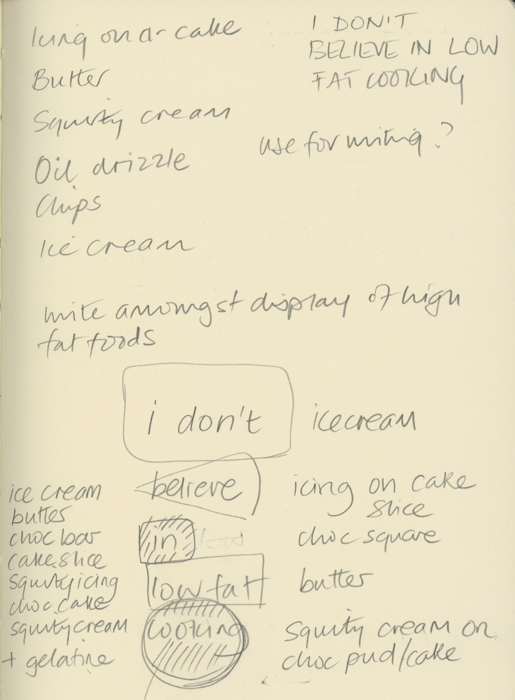
My ideas were loosely based on my cookery book theme for Waterstones. I chose a quote from Nigella Lawson - "I don't believe in low fat cooker" and sketched out some ideas of how I could produce an environmental design piece for these words.


My thoughts were to carved the letters into butter, ice-cream and chocolate, and use icing and squirty cream to write letters onto other high fat food. The idea was to underline the deliciousness of naughty foods, and support Nigella's view that a little of what you fancy does you goo.

Once I tried this idea out, I discovered that writing in ice-cream was not so simple - the ice-cream I bought was quite fluffy in texture and it was not possible to carve it legibly. I also struggled with the chocolate icing on cheesecake as the icing was too runny to write small enough. Some lettering ended up looking better directly on the worktop.


I experimented with lighting, thinking the carved letters would look most effective if lit from the side, but in fact the shadows cast elsewhere detracted too much from the design.

I shot at F8 to ensure everything was in focus when shooting from fairly close range, particularly when photography from an angle.


The image above contains words in the chocolate and butter, which I felt were not clear enough. My final image is below. Photoshop was just used to lighten up the mid tones and enhance the contrast very slightly.


My final image (above and below). I think it reflects what I was setting out to do. The crumbs and splatters of food were to represent the food being irresistible, along with the cheesecake on spoon waiting to be eaten. I replaced the words in and low fat, with icing and cream, which I think make the typography flow better. I wrote Nigella's name in a rounded type, to reflect Nigella's curvaceous figure that she is well know for, which ties in with the anti-stick-thin ethos of her recipes. The colour of the type was creamy yellow, to tie in with ice-cream and butter. I'm not sure whether the rule around the edge adds anything to it.


16 October 2015

Waterstones reserach

In order to concept, design and produce a promotional campaign to encourage people to buy books form Waterstones, I started off by deciding on my research methods.  They will include:

Visiting and photography some Waterstones stores.
Considering a primary research survey.
Researching who, when and why people buy books, and why they choose to buy them online or from bricks and mortar stores.

I decided to focus on cookery books and tie this in with a Christmas campaign. Cookery books are mostly bought by women, for themselves or as gifts, according to research I found.  I felt that people needed a reason to go into Waterstones, instead of buy from Amazon. I think mind mapped some thoughts about what prompts people to buy cookery books.


Most of the cookery books sold are those from celebrity chefs or from as a TV spin-off which can be ascertained from looking at Amazon's and Waterstones' top sellers lists.

I though about focusing my campaign on 4 recently released books, one each weekend of the main shopping weekends before Christmas. For the 4 books chosen, they are the same or only a £1 or £2 more expensive in Waterstone than on Amazon.The 4 books come from different market sectors - comfort food, healthy eating, lifestyle and simple cooking.

My ideas for tempting people into the store are:

Free gift wrapping
A giveaway associated with cooking - reusuable grocery bag (now they are chargeable), tea towel or apron
The smell of food
Money off vouchers

I thought of the advertising slogan "Cooking the books", which links food and books.

Ideas to concept

1. Scratch and sniff postcards/gift tags and wrap

Scratch and sniff technology on postcards, with pop-ut gift tags, to use along with matching gift wrapping when you buy in store. Using food stains found on well loved cookbooks (greasy fingers, curry powder, flour, fat spray, red wine glass ring, chocolate, tomatoes. The books would be wrapped in paper and tied with bakers string and the gift tag attached, to look like a parcel from a 50's grocer's store. The postcards coudl be given away in food magazines, in supermarkets, and sent out as mailshots.

2. Reusable carrier book bag

Giveaways by promoters wearing aprons and carrying reusable carrier bags. The reusable bags would be made as follows:

As this type of bag wouldn't hold very much, I thought about making a single compartment bag, which looks like a book. The bag for life could have a free recipe card or recipe printed on each for each book. Alternatively, the image could be an open book, and space to write your shopping list on the outside, with a wipeoff pen. There could be a pocket to hold the receipe card.

3. Food samples

3. Free food samples of receipes in the books, in boxes like miniature copies of the books, given away around the shopping malls containing a Waterstones store.

Recipe cards

4. Recipe cards (from the featured books) with scratch and sniff panels.


3 October 2015

Logo design

At the start of the branding and promotion module we were tasked with re-desiging a logo for a high street clothing store of our choice, preferably one in need of the job.

We picked Store Twenty One. Our research told us that the company had approximately 200 stores in the UK. They appeared to stock mostly women's clothing (but some men's and homewares), with no particular fashion appeal. Prices were at the lower end, but not as cheap as Primark. The stores appeared to be in less prestigious areas of towns, and were fairly small. We hypothesised that the customers consisted mostly of 40+ women, not interested in fashion, wanting cheap clothing, at convenient shops (not wanting to travel to larger towns or cities were Primark would be). We guessed that competition would be Primark, Peacocks, George at Asda.

The stores had totally uninspiring signage (akin to newsagents), and not much in the way of display posters inside. It looked like they had recently tried to re-design their logo (the three line logo).


Store Twenty One had originally started as an M&S clothing manufacturer 90 years ago, with a long heritage. We thought this might be something to capitalise on.

The key feelings we wanted to communicate were:

Value, trust, convenience, accessible, British

I drew some ideas as thumbnails


The following are my initial ideas. The top four I rejected, and the bottom two rows show my two preferred logos. I will develop these further by adding colour. I think the bottom one may be too feminine. The type was chosen to look more feminine and welcoming, with more traditional styles harking back to their heritage. I wanted to update their image by experimenting with vertical text.


The logos above are my final ideas.

The top row look distinctly more modern than their current one. The first logo lacks character, but the other three look feminine perhaps too much so, bearing in mind the store's customer base.

The bottom row conveys more of the feeling of history I wanted to associate with the brand, whilst the main typefaces on the final one (bottom right) look solid but friendly. Using 3 typefaces adds more interest. The type was centered to give a traditional feel. Reference to their year of founding was made to highlight their reliability and inferred good standards of workmanship. My reservation is that the layout is rather popular at the moment so may look dated soon. In addition, the bottm scripe font is not that legible.

The final iterations are below, in colour. The colours were chosen to appeal to the client base.


26 September 2015

Stencils

Stencils in advertising

I really like this method of advertising - the stencil is applied to the pavement with a chalk spray which can be completely removed. The simply typography works well for a stencilled design on a rough surface like paving. Anything complicated would be lost, unless it were huge, which would be impractical.


Waitrose Fairtrade Tea

We were tasked with creating a stencil for a poster to promote a fair-trade tea brand of our choice. Below is one of Waitrose's adverts (http://www.waitrose.com/shop/ProductView-10317-10001-145696-Waitrose+fairtrade+green+tea+bags). I also wanted to try another style so I selected Clipper who also make fairtrade tea products. I looked at their websites and chose a slogan which fitted in with their advertising.


I mind-mapped a few word associations with tea, and sketched some thumbnails, below.


I decided I wanted to incorporate the texture of the tea bag, and couldn't find a suitable photo online, so I scanned a tea bag and used that image.  For my other poster, I chose to use a tea stained background. For both posters, I cut my stencils from stencil film and experimented with sponging tea coloured ink, and white opaque ink. 


I produced 4 posters in Indesign, which I stencilled over, producing the 4 designs below. I think the tea coloured stencils work best, and I prefer the single tones of the Clipper poster, bottom left, as it looks warm and comforting, just like tea. The Waitrose poster works well without the stencil.


24 September 2015

Use of shadows

The Secret Garden book cover


We were asked to design a book cover using a shadow as the primary feature of the design. I chose to illustrate the cover of the book "The Secret Garden" by Francis Hodgson Burnett. The book is about a lonely child, Mary, who finds solace in a secret garden she discovers in the home of her extended family where she is sent to live when her parents die in the early 1900's.

I looked on Amazon at different book covers for the book, and at different ways of using shadows.

I also investigated artists who use shadows, and remembered seeing a BBC documentary about Tim Noble and Sue Webster who create sculpture installations from found items which look like nothing until light is directed at them from a certain angle, and the shadow created can be seen (see below). It works because the resulting shadow is so surprising, and it is fascinating to think about how it is actually produced. It also makes a statement about waste and what we throw away in Western society, and how what one person sees as rubbish can be reused.

Youngman (http://www.timnobleandsuewebster.com/youngman_2012.html)


My idea was to use shadows in a positive way to symbolise light, warmth, and a new day. I wanted to use a keyhole surrounded by darkness, and when you peer through it you can see a sunny yellow garden and a long shadow cast from the swing in the garden. Swings also represent childhood and joy. My initial ideas are shown as thumbnails below.


I then looked on Google at different ways of drawing a swing - rope swings and frame ones, tyres and wooden seats. I wanted the design to look quite graphic with lots of contrast.

I was particulary inspired by this image (http://www.katespapercreations.com/2014/01/3d-shadow-box.html):


My idea was to update the cover to appeal to a more modern audience, but still retain the Edwardian feel of the novel, so I chose a cursive script to relate back to those times when children were taught to form letters in a standard way and everyone's writing look the same. I found lots of examples on dafont.com which were suitable http://www.dafont.com/theme.php?cat=602&page=3&text=The+Secret+Garden.

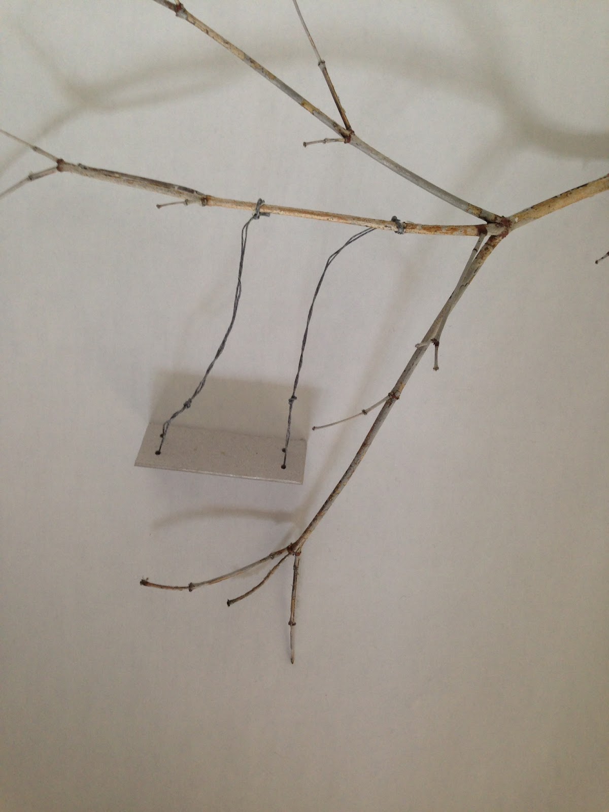
Initially I thought I would use Illustrator to draw the keyhole shape and add the photo of the swing and shadow in the hole, but decided to try to photograph the keyhole and swing together. I created a rough mock up of the keyhole shape cut from card (in 2 sizes) and the swing (card, waxed string, twig from the garden), to ascertain that the sizes were roughtly correct, and took some test shots. As these sizes worked, I then cut the keyhole from black card and experiemented with the positing of the light to cast an effective shadow. I tried to get the shadow to appear non-threatening and cheerful and evoke a feeling of warmth and sunlight.

My "studio" setup:


The swing and branch:


Some of my final shots before processing in photoshop:


I used a wide aperture (F2) to get the keyhole blurred but the swing in focus. The lamp was adjusted to make the shadow appear soft and less threatening.

Yellow was chosen for the only colour, because of it's connotation with sunlight, happiness, warmth and protection - the feelings that Mary has when in the Secret Garden.

I created several versions of the cover:

My favourite are the bottom two. However, I do quite like the top right design as it looks quite Penguin-esque. On the bottom left, I like the black and white with the bright yellow and the handwritten script. The typeface brings a more modern and friendly feel to the novel, and the yellow keeps the image from looking sinister. The bottom right cover has a photo of old script overlaid (suggested by Gemma!), and works well to bring another layer of interest and makes the image look more sunny. It contrasts well with the sans serif font, but the style of text could make the subject matter seem, incorrectly, for an older audience.

I made one final book cover which I think is the best because the typeface is friendly, but hints at a time when handwriting was more calligraphic, the yellow is sunny but not too orange, and the placement of the title is informal.  The author's name at the bottom is in Times New Roman which is easy reading for its target audience, but contrasts well with the title typeface. The white type looks interesting against the black and yellow. I think this is the best (of my covers) of a design which juxtaposes a shadowy photograph with a friendly feminine typeface, preventing the design from appearing ghostly.


23 September 2015

Paper challenge

With 30 minutes, we were tasked with creating a 3D form from a flat sheet of paper. I decided to cut out a sheep silhouette and represent the fleece being spun into fibre to create a hank of yarn:


18 May 2015

Start Me Up

I bought a fabulous book on branding which has just been published called Start Me Up. It's 256 pages of branding porn for the graphic designer, and the paper smells all inky too. Lots of useful into for my studies.


15 May 2015

Logo design

Below is the logo I developed for The Children's Homes Registered Manager's Forum - an organisation of children's home manager's from across the south of England which meet to share best practice.  The logo needed to relfect the name of the organisation, and include a reference to "home", without looking too much like a loft conversion company! I presented 4 options, and further developed their preferred logo to completion, below:

Final logo


The development ideas were:


My intial ideas are below:

30 March 2015

Digital collage

We experimented with a digital collage effect in class. I adapted the concept to my London imagery for Gordon's Gin.

The placement of the typography symbolises smoke coming from the chimneys of Battersea Power Station. I will develop this concept further to see if I can create a useable packaging label for Gordon's.

This concept could be developed for their other gin based products by using different shapes representing different London buildings, and different colour palettes.

The image was produced in Photoshop with various shapes (set to pixel, overlay), overlapping each other. The magic wand was used to select shapes, a layer of texture was selected, then select, inverse, delete. This filled each shape with the texture. A layer of handwritten text was added over the whole image and then I placed a stormy sky underneath everything. Each of the layers were adjusted for colour, opacity, levels, etc.


This works better as the text has room to breathe, and is not fighting with the imagery underneath. The typeface is Gill Sans, but has been stretched. I need to look at something more geometric that reflects the Art Deco architecture of the Oxo Tower and Battersea Power Station. The sky contrasts better with the buildings as it has been desaturated.