Showing posts with label fonts. Show all posts

6 November 2015

Infographics styles

We were asked to consider how we would format 4 styles of infographic.
1 What to do when you wreck your car
2 The science of sleep
3 The internet of things
4 Sourcing sustainable fish

For each infographic, you need to consider the audience, the format, the purpose, any existing house style, tone of voice, colours, grid, image style, hierarchy, typography and colours. My artboards, below, were created in Illustrator and show colour swatches, typefaces for 3 levels of hierarchy, and the style of imagery to be used in a mini style guide format.


18 October 2015

Environmental typography

When typography is placed in the environment, extra layers of meaning are connotated from the space, atmosphere and tone of the situation. Doing so provides the written words with an additional narrative or story. The environment can be outside, or inside, and means placing the typography anywhere other than on paper.

Exampes of designers' work


The word Descend, below, is created from duck tape stuck onto the treads of the steps by Becky Obenhaus. The simplicity of application and materials, compared with the straight word modern sans serif typeface and the direction of the type, when placed on the stairs, combines to make the instruction superfluous, but amusing. It would also lead you to wonder what is down there?
ttp://www.thestlouisegotist.com/sites/www.thestlouisegotist.com/files/imagecache/portfolio_work_image/portfolio/Becky%20Obenhaus/IMG_4594.jpg


The work below, from Nicole Dextras, a Canadian designer, was created on the shores of Lake Ontario. The letters stand 6" high and are carved in ice. Is the word a noun, or a verb? It was created in a response to the artist's feelings about estate agents selling land "with a view". It could mean so many different things, depending on your politics and your interpretation.

http://nicoledextras.com/portfolio/social-typography/views/


My design


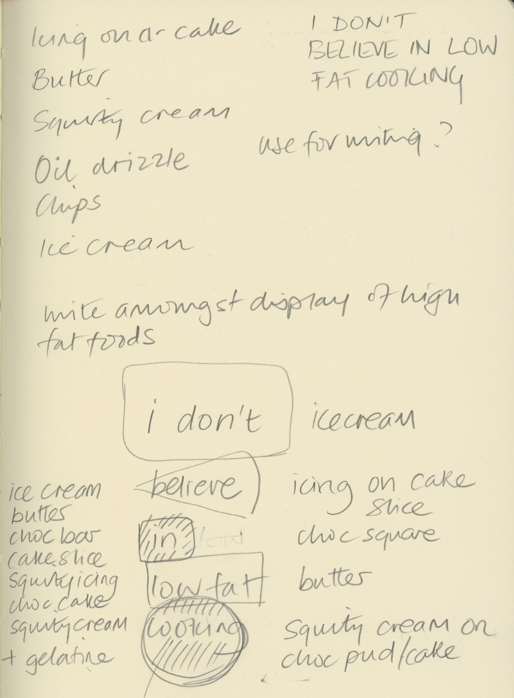
My ideas were loosely based on my cookery book theme for Waterstones. I chose a quote from Nigella Lawson - "I don't believe in low fat cooker" and sketched out some ideas of how I could produce an environmental design piece for these words.


My thoughts were to carved the letters into butter, ice-cream and chocolate, and use icing and squirty cream to write letters onto other high fat food. The idea was to underline the deliciousness of naughty foods, and support Nigella's view that a little of what you fancy does you goo.

Once I tried this idea out, I discovered that writing in ice-cream was not so simple - the ice-cream I bought was quite fluffy in texture and it was not possible to carve it legibly. I also struggled with the chocolate icing on cheesecake as the icing was too runny to write small enough. Some lettering ended up looking better directly on the worktop.


I experimented with lighting, thinking the carved letters would look most effective if lit from the side, but in fact the shadows cast elsewhere detracted too much from the design.

I shot at F8 to ensure everything was in focus when shooting from fairly close range, particularly when photography from an angle.


The image above contains words in the chocolate and butter, which I felt were not clear enough. My final image is below. Photoshop was just used to lighten up the mid tones and enhance the contrast very slightly.


My final image (above and below). I think it reflects what I was setting out to do. The crumbs and splatters of food were to represent the food being irresistible, along with the cheesecake on spoon waiting to be eaten. I replaced the words in and low fat, with icing and cream, which I think make the typography flow better. I wrote Nigella's name in a rounded type, to reflect Nigella's curvaceous figure that she is well know for, which ties in with the anti-stick-thin ethos of her recipes. The colour of the type was creamy yellow, to tie in with ice-cream and butter. I'm not sure whether the rule around the edge adds anything to it.


10 October 2015

Book layout

Waterstones book

We were tasked with designing 3 layouts for a double and single page spread, considering all the levels of type hierarchy that would be needed.

I used many of my design books for inspiration, with particular reference to Fifty Typefaces that Change the World (Walters 2013), and Thinking with Type by Ellen Lupton (2010). I have also looked at the styles used in my cookery books and magazines such as Kinfolk.

Below are two pages from Kinfolk Volume 12 (Ash and Verdugo 2014). I love the calmness created by their centre aligned type and font combinations. Although the typeface is very small (6-7pt?) is still still legible. The passe partout border compliments the type very well, fitting with the slow paced aesthetic of the magazine. They also use full bleed colour background for some pages of text which is very effective and helps with the pace of the magazine.


I considered the benefits of using columns or a grid. I then looked at fonts which I thought worked well together, which were different enough to create contrast, along with the sizes of the typeface. I then thought about how I would lay out a standard set of pages, and what colours to use. I decided to use grey as it goes with any colour of imagery, but I may introduce colours on some pages. I chose to use rules for some added interest.

I chose to work with a 6 column layout to give flexibility across the pages for different layouts, depending on the number of images and the length of the body copy. I experimented with layouts based on the gold section and have decided to go with a symmetrical layout, but to combine this with left and right aligned text (not centred).

Colour will be monochrome, initially, with perhaps some subtle colours added depending on the image colours.


Layout one

This is my first design. It was inspired by the layouts in Basics Design 07:Grids (Ambrose and Harris 2012), although the font choices are my own. I chose Droid Serif for the heading and subheading, Antique Olive for the large body copy, and Franklin Gothic Book for the body copy. I wanted to use 3 fonts which complimented each other, by combining a serif and sans serif. I decided 10% black border as a graphic device  and a 3 column layout for ease of reading.


Layout two

This layout looks more contemporary, and is inspired by layouts in 100 Ideas That Changed Graphic Design (Heller and Vienne 2012). The bold rule really draws the eye to the title, and allows the heading typeface to be smaller than without it. The combination of users of two different serifs for large and main body copy and and sans serif heading compliment each other well. I'm not so keen on the italic type used for the running head.


My version below, uses the Antique Olive family for all text except the running head and the picture captions, which are in Droid Serif Roman and Italic. I like this bold layout, again using 3 columns, and with the use of rules rather than the border (layout one).


Layout three

This is my preferred layout, in part because it uses only serifs. Bree, a slab serif, is used for the heading and subheading, and Droid Serif for the remaining type. Droid is an easy to read typeface, its serifs leading the eye gently across the page.


Further development

I am considering creating a square book but will apply the above template for layout three to the new format, with some slight changes. I will work out the margins based on the golden section. Some images will be full bleed and others with a passe partout. The reason for choosing a larger book is to be able to use plenty of white space and give the images (particularly the featured images) room to breathe.

References
AMBROSE, G and HARRIS, P (2012) Basics Design 07: Grids. 2nd ed Lausanne, AVA Publishing SA
ASH, R (2014) The Case for Crying. Kinfolk Volume 12 p123
HELLER and VIENNE (2012) 100 Ideas that Changed Graphic Design. London, Laurence King Publishing Ltd
LUPTON, E (2010) Thinking with Type. 2nd ed New York, Princetown Architectural Press
VERDUGO, A (2014) The Case for Crying. Kinfolk Volume 12 p122
WALTERS, J L (2013) Fifty Typeaces that Change the World. London, Conran Octopus Ltd

3 October 2015

Logo design

At the start of the branding and promotion module we were tasked with re-desiging a logo for a high street clothing store of our choice, preferably one in need of the job.

We picked Store Twenty One. Our research told us that the company had approximately 200 stores in the UK. They appeared to stock mostly women's clothing (but some men's and homewares), with no particular fashion appeal. Prices were at the lower end, but not as cheap as Primark. The stores appeared to be in less prestigious areas of towns, and were fairly small. We hypothesised that the customers consisted mostly of 40+ women, not interested in fashion, wanting cheap clothing, at convenient shops (not wanting to travel to larger towns or cities were Primark would be). We guessed that competition would be Primark, Peacocks, George at Asda.

The stores had totally uninspiring signage (akin to newsagents), and not much in the way of display posters inside. It looked like they had recently tried to re-design their logo (the three line logo).


Store Twenty One had originally started as an M&S clothing manufacturer 90 years ago, with a long heritage. We thought this might be something to capitalise on.

The key feelings we wanted to communicate were:

Value, trust, convenience, accessible, British

I drew some ideas as thumbnails


The following are my initial ideas. The top four I rejected, and the bottom two rows show my two preferred logos. I will develop these further by adding colour. I think the bottom one may be too feminine. The type was chosen to look more feminine and welcoming, with more traditional styles harking back to their heritage. I wanted to update their image by experimenting with vertical text.


The logos above are my final ideas.

The top row look distinctly more modern than their current one. The first logo lacks character, but the other three look feminine perhaps too much so, bearing in mind the store's customer base.

The bottom row conveys more of the feeling of history I wanted to associate with the brand, whilst the main typefaces on the final one (bottom right) look solid but friendly. Using 3 typefaces adds more interest. The type was centered to give a traditional feel. Reference to their year of founding was made to highlight their reliability and inferred good standards of workmanship. My reservation is that the layout is rather popular at the moment so may look dated soon. In addition, the bottm scripe font is not that legible.

The final iterations are below, in colour. The colours were chosen to appeal to the client base.


2 February 2015

Stefan Sagmeister

In class today we experimented with drawing on physical items (fruit), and then drawing typography over the top of photos, which are two forms of design that Stefan Sagmeister is renowned for, along with his business partner, Jessica Walsh.  Sagmeister famously got his intern to carve hand drawn type with a scalpel into his torso.  Sagmeister started this trend when he became bored with choosing standard fonts from a font source book in his early career and wanted to do something radical instead.

When drawing on a physical object, or on a photo, it is possible to see shade and tone, shadows, imperfections and depth that would be very hard to achieve using a purely digital format.

My apple with the quote: The life of a graphic designer is a life of fight.


I should have started the typography higher up, and not drawn so far around on the bottom line.

In the magazine cover featuring Colin Firth and the magazine cover I designed for Manhattan, the idea was to use the shape of his shirt to represent Manhattan island, and his labels are the Hudson River and the East River. The text was drawn in black over the image projected through a lightbox. I scanned the text into Photoshop and created two layers, one with the text in black, and another inverted to white. The white text was set to screen, and the black text to multiply. I then erased the unwanted text from each layer to combine the black and white type. The title would have looked better in a bolder typeface.


This work above, found on a Google search, is another example of how images can be created or enhanced with typography. There is a proliferation of this type of work on the internet now, with the design above being a particularly good example of how this style can work effectively. Unfortunately the artist is not credited on the original website.

9 January 2015

Poster 5

Post-modernism - David Carson inspired design

After this week's tutorial, I decided to experiment with the designs we had studied, to see if I could design a poster to replace my fourth one which I was not happy with. My chosen quote is "don't mistake legibility for communication".

Inspiration for my work is my poster for Skate Somerset House, from the tutorial, which given the time constraints, I thought was quite successful:


Other illustrations of the quote found on Google images:


I really like the way he uses type as a textured background in Ray Gun:


The red and black of this poster are really stiking, combined with the hand drawn typography, and the multiple layers:


I considered how you could illustrate the quote, and decided that a handprint would work well as it relates to STOP, along with a no entry sign.

I wanted to include some of my hand drawn type, below.

6 January 2015

Breaking the grid

Composition, not grid based graphic design

David Carson's style influenced my poster design for Skate at Somerset House. In Photoshop I cropped the image, desaturated it and added a large amount of noise. I imported the image into InDesign and created a panel of type with negative line spacing to add texture across the centre of the image. I then arranged the fonts across the image. Skate at Somerset House was set in a very graphic style of typeface. My design does not have that same chaotic rawness that is key to Carson's style.


1 January 2015

Hand drawn typography

I have been experimenting with brush lettering for one of my posters. The best brush pen, out of the dozen or so I have bought, is the Pentel Brush Pen.


23 December 2014

Type and layout assignment 3 - hand drawn type

Hand drawn typography inspiration

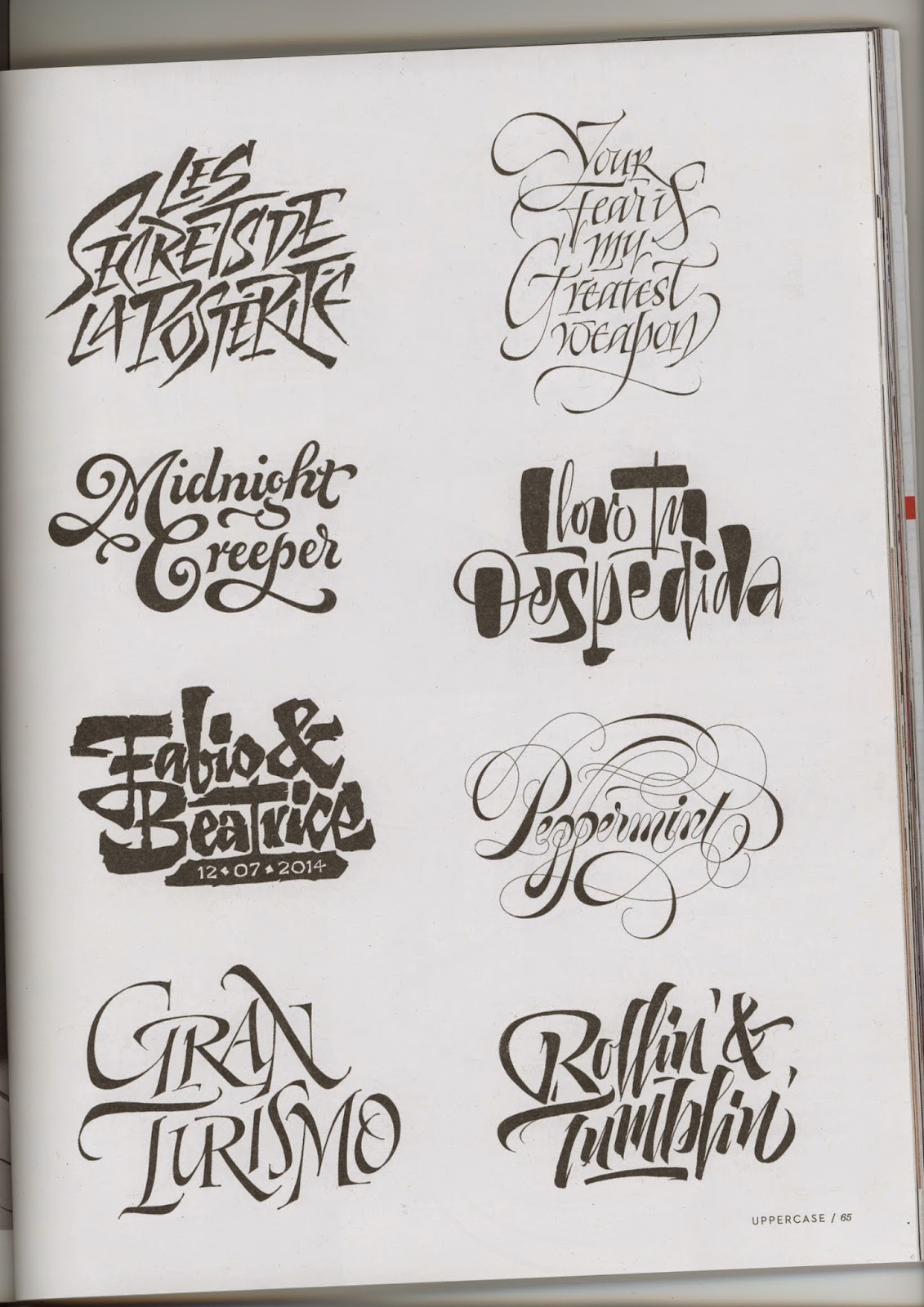
I really love the look of hand drawn typography, and calligraphy.  I'm not so keen on the very perfect styles, which take years to master, but the more informal characterful type, as show below.


http://typophile.com/node/88004


https://dribbble.com/shots/1422318-Begemot-Calligraphy-Logo

I love the huge contrast between the thick and thin strokes in the two pieces above, and will try out various techniques to achieve something similar. I will use a ruling pen and a Pilot Parallel pen.


http://www.flickr.com/photos/luca-beanone-barcellona/5859864506/in/set-72157627020568080/

To try out the technique above I need to use a straight edge calligraphy pen. I like the use of two colours and the informal style and combination of fonts.


http://www.pinterest.com/pin/18155204717369050/

I really like the splatters and uneven letter forms above, either created, I imagine, with a ruling pen or a handmade cola pen on rough watercolour paper.


The above piece is by Seb Lester from the cover of the latest Uppercase magazine.  It is created in the Copperplate style with an oblique pen holder and nib. I really like the rhythm and the smooth curling letter forms of this work. I intend to try this technique as well, although I suspect it will take a huge amount of practice.

These below are from Uppercase issue 23, by Pietro Piscitello.  I like the second down on the right - the contrast of thick/thin strokes make a really eye catching font with lots of character.


25 November 2014

Typesetting


Menus


We spent the lesson learning about typesetting and working from a type spec to lay out a restaurant menu.  Then we designed our own type spec for the same Italian Restaurant.  The format for each item was saved as a character style which stays with the document. All typos in the spec have to be resolved to ensure the styling is consistent.


Type spec for Gino’s Italian

Key:

Title: BodoniXT regular 72pt Pantone P1-3U
Byline: La Compagnie des Ombres regular 24pt black
Subheading: Champagne and Limousine regular 36pt Pantone P44-6U
Captions: BodoniXT regular 18pt black
Body Text: Champage and Limousine regular 12pt Pantone P34-5U
References: BodoniXT regular 8pt black

Colours as above


Copy:

Title: Gino’s Italian

Subtitle: Main Menu:

Subheading: Starters:

Subheading: Aperitivi

Byline: A glass of bubbles to start…

Captions: Prosecco Brut Glass 5.00

Captions: APEROL SPRITZ Glass 5.95
Bodytext: Aperol, Prosecco and soda plus ice.

Subheading: Breads & Nibbles

Captions: Italian Olives (V) NG LC 2.95
Bodytext: Large green Nocellara olives from Sicily.

etc

5 November 2014

Destroyed typography

Digital destruction

I started off with the alphabet in Century Gothic.  I then scribbled over the letters with a fine black pencil, a thicker black brush, and a white brush.  I then added dots of black and white.


25 October 2014

Week 5

Magazine layouts

Ebola DPS


I chose to play on the fear factor of the Ebola virus by choosing photos where healthcare workers look particularly alien-like. I converted the photos to black and white and cropped them to cut out the background to look more imposing. The word Ebola was spelled out in a scientific style typeface to reflect the medical issue and I made it oversized to be the dominant feature. I used a grid but then rotated it to the diagonal to give it a more dynamic appearance. Making Ebola the first word of each body copy text block, and making the E a drop cap, further emphasises the word.

Sportsperson DPS


I looked for a dynamic image full of movement which had a plain background that I could easily remove so I could wrap text around it. I chose to make the image the main feature and positioned it so the bottom ski was off the page to enhance the perception of movement. The red block underneath the skiier and text reflects the dangerous sport and draws the eye to the skier's jacket. I added page numbers and author in the margins.

Architecture DPS


I wanted to reflect the nature of the high rise buildings in the city of London by putting my text in tall thin columns, some with a grey background, stressing the vertical movement of city offices. I converted all but the main image to black and white and stacked or cropped them to reflect the surrounding architecture. I kept the main image in colour to show its important in the hierarchy. I used a small grid to allow for the large number of pictures but still allowing plenty of white space around the design. The black rule represents ground level. I chose to make the page numbers a feature as a lot of architectural practices seem to adopt this approach.

London Fashion Week DPS


For this spread I wanted a non-catwalk shot and chose this for it's colours and contrast and the expressions on the women's faces.  The image was cropped in half, and positioned on the recto, because this is the first page that is looked at when leafing through a magazine, but also their gaze is off to the right.  The background to the heading is the same colour as the clothing.  I chose to flush right the heading and subhead so they lined up nicely with the image leaving no white gaps. The taupe box behind the head bleeds to the left to look more dynamic.

Alpine trees DPS


The landscape dictated a horizontal stress for the image, and I placed the 2" wide white band above the trees with space for the heading at the top.  I placed the columns of text to the right to balance the taller trees on the left and allow me to use the blue sky as the background.  However, I'm not very inspired by this layout.  Perhaps the font selections are not very well thought out.

Shadow puppets DPS


I decided to go for something more unusual than the black and white imagery of the traditional shadow puppets.  I selected this image because there was plenty of space around the subject to allow text to be placed on it, linking it with the other text boxes on the page.  I chose a "scary" looking font for the heading and continued the orange colour theme behind the last two text boxes to encourage the reader to turn the page.  The orange elements were kept in a diagonal line for movement.