Showing posts with label photographing. Show all posts

18 October 2015

Environmental typography

When typography is placed in the environment, extra layers of meaning are connotated from the space, atmosphere and tone of the situation. Doing so provides the written words with an additional narrative or story. The environment can be outside, or inside, and means placing the typography anywhere other than on paper.

Exampes of designers' work


The word Descend, below, is created from duck tape stuck onto the treads of the steps by Becky Obenhaus. The simplicity of application and materials, compared with the straight word modern sans serif typeface and the direction of the type, when placed on the stairs, combines to make the instruction superfluous, but amusing. It would also lead you to wonder what is down there?
ttp://www.thestlouisegotist.com/sites/www.thestlouisegotist.com/files/imagecache/portfolio_work_image/portfolio/Becky%20Obenhaus/IMG_4594.jpg


The work below, from Nicole Dextras, a Canadian designer, was created on the shores of Lake Ontario. The letters stand 6" high and are carved in ice. Is the word a noun, or a verb? It was created in a response to the artist's feelings about estate agents selling land "with a view". It could mean so many different things, depending on your politics and your interpretation.

http://nicoledextras.com/portfolio/social-typography/views/


My design


My ideas were loosely based on my cookery book theme for Waterstones. I chose a quote from Nigella Lawson - "I don't believe in low fat cooker" and sketched out some ideas of how I could produce an environmental design piece for these words.
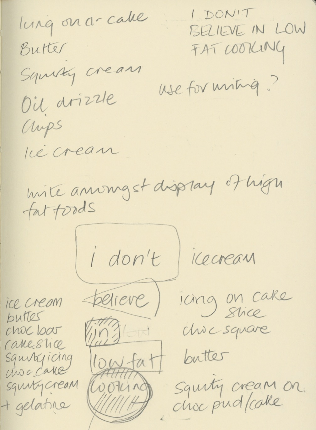

My thoughts were to carved the letters into butter, ice-cream and chocolate, and use icing and squirty cream to write letters onto other high fat food. The idea was to underline the deliciousness of naughty foods, and support Nigella's view that a little of what you fancy does you goo.

Once I tried this idea out, I discovered that writing in ice-cream was not so simple - the ice-cream I bought was quite fluffy in texture and it was not possible to carve it legibly. I also struggled with the chocolate icing on cheesecake as the icing was too runny to write small enough. Some lettering ended up looking better directly on the worktop.


I experimented with lighting, thinking the carved letters would look most effective if lit from the side, but in fact the shadows cast elsewhere detracted too much from the design.

I shot at F8 to ensure everything was in focus when shooting from fairly close range, particularly when photography from an angle.


The image above contains words in the chocolate and butter, which I felt were not clear enough. My final image is below. Photoshop was just used to lighten up the mid tones and enhance the contrast very slightly.


My final image (above and below). I think it reflects what I was setting out to do. The crumbs and splatters of food were to represent the food being irresistible, along with the cheesecake on spoon waiting to be eaten. I replaced the words in and low fat, with icing and cream, which I think make the typography flow better. I wrote Nigella's name in a rounded type, to reflect Nigella's curvaceous figure that she is well know for, which ties in with the anti-stick-thin ethos of her recipes. The colour of the type was creamy yellow, to tie in with ice-cream and butter. I'm not sure whether the rule around the edge adds anything to it.


17 May 2015

Lomography - analogue to digital

Lomography is an analogue photography craze that has a huge online following. The company have recreated, or sourced, cheap retro plastic cameras (Diana, Lomo, etc) and expired film, and used all their faults (light leaks, colour casts, vignetting, etc) as a marketing tool to make people want buy into retro look so popular now.

But many of these people still want digital image manipulation so combine their love of film with all its quirks, and the flexibility of Photoshop, by shooting on film and scanning their images to edit them further. 

There are a huge array of apps available to recreate a similar look digitally with a camera phone, but it doesn't quite get there. Instagram is the most popular. Will people still love this faux-retro effect in 10 years or will they wish they took all the shots without those dubious digital filters?


30 March 2015

Photography research in London

Gordon's Gin assignment

I spent a day in London looking for ghost typography, which proved to be very elusive. I also photographed lots of interesting brickwork, some of which I will use in my Gordon's Gin design.

I read about the history of Gordon's Gin on their website, and researched buildings in the Clerkenwell area where the distillery was located. The latest incarnation of the distillery building is still there, but this was a relatively modern building as the previous one was destroyed at the beginning of the 2th century. The building is now one of the largest data centres in the UK.

The first photo is looking east along the Southbank towards the Oxo Tower. I love the colours and greyness of this image, coupled with the red of the building on the left.

The next 3 images of of some ghost typography that I found whilst wandering round Clerkenwell, where the Gordon's Gin distillery was based for over a hundred years. The photo on bottom right is the beautiful Art Deco windows on Tate Modern.

Art Deco buildings really inspired by design, as it conjures up images of when people drank gin and tonic in the roaring 20s.

I wanted to use textures of bricks and concrete to reflect the urban nature of where Gordon's Gin originates.


Photos of brick, tiles and limestone I shot in London.

24 February 2015

Gordon's gin packaging assignment

I am considering using my own photography for the Gordon's Gin packaging. I took the first photo on the South Bank outside the National Theatre. I edited the hue in Photoshop to reflect the green of the glass bottle, and mimic the purple of the Juniper berries it is flavoured with.

The fifth photo has been edited to contrast with the green of the bottle, and the sixth is of a speeding tube training, again with the hue changed.

I want to use images that reflect the provenance of the drink - London Dry Gin,  but without being overtly obviously of London.


13 October 2014

Pre-course preparation 3

Photographing


I took some photos along the Southbank of the brutalist architecture.  I love the bulk and unpretentiousness of it.  The mass of uncompromising concrete sits really well with the hoarding typography in Helvetica.


I really like the typefaces used on this new pub on the Southbank.  It contrasts really well with the painted brickwork and pavement.


This image was painted on the National Theatre.  I really like the colour combinations and the graphic shapes which look quite typographic.