Hand drawn typography inspiration
I really love the look of hand drawn typography, and calligraphy. I'm not so keen on the very perfect styles, which take years to master, but the more informal characterful type, as show below.

http://typophile.com/node/88004

https://dribbble.com/shots/1422318-Begemot-Calligraphy-Logo
I love the huge contrast between the thick and thin strokes in the two pieces above, and will try out various techniques to achieve something similar. I will use a ruling pen and a Pilot Parallel pen.

http://www.flickr.com/photos/luca-beanone-barcellona/5859864506/in/set-72157627020568080/
To try out the technique above I need to use a straight edge calligraphy pen. I like the use of two colours and the informal style and combination of fonts.

http://www.pinterest.com/pin/18155204717369050/
I really like the splatters and uneven letter forms above, either created, I imagine, with a ruling pen or a handmade cola pen on rough watercolour paper.

The above piece is by Seb Lester from the cover of the latest Uppercase magazine. It is created in the Copperplate style with an oblique pen holder and nib. I really like the rhythm and the smooth curling letter forms of this work. I intend to try this technique as well, although I suspect it will take a huge amount of practice.
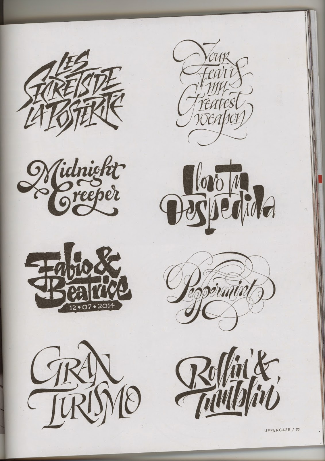
These below are from Uppercase issue 23, by Pietro Piscitello. I like the second down on the right - the contrast of thick/thin strokes make a really eye catching font with lots of character.
No comments:
Post a Comment