Great British Bake Off
We were asked to produce an entertainment based infographic for The Great British Bake Off. After brainstorming the statistics available to include, I decided on:Age, gender, occupation, average viewing figures and subsequent book deals.
I sourced my research as follows:
Age, gender and occupation:
https://en.wikipedia.org/wiki/The_Great_British_Bake_Off#Series_6_.282015.29
accessed on 09/10/15
Average viewing figures:
http://www.theguardian.com/media/2015/oct/08/the-great-british-bake-off-final-nadiya-jamir-hussain-gbbo (the Wiki ones were different)
accessed on 09/10/15
Book deals:
http://www.google.co.uk/url?sa=t&rct=j&q=&esrc=s&source=web&cd=7&ved=0CFAQFjAGahUKEwiW8ei6tLXIAhVBiw0KHWo6Ca4&url=http%3A%2F%2Fwww.lovefood.com%2Fguide%2Fchefs%2F17807%2Fgreat-british-bake-off-winners-where-are-they-now&usg=AFQjCNG6xVchC-0ZpIcU3ZZM7HXDP--tZw&sig2=pxXylYpkJNmKQiJ-kSMqgw
accessed on 09/10/15
I looked at other infographics about Bake Off, and particularly like this one:
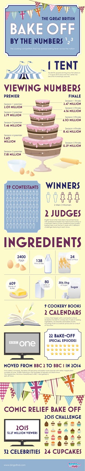
The colours are very inkeeping with the series, and the imagery used fits well (bunting, tent, cakes!). It is not overloaded with information and contains factual information such as viewing figures, and more light-hearted stats like number of cup cakes.
Source:
http://infographicjournal.com/wp-content/uploads/2015/06/The-Great-British-Bake-Off-Infographic1.jpg accessed on 09/10/15
Considerations when creating an infographic are:
Audience
Format - screen, print, landscape, scolling?
Tone of voice
Colours
Grid
Image style - type, format
Charts, graphs
Hierarchy
Typography
We started out by drawing some roughs and thumbnails and getting feedback from our peers:

The feedback I got from the group was:
Consider using a story book theme with a fairy tale script in a drop cap, keep it simple, use pastel colours.
I created all elements of the design in Illustrator, including the graph and cupcakes.
When scaling the cupcakes part of the infographic, I sized them in mm according to their viewing figures in millions, e.g. 12.3mm = 12.3 million. Then, providing they are all scaled together, their sizes are all mathematically proportional.

My final design is for A3 print. The idea was to represent the contestants' journey from prior to the series, to what happened beyond it. The cream line is the path, supposed to mimic butter cream icing piping. The outside pattern was created to look like a polka dot table cloth. I chose to put the elements inside a carrier bag, a mixing bowl, an Aga and a cake, designed to infer the journey of the cake, mimicking that of the contestant. The colours are ice-cream shades which I felt were appropriate for this informal infographic. I chose an informal hand drawn typeface for the titles, and Helvetica Neue for the rest. I think they complement each other well. Helvetica Neue works well at small sizes due to its large x-height.
In hindsight, I don't think the age graph fits very well with the rest of the design as a bar graph is too formal. A pie chart would have worked better - one for women's age ranges and one for men's.
Class feedback was as follows:
Make the path element more obvious by perhaps a reflected s-curve
Show numbers with proportions, professions could have been shown like this

No comments:
Post a Comment