24 February 2015

Gordon's gin packaging assignment

I am considering using my own photography for the Gordon's Gin packaging. I took the first photo on the South Bank outside the National Theatre. I edited the hue in Photoshop to reflect the green of the glass bottle, and mimic the purple of the Juniper berries it is flavoured with.

The fifth photo has been edited to contrast with the green of the bottle, and the sixth is of a speeding tube training, again with the hue changed.

I want to use images that reflect the provenance of the drink - London Dry Gin,  but without being overtly obviously of London.


23 February 2015

Metaphoric type

Metaphoric type means using type to illustrate the word, phrase or prose being communicated. It can be a visual pun or an illustration.

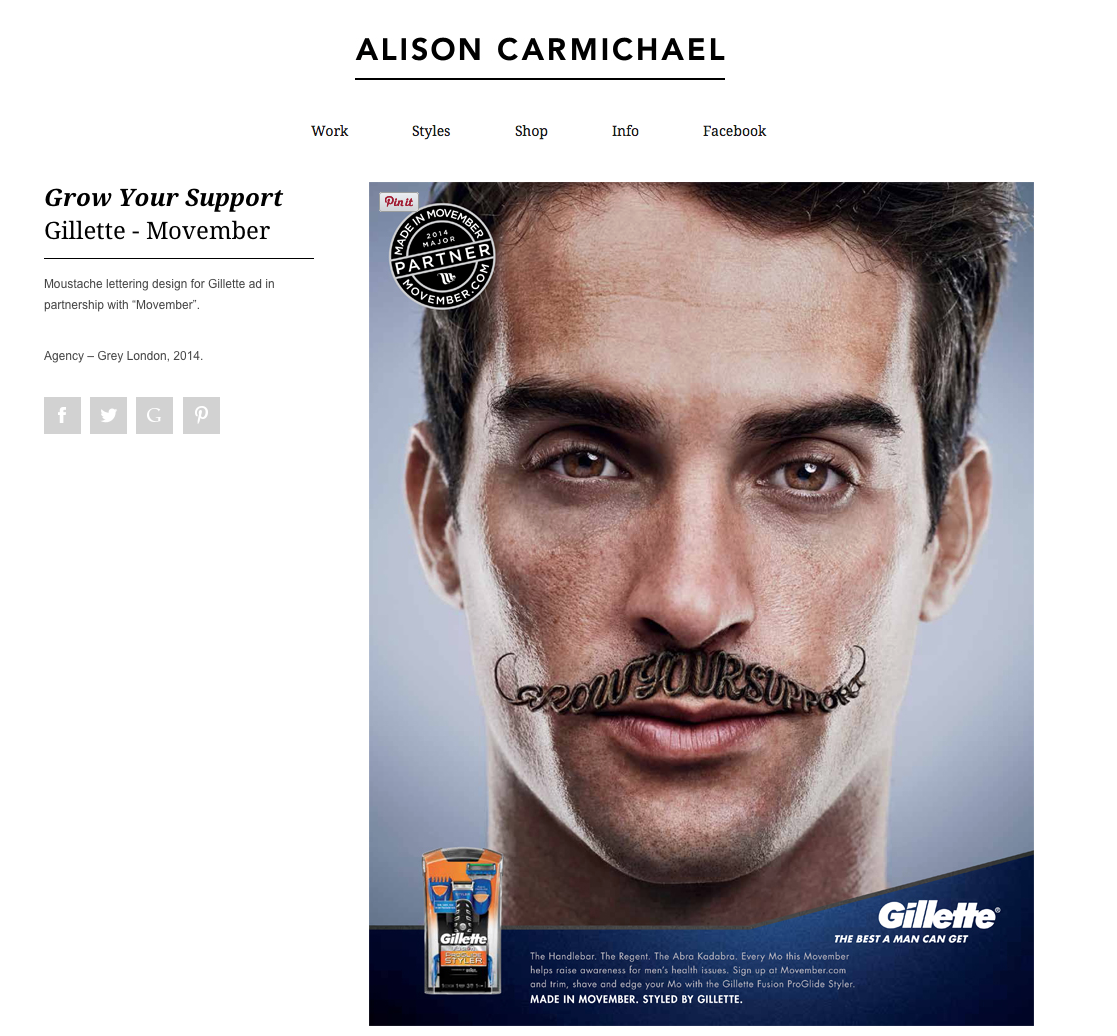
We looked at the work of some graphic designers who produced examples of metaphoric type, including Alison Carmichael:


The first example, above, uses a cracked ice stylised font to symbolise the word cough - icy, cold, broken, rough. A cough is a difficult word to illustrate as typography, but she has communicated the essence of the word. In the second image, Carmichael writes the words Grow your Support in the shape of a moustache in a very hairy type.

I used Illustrator to create a flat colour illustration of Oranges and Apples. I chose a rounded font which I then expanded. I reshaped the letters to look as round as possible without loosing their legibility. I then supplemented the letter with a naive leaf and stalk, and dots to suggest skin on the oranges. I hand drew the word "the" with the pencil tool.


I then hand drew my interpretation of the word dyslexia. I wanted to communicate feelings of confusion, anger, frustration and helplessness that often affects dyslexia suffers. I used a brush pen for the muddled up letters and then drew dots of varying densities over the page, with darker areas around the dark areas of letters to look like destruction. The idea of making the dots denser at the bottom was to infer the weight of their disability that suffers of dyslexia may feel.


14 February 2015

Gordon's Gin mood board 1

Packaging assignment

I have decided to look at producing a new label for Gordon's based on the botanical ingredients. Drawing inspiration from tattoos, I'm considering doing a stylized hand drawn line drawing of the ingredients, on a transparent background which weaves in and out of the brandname, covering the front face of the bottle. The colour scheme would be green and deep blue, bringing together the iconic green glass of the bottle, and the juniper berries, and reflecting the natural ingredients which make the distinctive flavour.


12 February 2015

Starbucks presentation development

Seb and I met to discuss our research findings. Seb gave me information for his slides, so I have incorporated those into the Powerpoint slideshow.  Unfortunately Connor wasn't in today, so I emailed him requesting the information for his slides so I could add them too. I passed all the questionnaires I had got completed, along with the results of the Facebook survey I did, via his friend, to pass on to Connor so he could use them to prepare during reading week.

11 February 2015

Drinks packaging assignment

For the drinks packaging assignment I have chosen Gordon's Gin. It has been in production since 1769 and is a London Dry Gin. There are 3 other variants - Elderflower, Cucumber and Sloe.

Gordon's is a very traditional looking product, aimed at 40+ regular gin drinkers. I would like to develop packaging which would also appeal to a younger market without alienating its loyal customer base.


I created a mind map of my initial thoughts about Gordon's Gin. I will draw some thumbnails of my first ideas: botanicals, London skyline, history and London imagery.