24 October 2015

Infographics

Analysis

We were asked to review 5 infographics, in a variety of styles.Whist searching I found what is potentially a really useful tool from The Guardian:

http://www.theguardian.com/global-development-professionals-network/2014/aug/28/interactive-infographics-development-data


Example 1: The Guardian - The world's top 50 banks


This infographics (ROGERS 2007) represents a serious subject for a serious readership and is presented in a formal manner. It has a standard colour scheme across all colours, and a business like serif font (the same one the Guardian uses, I think). It includes source information (in very small print). No key is necessary and it is very easy to understand and compare the data, as the size of the circles relate to the amount, and countries are displayed in a single colour. The audience is the readers of The Guardian newspaper - I'm guessing they would be well educated and interested in a factual analysis. This infographic would look better in print as the writing is too small to read on an iMac, let alone on a tablet or phone. There is no hierachy involved as all the information is equally important, which makes the eye flit around looking for somewhere to settle, which is perhaps a weak point of the graphic.


Example 2 - The Guardian (Culture supplement) - Fact-checking the famous: Beyonce


This tongue-in-cheek infographic (Dee, 2013) contrasts in style with the previous example from The Guardian. This is aimed a less serious reader, or the same reader who expects something more light-hearted from The Guardian's culture supplement. No sources are referenced, because to be honest its unlikely that Beyonce has "the world's most powerful thighs'. There is a clear hierarchy in the information, with the dominant pink colour drawing your eye round the page with its repetition. The typefaces are straightforward sans serifs making it a very quick read. The simple doughnut graphic is the only formal element, even that is used to show trivia. It serves its purpose well though and would appeal mostly to teens or someone looking to fill a spread 30 seconds.

Example 3 - UK road sign


This infographics is a very straightforward road sign (Traffic road signs giving directions, ND). Signs like this are directed at the road driving public who would be very familiar with them. They are in standard colours, in the same standard typeface, Transport, that was introduced in the 1950s. It is large and easy to read from a distance with a large x-height. The pictograms representing airport and motorway would be recognisable to any driver from anywhere in the world. The graphic representing the roundabout is standard and straightforward. This is obviously a serious, if simple, infographic.

Example 4 - London's Literary Haunts


This piece of art shows the places that characters from famous novels visited (Dex, ND). It is a fun piece and is on display at The Literary London Art Collection. Presumably the more famous the character, the larger the type. The river Thames is clear to see. This is informal but eye-catching in black and white, with a variety of hand drawn typefaces and a few pictograms thrown in. I'm sure this piece is stunning in real life, but on screen it's a hard read.

Example 5 - Preserves


Preserves (Wildish, ND) is a lighthearted infographic representing the ingredients of various preserves (except The Jam!). It is straightforward and to the point, with different colours relevant to the colour of the ingredient they represent, and consistent in each jar. The typeface is a clear sans serif, which goes well with the informal and quite retro tone and subject matter. It is simple enough to be clearly legible on a smartphone. As Wildish is a graphic artist, it goes well with the other work in his portfolio and would suit many applications.

References


DEE, J (2013) Fact-checking the famous: Beyonce [online] The Guardian. Available from http://www.theguardian.com/culture/interactive/2013/feb/15/infomania-beyonce [Accessed 24 October 2015]
DEX (ND) [online] http://www.stipso.com/blog/2014/10/16/infographic-of-the-week-whats-killing-james-bond [Accessed 24 October 2015]
FERGIE'S DRIVER TRAINING (ND) Traffic road signs giving directions [online] Available from http://www.drivinginstructorm44.co.uk/learning-to-drive/learnig-to-drive/uk-road-signs/traffic-road-signs-giving-directions [Accessed 24 October 2015]
ROGERS, S (2007) The world's top 50 banks [online] The Guardian. Available from http://www.theguardian.com/news/datablog/2009/mar/25/banking-g20 [Accessed 24 October 2015]
WILDISH, S (ND) Preserves. Available from http://stephenwildish.co.uk [Accessed 24 October 2015]

23 October 2015

Waterstones Bag for Life

I experimented with a couple of ideas for the illustrations for my bag for life. These are just rough concepts:

This illustration for my bag was quickly created in Illustrator with the blob brush and shape tools. The black panel would be fixed with velcro to the bag and could be written on with a wipeable white chalk pen.


The image below is a quick watercolour sketch in line and wash on NOT watercolour paper. It would be used in the same way as the Illustrator sketch above.


In the image above, I hand drew some type with a white gel pen. I quite like the effect on this sketch, and think I will explore this technique further. The white hand writing on the blackboard is not part of the design, and the background has printed too dark.

Marketing brochures

Hampshire County Council brochures

I recently created the branding for Hampshire County Council's children's homes. There are soon to be 8 children's homes owned by HCC and I was tasked with creating a brand for them. I created logos for all the homes, and 40-page brochures for each of the homes (see below). For the remaining children's homes, I will endeavour to take the internal and external photographs of the building myself, as the styling of the photos needs to be improved. The brochures were printed by our in-house print shop. I was really pleased with the results, and the Service Manager and children's homes managers gave me positive feedback. I have also designed flyers, certificates and leaflets.

HCC children's homes handbooks, designed by myself


Packaging - the delivery medium

Postcard mailer and tea towel wrapping

We were asked to consider the different mediums that can be used to deliver a product - bags, envelopes, boxes etc.

Bags are the method shops employ as free advertising when you buy from a store. It's a signpost to other shoppers that their store is in the vicinity. You are the walking advertisement.

Packaging also has negative connotations - it creates litter, it goes into landfill - non-biodegradable packaging in particular.

We were asked to create 2 concepts for envelopes, incorportaing an element from our assignment on a Waterstones envelope.

I sketched out two ideas, below. The first idea was for a mailer to prospective customers in the form of a postcard. This would include a pop out gift tag which customers could take into Waterstones to get a discount on their cookbook purchase. The tag could be attached after the parcel had been gift wrapped by Waterstones, and has a scratch and sniff panel relating to one of the recipes in the book on promotion.

The second idea was to use a promotional tea towel as gift wrap for a cook book purchase. Alternatively an apron would work too. The illustration/pattern could be related to the cook book promotions.

Mailers - inspiration

Mailers from Boden and White Stuff, self-generated photo


These two mailers were sent to me by Boden and White Stuff over the last couple of years. These companies are really inventive with their mail shots.

The first one is from Boden. A paper envelope shaped like a camera with a tab on the side invites you to pull. This reveals a double sided sheet advertising their sale, mimicking the pulling out of old style Polaroid Instamatics. This idea works well for Boden as they rely heavily on their retro styling and old school imagery.

The second piece is from White Stuff. They sent out a thick card in A5 with pop-out cocktail toppers, which suited their catalogue theme, being summer holidays. Although not amazingly practical, it is a fun idea, and very engaging.

22 October 2015

Waterstones - Concepts

Bag for life

I have further developed my plans for a bag for life as a giveaway with cookery books from Waterstones (perhaps if you buy 2). The first is a bag in the style of a wood-framed blackboard, with a velcro-detachable panel to write a shopping list on. A white wipeable chalk marker would be included with the bag, and food illustrations would surround the blackboard on different styles of background, for instance a gingham tablecloth, a wood table, hessian or a marble worktop. The write on panel would look like a menu, with areas to write meals for the week and sections for the different types of groceries.


Lunchbox bag

My second option is for a single book purchase the customer would get a insulated lunch box carrier, joined at the sides with velcro, which opens to form a wipeable picnic mat to put your lunch on at your desk or in the park.


Inspiration


I will take inspiration from the food illustrations below and will experiment with watercolours and with creating flat images in Illustrator. I like the idea of using white and black gel/paint/marker pens over the illustrations.


18 October 2015

Minimalism

Minimalism in graphic design can be defined as using the simplest design, with the least number of elements required to communicate a message. Simple tools, simple message.

We started by listing all the positive imagery that McDonalds conjures up:

Golden Arches
Ronald McDonald
McFlurry
Milkshake
Red and yellow
Happy Meal
I'm lovin' it
Etc

We then pared this list down to the items which were exclusively McDonalds, and would be instantly recognizable. Perhaps only the yellow McDonalds M, Ronald McDonald and I'm lovin' it. However when two of these elements are combinded, McDonalds would certainly be signified, for instance, combining a milkshake with a straw and the colours red and yellow. This means somethings to a very wide audience, and in the case of McDonalds, to most of the world. This is so, because the McDonalds products are entrenched in our cultural mythology. 

Sometimes, words alone can be enough. It's all about the audience.

Research


We looked at film posters and book covers created in the minimalist style. 

Memoirs of a Geisha is so successful because it relies really on just one element, the red lips.


I really like this Titanic poster for its simplicity. The placement of the liner in front of the negative space of the iceberg works very effectively. Their relatively small size on the poster infers how small humans are when nature decides to strike. Titanic in large type represents the enormity of the event.


My work


I chose to design posters for the TV series Outlander as it has some imagery in it which, when paired, would signify Outlander to those who has seen the series, or viewed trailers. 

I listed the obvious images from the series:

Tartan
The stones
Medicine
200 lashes - scarred back
Scotland
The Laird's deformed legs

I decided that combining a quote from the series, together with tartan and another graphic element would work well.

I created the tartan by making a pattern from the swatch on a tartan manufacturer's website:
http://www.kilts-n-stuff.com/outlander-products/outlander-tartans/.This is combined with a simplistic representation of the standing stones which are constantly referenced in the series.

I think this poster works well, as the words and tartan represent a Scottish origin, and the standing stones would be recognised by a fan of the series. The type was placed in short lines in large type as a reflection of the simple statement that the words represent. The sentiment is firm and non-debatable.


I don't think this poster works as well. The red was meant to represent blood on Jamie's back after being inflicted with 200 lashes. I don't think it works though. I spent some time trying to improve it, and swapped the tartan for a skin coloured background but didn't feel this worked either.


The above poster is my final design, and one which, when I sketched the thumbnails, I thought would be the least successful. However, I actually think it works the best. Anyone who has seen the series would recognise the Laird's legs, inflicted with Toulouse Lautrec syndrome. The tartan legs, cut off at the top of the page look like he is walking menacingly across a darkened room, and the writing in red communicates a sinister feel. I wrote in a small point size as the words are spoken softly, but menacingly. The black negative space is another element that makes this poster work well. It adds to the drama.

The typeface chosen for all the posters was a celtic one, which I thought trod the line between stylistic aesthetics and legibility well. The words are obviously Scottish so the tartan could be overkill, except patten has the immediacy that words do not.


Environmental typography

When typography is placed in the environment, extra layers of meaning are connotated from the space, atmosphere and tone of the situation. Doing so provides the written words with an additional narrative or story. The environment can be outside, or inside, and means placing the typography anywhere other than on paper.

Exampes of designers' work


The word Descend, below, is created from duck tape stuck onto the treads of the steps by Becky Obenhaus. The simplicity of application and materials, compared with the straight word modern sans serif typeface and the direction of the type, when placed on the stairs, combines to make the instruction superfluous, but amusing. It would also lead you to wonder what is down there?
ttp://www.thestlouisegotist.com/sites/www.thestlouisegotist.com/files/imagecache/portfolio_work_image/portfolio/Becky%20Obenhaus/IMG_4594.jpg


The work below, from Nicole Dextras, a Canadian designer, was created on the shores of Lake Ontario. The letters stand 6" high and are carved in ice. Is the word a noun, or a verb? It was created in a response to the artist's feelings about estate agents selling land "with a view". It could mean so many different things, depending on your politics and your interpretation.

http://nicoledextras.com/portfolio/social-typography/views/


My design


My ideas were loosely based on my cookery book theme for Waterstones. I chose a quote from Nigella Lawson - "I don't believe in low fat cooker" and sketched out some ideas of how I could produce an environmental design piece for these words.


My thoughts were to carved the letters into butter, ice-cream and chocolate, and use icing and squirty cream to write letters onto other high fat food. The idea was to underline the deliciousness of naughty foods, and support Nigella's view that a little of what you fancy does you goo.

Once I tried this idea out, I discovered that writing in ice-cream was not so simple - the ice-cream I bought was quite fluffy in texture and it was not possible to carve it legibly. I also struggled with the chocolate icing on cheesecake as the icing was too runny to write small enough. Some lettering ended up looking better directly on the worktop.


I experimented with lighting, thinking the carved letters would look most effective if lit from the side, but in fact the shadows cast elsewhere detracted too much from the design.

I shot at F8 to ensure everything was in focus when shooting from fairly close range, particularly when photography from an angle.


The image above contains words in the chocolate and butter, which I felt were not clear enough. My final image is below. Photoshop was just used to lighten up the mid tones and enhance the contrast very slightly.


My final image (above and below). I think it reflects what I was setting out to do. The crumbs and splatters of food were to represent the food being irresistible, along with the cheesecake on spoon waiting to be eaten. I replaced the words in and low fat, with icing and cream, which I think make the typography flow better. I wrote Nigella's name in a rounded type, to reflect Nigella's curvaceous figure that she is well know for, which ties in with the anti-stick-thin ethos of her recipes. The colour of the type was creamy yellow, to tie in with ice-cream and butter. I'm not sure whether the rule around the edge adds anything to it.


16 October 2015

Waterstones reserach

In order to concept, design and produce a promotional campaign to encourage people to buy books form Waterstones, I started off by deciding on my research methods.  They will include:

Visiting and photography some Waterstones stores.
Considering a primary research survey.
Researching who, when and why people buy books, and why they choose to buy them online or from bricks and mortar stores.

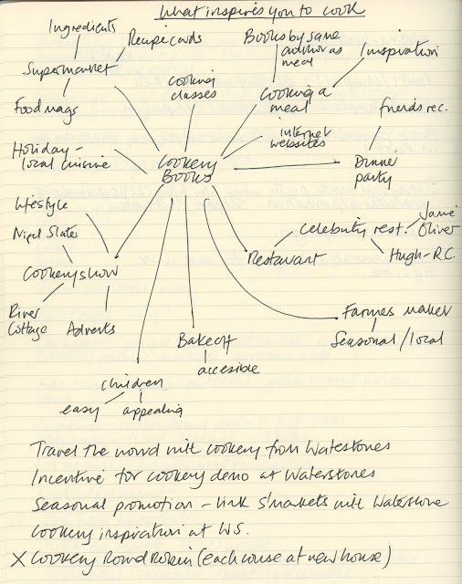
I decided to focus on cookery books and tie this in with a Christmas campaign. Cookery books are mostly bought by women, for themselves or as gifts, according to research I found.  I felt that people needed a reason to go into Waterstones, instead of buy from Amazon. I think mind mapped some thoughts about what prompts people to buy cookery books.


Most of the cookery books sold are those from celebrity chefs or from as a TV spin-off which can be ascertained from looking at Amazon's and Waterstones' top sellers lists.

I though about focusing my campaign on 4 recently released books, one each weekend of the main shopping weekends before Christmas. For the 4 books chosen, they are the same or only a £1 or £2 more expensive in Waterstone than on Amazon.The 4 books come from different market sectors - comfort food, healthy eating, lifestyle and simple cooking.

My ideas for tempting people into the store are:

Free gift wrapping
A giveaway associated with cooking - reusuable grocery bag (now they are chargeable), tea towel or apron
The smell of food
Money off vouchers

I thought of the advertising slogan "Cooking the books", which links food and books.

Ideas to concept

1. Scratch and sniff postcards/gift tags and wrap

Scratch and sniff technology on postcards, with pop-ut gift tags, to use along with matching gift wrapping when you buy in store. Using food stains found on well loved cookbooks (greasy fingers, curry powder, flour, fat spray, red wine glass ring, chocolate, tomatoes. The books would be wrapped in paper and tied with bakers string and the gift tag attached, to look like a parcel from a 50's grocer's store. The postcards coudl be given away in food magazines, in supermarkets, and sent out as mailshots.

2. Reusable carrier book bag

Giveaways by promoters wearing aprons and carrying reusable carrier bags. The reusable bags would be made as follows:

As this type of bag wouldn't hold very much, I thought about making a single compartment bag, which looks like a book. The bag for life could have a free recipe card or recipe printed on each for each book. Alternatively, the image could be an open book, and space to write your shopping list on the outside, with a wipeoff pen. There could be a pocket to hold the receipe card.

3. Food samples

3. Free food samples of receipes in the books, in boxes like miniature copies of the books, given away around the shopping malls containing a Waterstones store.

Recipe cards

4. Recipe cards (from the featured books) with scratch and sniff panels.


14 October 2015

Modernism and Utopia

Modernism was a collection of ideas, in part in response to the terrible losses of WW1, to create a better world by changes in philosophical thinking. It was about using art in a secular, apolitical way, to transform society into an utopian ideal by focusing on design and the way people live. Although originally rejecting politics, many of the idealogies are politically left of centre.

There are five ideaologies:

Communist utopia

It was bourne out of Constructivism and the Avant Garde having the desire ‘not to adorn life but to organise it’. The work was seen in architecture and propaganda primarily, but also in new ways of thinking.

Social utopia

Social utopia was adopted by De Stijl and the Bauhaus to utilise new industrial methods to create greater social equality within exisiting social and economic structures.

Spiritual utopia

Practioners sought to reject the sterile design aesthetic of the modern world, looking inwards at human intellect and the soul.

Dionysian utopia

The emotional and sensual obsession of the Italian Futurists was embraced in their utopia ideals of a world where everything was create by the machine.

Rational utopia

A practical and rational idealism, it sought to use mechanisation to fuel social change for equality, giving everyone access to a clean, bright and fresh life.


Google logo

We were tasked with researching aspects of the redesign of the Google logo.

Google has recently announced a major restructure, and now consists of many companies under the holding company of Alphabet. This is to separate its traditional business with its more speculative ventures.


The Alphabet wordmark


After the Google restructure
Before and after the resdesign


The purpose of the redesign was to reflect the ways in which people interact with Google across producs, platforms and devices.

The new Google logo embraces modern typography with a sans serif typeface (which looks very much like Futura). However, the cross bar of the G is longer, making it look more like a grin, and the counter is large, make it appear more open and more legible when very small.


Its colours remain consistent with the old logo but softened slightly, allowing viewers to be comfortable in its familiarity. The custom typeface is called Product Sans but looks similar to many other typefaces.

There are 3 versions of the Google logo:


The coloured slightly upward line of dots and the single letter G allow the marque to be used at any scale and still be recognisable.

The dots are used in animation and morph into any one of Google's brands.  

The colours on the single G encourage movement around the letterform. The uppercase G is synonomous with Google.

Almost any redesign of the logo would be better than the previous one. Keeping the colours consisent but modernising the typeface works, and the angled e gives it a slight edge.


Modernism

International/Swiss Style

We were tasked with researching one area of Modernism. I decided to focus on International Style/Swiss Style.

International Style developed after WWII, originating in Switzerland as Swiss Style (1950s) but soon becoming adopted by many large US corporations as part of their identity. It took its cues from De Stijl, Constructivism, Bauhaus and the New Typography, but without the political influences.


Jan Tschichold, film poster, 1927


Students of the Bauhaus, Max Bill and Theo Ballmer, along with Jan Tschichold (a German refugee) were the founders of the Swiss Style. At first Tschichold dictated that very strict rules should be applied to all typography - flush left, sans serif, etc, which then became popular. However some years later he decided his views were too dictatorial and changed his ideas about what the ideal style was, and later became a serif type designer. Many of his contemporaries felt he had betrayed them.

Akzidenz Grotesk, the typeface on which Helvetica (formerly Neue Haas Grotesk) was based, was the most popular typeface. For many graphic designers, it was the only typeface they ever used. It was revered for its functionalist style, with no political connotations from Constructivism or the Bauhaus. Being politically neutral was key to International Style.

In 1957, Adrian Frutiger designed the type family Univers, which was the first of it's kind to have a numerical reference system defining weights and widths of the typefaces.


Josef Muller-Brockman designed the poster below, which includes key features of Swiss Style - a grid system, curves, and asymmetrical text.


Josef Muller-Brockmann, Beethoven, 1955


Brockmann believed that you should never use more than one typeface, and even then only 2 sizes were allowed, and that text should always be horizontal.

In 1951 HfG (University of Design) was founded by Bill, Aitcher and Scholl who were the first to teach semiotics in relation to graphic design. As a result of this, their graduates found they were in demand. They designed logos for Deutsche Bank, Lufthansa, and the pictogram based designs for the 1972 Munich Olympics.

Jan Tschichold was recruited by Penguin Books in 1947. After rejecting his New Typography dogma, he set some loose design rules in place - Penguin Composition Rules, and established what is now the Penguin style.

Another proponent of International Style was Alan Fletcher, who designed the V&A logo, and co-founded Pentagram.

In the USA, corporations raced to adopt International Style which reflected their aggressive ideals of capitalism. Paul Rand was its most famous designer of corporate identities. His worked includes the IBM logos, and those for UPS and Yale. Paul Rand's website says the following about logo design:

The effectiveness of a good logo depends on:

a. distinctiveness
b. visibility
c. useability
d. memorability
e. universality
f. durability
g. timelessness

It says “We care.”

Paul Rand http://www.paul-rand.com/foundation/thoughts_logosflags/#.Vh4XoHg0O9o

Paul Rand, logos for IBM, 1956-1990


10 October 2015

Book layout

Waterstones book

We were tasked with designing 3 layouts for a double and single page spread, considering all the levels of type hierarchy that would be needed.

I used many of my design books for inspiration, with particular reference to Fifty Typefaces that Change the World (Walters 2013), and Thinking with Type by Ellen Lupton (2010). I have also looked at the styles used in my cookery books and magazines such as Kinfolk.

Below are two pages from Kinfolk Volume 12 (Ash and Verdugo 2014). I love the calmness created by their centre aligned type and font combinations. Although the typeface is very small (6-7pt?) is still still legible. The passe partout border compliments the type very well, fitting with the slow paced aesthetic of the magazine. They also use full bleed colour background for some pages of text which is very effective and helps with the pace of the magazine.


I considered the benefits of using columns or a grid. I then looked at fonts which I thought worked well together, which were different enough to create contrast, along with the sizes of the typeface. I then thought about how I would lay out a standard set of pages, and what colours to use. I decided to use grey as it goes with any colour of imagery, but I may introduce colours on some pages. I chose to use rules for some added interest.

I chose to work with a 6 column layout to give flexibility across the pages for different layouts, depending on the number of images and the length of the body copy. I experimented with layouts based on the gold section and have decided to go with a symmetrical layout, but to combine this with left and right aligned text (not centred).

Colour will be monochrome, initially, with perhaps some subtle colours added depending on the image colours.


Layout one

This is my first design. It was inspired by the layouts in Basics Design 07:Grids (Ambrose and Harris 2012), although the font choices are my own. I chose Droid Serif for the heading and subheading, Antique Olive for the large body copy, and Franklin Gothic Book for the body copy. I wanted to use 3 fonts which complimented each other, by combining a serif and sans serif. I decided 10% black border as a graphic device  and a 3 column layout for ease of reading.


Layout two

This layout looks more contemporary, and is inspired by layouts in 100 Ideas That Changed Graphic Design (Heller and Vienne 2012). The bold rule really draws the eye to the title, and allows the heading typeface to be smaller than without it. The combination of users of two different serifs for large and main body copy and and sans serif heading compliment each other well. I'm not so keen on the italic type used for the running head.


My version below, uses the Antique Olive family for all text except the running head and the picture captions, which are in Droid Serif Roman and Italic. I like this bold layout, again using 3 columns, and with the use of rules rather than the border (layout one).


Layout three

This is my preferred layout, in part because it uses only serifs. Bree, a slab serif, is used for the heading and subheading, and Droid Serif for the remaining type. Droid is an easy to read typeface, its serifs leading the eye gently across the page.


Further development

I am considering creating a square book but will apply the above template for layout three to the new format, with some slight changes. I will work out the margins based on the golden section. Some images will be full bleed and others with a passe partout. The reason for choosing a larger book is to be able to use plenty of white space and give the images (particularly the featured images) room to breathe.

References
AMBROSE, G and HARRIS, P (2012) Basics Design 07: Grids. 2nd ed Lausanne, AVA Publishing SA
ASH, R (2014) The Case for Crying. Kinfolk Volume 12 p123
HELLER and VIENNE (2012) 100 Ideas that Changed Graphic Design. London, Laurence King Publishing Ltd
LUPTON, E (2010) Thinking with Type. 2nd ed New York, Princetown Architectural Press
VERDUGO, A (2014) The Case for Crying. Kinfolk Volume 12 p122
WALTERS, J L (2013) Fifty Typeaces that Change the World. London, Conran Octopus Ltd

9 October 2015

Infographics for entertainment

Great British Bake Off

We were asked to produce an entertainment based infographic for The Great British Bake Off. After brainstorming the statistics available to include, I decided on:

Age, gender, occupation, average viewing figures and subsequent book deals.

I sourced my research as follows:

Age, gender and occupation:

https://en.wikipedia.org/wiki/The_Great_British_Bake_Off#Series_6_.282015.29
accessed on 09/10/15

Average viewing figures:
http://www.theguardian.com/media/2015/oct/08/the-great-british-bake-off-final-nadiya-jamir-hussain-gbbo (the Wiki ones were different)
accessed on 09/10/15

Book deals:
http://www.google.co.uk/url?sa=t&rct=j&q=&esrc=s&source=web&cd=7&ved=0CFAQFjAGahUKEwiW8ei6tLXIAhVBiw0KHWo6Ca4&url=http%3A%2F%2Fwww.lovefood.com%2Fguide%2Fchefs%2F17807%2Fgreat-british-bake-off-winners-where-are-they-now&usg=AFQjCNG6xVchC-0ZpIcU3ZZM7HXDP--tZw&sig2=pxXylYpkJNmKQiJ-kSMqgw
accessed on 09/10/15

I looked at other infographics about Bake Off, and particularly like this one:


The colours are very inkeeping with the series, and the imagery used fits well (bunting, tent, cakes!). It is not overloaded with information and contains factual information such as viewing figures, and more light-hearted stats like number of cup cakes.

Source:
http://infographicjournal.com/wp-content/uploads/2015/06/The-Great-British-Bake-Off-Infographic1.jpg accessed on 09/10/15

Considerations when creating an infographic are:
Audience
Format - screen, print, landscape, scolling?
Tone of voice
Colours
Grid
Image style - type, format
Charts, graphs
Hierarchy
Typography

We started out by drawing some roughs and thumbnails and getting feedback from our peers:

I compiled by figures into an Excel spreadsheet, and used it work working out average ages (I could have just used a calculator...). I then looked at the type of imagery I wanted to include.

The feedback I got from the group was:

Consider using a story book theme with a fairy tale script in a drop cap, keep it simple, use pastel colours.


I created all elements of the design in Illustrator, including the graph and cupcakes.

When scaling the cupcakes part of the infographic, I sized them in mm according to their viewing figures in millions, e.g. 12.3mm = 12.3 million. Then, providing they are all scaled together, their sizes are all mathematically proportional.


My final design is for A3 print. The idea was to represent the contestants' journey from prior to the series, to what happened beyond it. The cream line is the path, supposed to mimic butter cream icing piping. The outside pattern was created to look like a polka dot table cloth. I chose to put the elements inside a carrier bag, a mixing bowl, an Aga and a cake, designed to infer the journey of the cake, mimicking that of the contestant. The colours are ice-cream shades which I felt were appropriate for this informal infographic. I chose an informal hand drawn typeface for the titles, and Helvetica Neue for the rest. I think they complement each other well. Helvetica Neue works well at small sizes due to its large x-height.

In hindsight, I don't think the age graph fits very well with the rest of the design as a bar graph is too formal. A pie chart would have worked better - one for women's age ranges and one for men's.

Class feedback was as follows:
Make the path element more obvious by perhaps a reflected s-curve
Show numbers with proportions, professions could have been shown like this