24 February 2015

Gordon's gin packaging assignment

I am considering using my own photography for the Gordon's Gin packaging. I took the first photo on the South Bank outside the National Theatre. I edited the hue in Photoshop to reflect the green of the glass bottle, and mimic the purple of the Juniper berries it is flavoured with.

The fifth photo has been edited to contrast with the green of the bottle, and the sixth is of a speeding tube training, again with the hue changed.

I want to use images that reflect the provenance of the drink - London Dry Gin,  but without being overtly obviously of London.


23 February 2015

Metaphoric type

Metaphoric type means using type to illustrate the word, phrase or prose being communicated. It can be a visual pun or an illustration.

We looked at the work of some graphic designers who produced examples of metaphoric type, including Alison Carmichael:


The first example, above, uses a cracked ice stylised font to symbolise the word cough - icy, cold, broken, rough. A cough is a difficult word to illustrate as typography, but she has communicated the essence of the word. In the second image, Carmichael writes the words Grow your Support in the shape of a moustache in a very hairy type.

I used Illustrator to create a flat colour illustration of Oranges and Apples. I chose a rounded font which I then expanded. I reshaped the letters to look as round as possible without loosing their legibility. I then supplemented the letter with a naive leaf and stalk, and dots to suggest skin on the oranges. I hand drew the word "the" with the pencil tool.


I then hand drew my interpretation of the word dyslexia. I wanted to communicate feelings of confusion, anger, frustration and helplessness that often affects dyslexia suffers. I used a brush pen for the muddled up letters and then drew dots of varying densities over the page, with darker areas around the dark areas of letters to look like destruction. The idea of making the dots denser at the bottom was to infer the weight of their disability that suffers of dyslexia may feel.


14 February 2015

Gordon's Gin mood board 1

Packaging assignment

I have decided to look at producing a new label for Gordon's based on the botanical ingredients. Drawing inspiration from tattoos, I'm considering doing a stylized hand drawn line drawing of the ingredients, on a transparent background which weaves in and out of the brandname, covering the front face of the bottle. The colour scheme would be green and deep blue, bringing together the iconic green glass of the bottle, and the juniper berries, and reflecting the natural ingredients which make the distinctive flavour.


12 February 2015

Starbucks presentation development

Seb and I met to discuss our research findings. Seb gave me information for his slides, so I have incorporated those into the Powerpoint slideshow.  Unfortunately Connor wasn't in today, so I emailed him requesting the information for his slides so I could add them too. I passed all the questionnaires I had got completed, along with the results of the Facebook survey I did, via his friend, to pass on to Connor so he could use them to prepare during reading week.

11 February 2015

Drinks packaging assignment

For the drinks packaging assignment I have chosen Gordon's Gin. It has been in production since 1769 and is a London Dry Gin. There are 3 other variants - Elderflower, Cucumber and Sloe.

Gordon's is a very traditional looking product, aimed at 40+ regular gin drinkers. I would like to develop packaging which would also appeal to a younger market without alienating its loyal customer base.


I created a mind map of my initial thoughts about Gordon's Gin. I will draw some thumbnails of my first ideas: botanicals, London skyline, history and London imagery.


Typography insertion


I cropped an image of a hurricane to roughly golden spiral proportions on the page. In Illustrator I created a spiral which I inverted and then edited the proportions and the position to line up correctly. I chose a font that looked in harmony with could, rounded and fluffy, but still authoritative, like the weather agencies. The text I added was hold onto your hats, in an overlay layer so that some of the shading from the image showed though. I would have liked to make the text into a wedge shape, to narrow as it approached the centre, but I couldn't work out how.


For the dog's image, I decided to use a font that reminded me of the dog food brand Pedigree Chum. I used Photoshop and aligned the baselines along the layers of dust that the dogs were running along, except for the word "only" which fitted nicely between the P and d, and leads the eye into the main text, and from one dog to the next. I used an eraser to remove the text from the main dog, to make it look like the dog was running on top of it. The word "fast" is in red for emphasis. I quite like the simplicity and the rawness of this piece.


In InDesign I added three lines of text in the same font, each one progressively lighter and smaller. The object style for text was set to colour burn to make it appear to blend in with the textures and shades of the buildings. I wanted to make it look like the text was floating off into the sky. The angle of the text reflects the diagonals of the buildings, and I placed the words "not down", upside down to reflect the message, and chose a bulbous font to look like the text had been squashed and to contrast strongly with the angular buildings and other typeface.


Insertion techniques

We looked at different methods of integrating text into an image, and making it look like it is an integral part, rather than something that has been placed on top of an image.

In the first image, the text is simply aligned with the dominant diagonal of the image, enhancing the movement and dynamic style of the picture. The white of the type is repeated in the white building roof to the left which ensures there is rhythm and balance.


The  numbers placed on the front of the rock faces below, have shadows, texture and contours to make them appear as if they have actually been painted on the rocks, rather than added digitally.


In the image below, the picture has been cropped very creatively, and the figure at the top appears to be floating on the typography. The type has been made to appear very grainy, like the photo, and integrates well in the negative space.

9 February 2015

Research assignment - Starbucks

There was a huge amount of information to be found in academic journals and reports about Starbucks and coffee shops in general. It was difficult sifting through and finding things that could be used to help prove or disprove our hypothesis. In the end the information I focused on was a Keynote Market Report 2014, on coffee and sandwich shops, and a report called Starbucks Exceptionalism: An Institutional Ethnographic Exploration of Coffee Culture in America from the Journal of Psychological Issues in Organisational Culture.

I considered what the agenda's of these two publications would be, and who was consulted for the purpose of the surveys - what ages, socio-economic groups, nationalities, etc, and whether they were already Starbucks customers.

I printed out both reports, and highlighted facts which I considered were relevant to confirming or contradict our hypothesis that Starbucks is so successful because its coffee has become a status symbol. Next I went through and summarised my findings with bullet points.

I also asked as many friends, family and colleagues as I could, the questions in the survey that Seb and myself had put together, and got 12 completed responses. I also asked a very quick 2 question survey on Facebook: describe Starbucks, and describe a Starbucks customer. I got 15 responses. The difficulties with both of these are friends and family are likely to share viewpoints, be from the same socio economic group and the research could be very skewed. With asking people for 2 words, you get a very generalised view of their opinions, and some people respond with what they consider to be "funny" responses!

Seb and Connor are working on their respective areas, so I decided to start putting the slides together, so that on Thursday we can confirm our presentation.

3 February 2015

Research assignment

Why is Starbucks so successful?

We were put into teams to work on presentation to investigate brand perception and consumer responses. I was partnered with Seb and Connor. Unfortunately Connor was unwell, so Seb and I started our research.

We decided to use Starbucks for our presentation. The question we wanted to answer was "Why is Starbucks so successful?". We discussed what our hypothesis could be, and concluded that it would be "Starbucks is so successful because a Starbucks coffee is considered to be a status symbol".

Seb and I discussed what research already exists and how we could use it. We decided that we would research academic journals, general information available in the press on the internet, and conduct a questionnaire to provide us with primary research. 

We drew up a questionnaire of 10 questions that we could use. We planned to conduct primary research amongst our friends and family and also outside Starbucks in Farnborough.

It was decided that while we would all complete about 20-30 questionnaires with our friends and family, Seb and Connor would undertake to question customers together outside Starbucks (for 1-2 hours on Thursday). I will be responsible for investigating academic research, and Seb and Connor will also look into other sources from the internet in general. 

We will meet on Thursday to discuss our progress. Next Monday we will review our results. The following Thursday we will analyse our findings and decide what will go into the presentation, and then create the slides. The presentation will be divided up so we each present for about 3 minutes on the Monday after half term. 

2 February 2015

Stefan Sagmeister

In class today we experimented with drawing on physical items (fruit), and then drawing typography over the top of photos, which are two forms of design that Stefan Sagmeister is renowned for, along with his business partner, Jessica Walsh.  Sagmeister famously got his intern to carve hand drawn type with a scalpel into his torso.  Sagmeister started this trend when he became bored with choosing standard fonts from a font source book in his early career and wanted to do something radical instead.

When drawing on a physical object, or on a photo, it is possible to see shade and tone, shadows, imperfections and depth that would be very hard to achieve using a purely digital format.

My apple with the quote: The life of a graphic designer is a life of fight.


I should have started the typography higher up, and not drawn so far around on the bottom line.

In the magazine cover featuring Colin Firth and the magazine cover I designed for Manhattan, the idea was to use the shape of his shirt to represent Manhattan island, and his labels are the Hudson River and the East River. The text was drawn in black over the image projected through a lightbox. I scanned the text into Photoshop and created two layers, one with the text in black, and another inverted to white. The white text was set to screen, and the black text to multiply. I then erased the unwanted text from each layer to combine the black and white type. The title would have looked better in a bolder typeface.


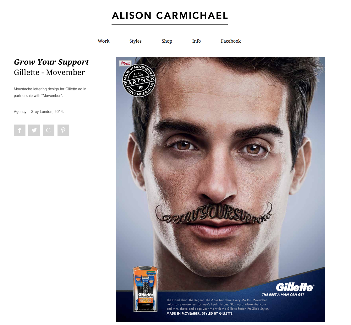
This work above, found on a Google search, is another example of how images can be created or enhanced with typography. There is a proliferation of this type of work on the internet now, with the design above being a particularly good example of how this style can work effectively. Unfortunately the artist is not credited on the original website.