28 May 2015

Surface pattern design

Colour story and colour way


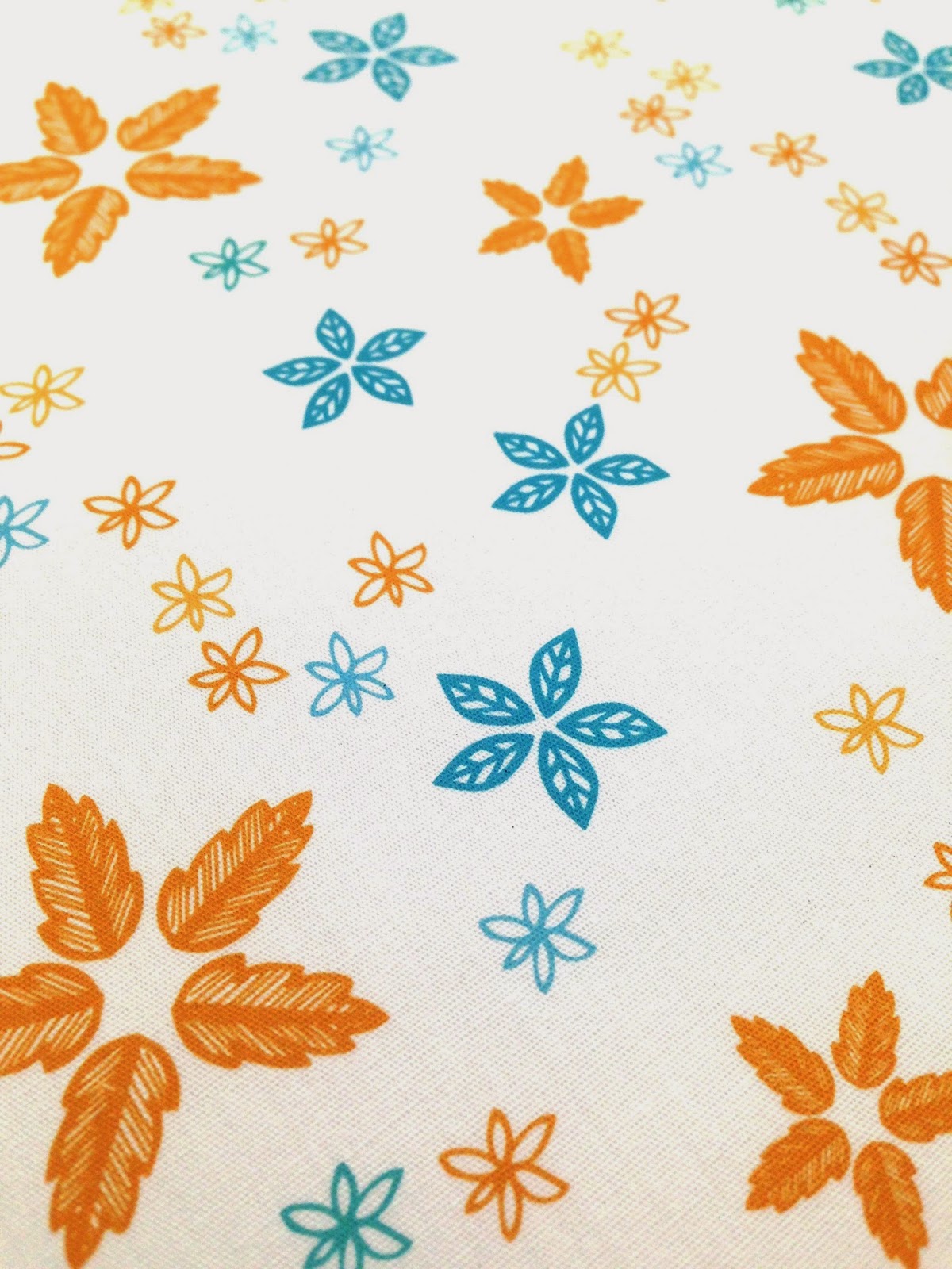
I have been working through a Skillshare surface pattern design course which teaches about designing contrasting pattern tiles, developing a colour story, creating neutrals that blend with your dominant colours, and making fabrics in colour ways. The course explains about Itten's and Alber's theory of colours being perceived differently depending on their surroundings. I think the most successful are the first two colour ways, but I know the actual designs need a lot of work, but I wanted to learn the theory behind it more than produce excellent designs. I will be learning more about pattern design over the summer.


26 May 2015

Textile design

I'm working my way through a Skillshare course on surface pattern design, and at the same time making a quilt for my daughter. I couldn't find a fabric with both colours from my palette in a ditsy floral, so I designed one (top) and printed it off on inkjet cotton at home. The bottom fabrics are the purchased ones. The colours on the printed fabric came out very close to the screen colours, with the correct ICC profile selected.


18 May 2015

Start Me Up

I bought a fabulous book on branding which has just been published called Start Me Up. It's 256 pages of branding porn for the graphic designer, and the paper smells all inky too. Lots of useful into for my studies.


17 May 2015

Children's Homes resident's guide

As part of rebranding the Hampshire County Council children's homes, I have been asked to create the new resident's guide, for children who come to live in the homes. This is this first few pages of the guide for The Mead.  I have guides for 6 other homes to create. As part of my Valuing Performance goals, I will be spending 3 days in the HCC graphic design studio which I am currently organising.


Company branding

Branding for my own company, as part of the Professional Practice module:

Stamp design

Hat-trick Design (http://www.hat-trickdesign.co.uk) used hand drawn type combined with photography to create a distinctive range of Royal Mail stamps to commemorate 50 years of the Royal Shakespeare Company. Insertion is used for the different styles of type making the stamps look casual and engaging, with the words flowing around the images. The black and white colour scheme adds to the intensity of the designs.


Another of their stamp designs, for the Olympics,  uses 50p coins as a template for pointillist style imagery:


Generative design

Holger Lippmann is one of a group of digital artists who use computer algorithms to create their designs which are then printed for exhibition. I'll let him explain:

the e-pastel TAR_GRID series consists of a X Y axis grid of bezier vector curves. a seperate vector curve class defines all vector properties such as color, transparency and/or stroke weight. to later position them within different grid arrays. different keyboard input values are used for a layered image build up; coloring, sizing, transparency, count and density of star pedals

Complex but fascinating: http://www.lumicon.de/wp/


Lomography - analogue to digital

Lomography is an analogue photography craze that has a huge online following. The company have recreated, or sourced, cheap retro plastic cameras (Diana, Lomo, etc) and expired film, and used all their faults (light leaks, colour casts, vignetting, etc) as a marketing tool to make people want buy into retro look so popular now.

But many of these people still want digital image manipulation so combine their love of film with all its quirks, and the flexibility of Photoshop, by shooting on film and scanning their images to edit them further. 

There are a huge array of apps available to recreate a similar look digitally with a camera phone, but it doesn't quite get there. Instagram is the most popular. Will people still love this faux-retro effect in 10 years or will they wish they took all the shots without those dubious digital filters?


Eloise Renouf - Illustration to print

Eloise is a successful designer and illustrator whom I admire. Her work begins with sketches and paintings which are then manipulated in Illustrator to create contemporary prints, cards and fabrics designs:

Andrea Lauren - hand printing to digital print


Andrea Lauren is a printmaker I have followed on Instagram and on her blog for sometime. She uses linocut and screen printing to create her initial motifs for fabric, cards and print, and these are manipulated in Photoshop and Illustrator before being printed digitally.

andrealauren.com


16 May 2015

Gordon's Gin assignment


I've finished my packaging project for Gordon's Gin and included ideas of two of their other flavours - Sloe and Elderflower.


15 May 2015

Career map


This ABC of graphic design careers was created for the Professional Practice module and was designed in the style of Uppercase Magazine's editorial layout.


Logo design

Below is the logo I developed for The Children's Homes Registered Manager's Forum - an organisation of children's home manager's from across the south of England which meet to share best practice.  The logo needed to relfect the name of the organisation, and include a reference to "home", without looking too much like a loft conversion company! I presented 4 options, and further developed their preferred logo to completion, below:

Final logo


The development ideas were:


My intial ideas are below: