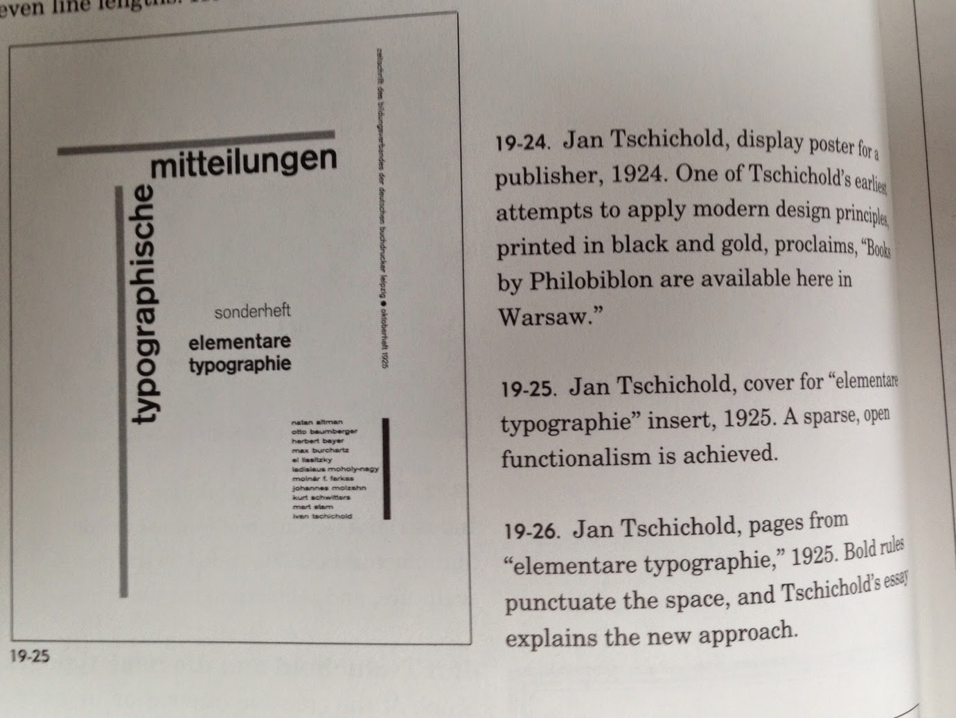
25 October 2014

Polygonal art

Another Christmas robin


My last Christmas card design before uploading them to Moo.com.

Week 5

Magazine layouts

Ebola DPS


I chose to play on the fear factor of the Ebola virus by choosing photos where healthcare workers look particularly alien-like. I converted the photos to black and white and cropped them to cut out the background to look more imposing. The word Ebola was spelled out in a scientific style typeface to reflect the medical issue and I made it oversized to be the dominant feature. I used a grid but then rotated it to the diagonal to give it a more dynamic appearance. Making Ebola the first word of each body copy text block, and making the E a drop cap, further emphasises the word.

Sportsperson DPS


I looked for a dynamic image full of movement which had a plain background that I could easily remove so I could wrap text around it. I chose to make the image the main feature and positioned it so the bottom ski was off the page to enhance the perception of movement. The red block underneath the skiier and text reflects the dangerous sport and draws the eye to the skier's jacket. I added page numbers and author in the margins.

Architecture DPS


I wanted to reflect the nature of the high rise buildings in the city of London by putting my text in tall thin columns, some with a grey background, stressing the vertical movement of city offices. I converted all but the main image to black and white and stacked or cropped them to reflect the surrounding architecture. I kept the main image in colour to show its important in the hierarchy. I used a small grid to allow for the large number of pictures but still allowing plenty of white space around the design. The black rule represents ground level. I chose to make the page numbers a feature as a lot of architectural practices seem to adopt this approach.

London Fashion Week DPS


For this spread I wanted a non-catwalk shot and chose this for it's colours and contrast and the expressions on the women's faces.  The image was cropped in half, and positioned on the recto, because this is the first page that is looked at when leafing through a magazine, but also their gaze is off to the right.  The background to the heading is the same colour as the clothing.  I chose to flush right the heading and subhead so they lined up nicely with the image leaving no white gaps. The taupe box behind the head bleeds to the left to look more dynamic.

Alpine trees DPS


The landscape dictated a horizontal stress for the image, and I placed the 2" wide white band above the trees with space for the heading at the top.  I placed the columns of text to the right to balance the taller trees on the left and allow me to use the blue sky as the background.  However, I'm not very inspired by this layout.  Perhaps the font selections are not very well thought out.

Shadow puppets DPS


I decided to go for something more unusual than the black and white imagery of the traditional shadow puppets.  I selected this image because there was plenty of space around the subject to allow text to be placed on it, linking it with the other text boxes on the page.  I chose a "scary" looking font for the heading and continued the orange colour theme behind the last two text boxes to encourage the reader to turn the page.  The orange elements were kept in a diagonal line for movement.


19 October 2014

Logo development

Further to my earlier post, I created this logo for Jan's Dog Walking in Illustrator.


I used the pathfinder tool to minus and unite shapes for the name, and used the pencil tool to draw the head.  The anchor points of the name were moved to line up the top and bottom of the name horizontally.

18 October 2014

Print finishing

Paper stock


I ordered some samples of paper in various finishes from moo.com who supply printing in small quantities and allow you to have a different design on every card.  They supply business card in the traditional shape, or with rounded corners, or square in matt laminate, gloss laminate or lux (600gsm seamed in various colours).  They print many other things, including greetings cards and stickers.


I like the quality, and flexibility of have many different images in one order, but they seem quite expensive.

Idea generation

Logo development


A colleague has asked me to design her a business card and website. The company is  Jan's Dog Walking.  I came up with some ideas for her logo.


The best options are on the third page bottom right (the letters of Jan made into a dog), and the O in dog being a footprint, with the footprints walking towards the bottom getting bigger.

I will develop these in Illustrator.

Logo development

Learning


We took the logo we produced in Monday's Type and Layout class, and developed it further in Illustrator.  I really enjoyed the lesson and was pleased with what I produced, considering that I have only opened Illustrator once before.  I'm painfully aware that my software skills need work and will be using reading week to practice.


I used the pencil tool with a stripy brush to write the word 'Smile", and used shapes to form the toothpaste.  I chose blue because it appears clean and clinical, and wrote the word by hand to look friendly and approachable.  Right aligned text looks neat against the edge of the card.

17 October 2014

Week 4

Idea generation


We had to draw thumbnails for branding for two companies.  This is Smile Style Dental Practice. In such a short amount of time you can't really sit and think about words or shapes you associate with the theme, so I just came up with smiley lips and toothpaste.  I played around with the text and came up with the idea of writing the name Smile in toothpaste.  I wanted it to feel clean and reassuring, two things you definitely want from a dentist.


Posters

Creating so many posters in a short space of time was very challenging.  I only managed 7 out of a goal of 30.  I didn't want to crop the photo in the centre, as this seemed a bit obvious, so I chose a side crop which left space at the bottom as well as at the top for the text.


I was intrigued by the number of combinations that are possible, even with just a few elements. Leaving in the illuminated word 'skate' was not the best idea.  I chose the main font because it looks crisp and sharp, but not too formal - to reflect the formal setting, but informal activity, and the cool, crisp temperatures and the sharp blades of ice skates.  My favourite two posters are where the text is set vertically which looks more dynamic.  I think the text on the left is easier to read and it looks like the people are skating out from behind the word, but on the right indicates movement.  The least successful is the orange on white banner. I prefer the word 'skate' in white and 'Somerset House' in light blue.

Greetings cards

Polygonal art


Following our lesson on polygonal art, I thought I would use my image as a Christmas card design.  I am intending to create other cards with polygonal art on them.


I chose a fairly low resolution image which made creating the polygons fairly straightforward and not too time consuming.  I couldn't work out how to fill in the gaps between with the brush (I have since learned where I went wrong), so I went over the whole image with larger overlapping shapes.  Then I created a foreground shape for the bird to rest on, and selected a noise filter.  Then I imported a photo of snow on the top layer, copied some extra snowflakes with the clone tool, and set the layer to lighten.


Another robin, following similar steps to the previous one.

15 October 2014

Week 3

Portraits and type

We were given a list of phrases and black and white portraits to use to create posters.  All posters were full bleed, except "a man must learn to forgive himself".

I completely cropped the subject's eyes out of this picture to make it seem unnerving - if you can't see the eyes, it is hard to read a person.  There is something slightly unhinged about what he is saying, so 
I wanted to elude to that with the crop. I chose the font because it is clinical and characterless, to match his words.  The gradient on the last word is a literal interpretation.


The expression of the man, with his tongue sticking out indicated childishness and immaturity which went well with the words.  I chose Courier as it is an immature and basic typeface.  I wrote over his eyes as the whole combination of picture and text seems a bit wacky so placing the font in an unusual position seemed to fit.


This man has obviously had a very hard life - he appears extremely impoverished and neglected. I chose to make the word "why" big - like a silent shout across his mouth, and the other words small and fractured to reflect despair - a quiet disbelieving voice. I have put darker transparent blocks at the top and bottom to suggest he is incarcerated and peering through a small gap in the door.


I did a very close crop on the picture below and selected a solid friendly looking, but masculine, typeface because to reflect the man's appearance. I chose to place the text at eye level as he has a trusting face which links to his eyes.


For the two pieces below, I chose to use white space to focus on the picture, and to produce some tension or rhythm.

The girl is attractive but has no obvious character - I chose this text to contrast with that image and make the reader feel curious about the statement.  Placing the text sideways forces the reader to engage with the work as they much turn their head or the page to read it.  The suffixed word is the only unusual thing about the piece. I am Helvetica is very plain, like the typeface, but placing the image and text to the far right makes you want to turn the page.

Week 2

Playbills


During and after the class I created 4 playbills. 

I learned how to use dafont.com and to think about how to combine different typefaces.  I tried to consider which typeface is appropriate for different phrases, or our perception of the meaning of the words.  Using a script font for words like darling and dream felt a bit hackneyed and sentimental, but I noted that I wasn't alone in my choice!  I think I should have used a wider range of fonts on each design.

I realised that I don't like really stylised fonts and I am drawn towards sans serifs (particularly Gill Sans), Clarendon, Rockwell and other slab serifs, and serifs with a large thick/thin stroke contrast like Bodoni.  I love Bauhaus, Eurostile and Helvetica Light.


Week 1

Swiss Design


Wim Crouwel's work was discussed in the class, and after reading the class notes about him, I decided to investigate Swiss Design further.  Swiss Design has so many aspects that appeal to me.  The mathematics and controlled order of grids, and simplistic minimalist sans serif typefaces.  Crouwel's New Alphabet is fascinating in its design, although limited in its application. 

I read Grid Systems by Hans Muller-Brockman.  It is very useful for helping to understand the intricacies and possibilities of how applying different types of grid can aid design.  Some of the methods for developing a grid seem really complicated, but the principles are easy to follow.  I definitely want to apply his grid format to work I create.


I watched the film Helvetica, a documentary about the history of the typeface.  What I found most interesting was the attitude of Wim Crouwel, when he said that when you write the word dog, it doesn't need to bark, meaning the typeface doesn't need to be expressive, that is what words are for. Massimo Vignelli stated that he only uses 3 typefaces! I love the simplicity of the film poster, but I prefer Helvetica in lower case.  To me the upper case characters look ungainly.


Reading

The New Typography - Jan Tschichold


I enjoyed this book, although it was rather a dry read.  His ideas are very prescriptive - every design should be done on specified paper sizes, only with certain fonts and with images that comply to his strict rules.  Since writing this book in 1928, Tschichold changed his mind about many of his design rules, but it is a fascinating read and has some ideas for layouts that I want to try out.

In this layout I love the use of horizontal and vertical rules which frame the page and the layout of the text.


The use of colours overlaying the image really focuses the eye on the grid layout.


13 October 2014

Designing

Business card


I've made an attempt at designing a card for my future design business.


Some thumbnails of the preparatory work for developing the logo are shown below.  I wanted it to be a single colour, but with the option of adding a second colour for variety. The logo on black makes it stand out really well.  I considered using a serif font with a more traditional feel for the logo, but decided incorporating the eyes and personifying it made it  look friendly and creative.  Combined with Helvetica, I thought there was a good contrast.

Some of my preliminary sketches for the logo:


Inspiration

Curating


I have started a physical collection of brochures and leaflets that I find inspiring, and others which appear to me to be terrible in the design and layout.  Some are documents I use at work and would like the opportunity to redesign them when I have gained some experience.


I have started a virtual board in Pinterest of anything that I find inspiring, including design, architecture, furniture, films, logos, infographics, branding, photography and websites.


Pre-course preparation 3

Photographing


I took some photos along the Southbank of the brutalist architecture.  I love the bulk and unpretentiousness of it.  The mass of uncompromising concrete sits really well with the hoarding typography in Helvetica.


I really like the typefaces used on this new pub on the Southbank.  It contrasts really well with the painted brickwork and pavement.


This image was painted on the National Theatre.  I really like the colour combinations and the graphic shapes which look quite typographic.


Pre-course preparation 2

Visiting


I visited the V&A in London and viewed two exhibitions - Wedding Dresses 1775-2014, and Disobedient Objects.  I also looked at other areas of the museum including Photography, 20th Century, and Prints & Drawings.  I really enjoyed Disobedient Objects which was about showing how ordinary objects were used for activisim. Prints and Drawings exhibited some very moving pieces, including posters depicting the Vietnam war and activist posters.


I went to Tate Modern during London Design Festival.  There wasn’t anything going on for the festival there, but I enjoyed viewing some of the works – Mark Rothko in particular.   I found his Seagram Murals very atmospheric and contemplatative.  


Some other work I particularly like was that by Josef Albers – Homage to the Square. I particularly like the apparent simplicity of the pieces.


Unfortunately I don’t think I know enough about art to appreciate a lot of the work displayed.  Yet.  


Pre-course preparation 1


Reading


Throughout the summer I studied 7 books from the Basics Design and Basics Graphic Design series:

Basics Design 01 Format, Gavin Ambrose & Paul Harris
Basics Design 02 Layout, Gavin Ambrose & Paul Harris
Basics Design 03 Typography, Paul Harris
Basics Design 07 Grids, Gavin Ambrose & Paul Harris
Basics Design 08 Design Thinking, Gavin Ambrose & Paul Harris
Basics Graphic Design 02 Design Research, Neil Leonard & Gavin Ambrose
Basics Graphic Design 03 Idea Generation, Neil Leonard & Gavin Ambrose


I read all of the above books and made notes on them. I feel that they have all helped me gain a good basic understanding of some of the areas of graphic design so I will not be starting the degree coursework completely ignorant. 


Other books I borrowed from the library and read:

Graphic Design : a user’s manual, Adrian Shaughnessy
Type & typography, Phil Baines & Andrew Haslam
100 ideas that changed graphic design, Steven Heller and Veronique Vienne

Some of these  books I found very engaging, others less so.  Graphic Design ; a concise history was really interesting as I had no knowledge of this area at all.

100 ideas that changed graphic design is an amazing resource for layout ideas: