26 September 2015

Stencils

Stencils in advertising

I really like this method of advertising - the stencil is applied to the pavement with a chalk spray which can be completely removed. The simply typography works well for a stencilled design on a rough surface like paving. Anything complicated would be lost, unless it were huge, which would be impractical.


Waitrose Fairtrade Tea

We were tasked with creating a stencil for a poster to promote a fair-trade tea brand of our choice. Below is one of Waitrose's adverts (http://www.waitrose.com/shop/ProductView-10317-10001-145696-Waitrose+fairtrade+green+tea+bags). I also wanted to try another style so I selected Clipper who also make fairtrade tea products. I looked at their websites and chose a slogan which fitted in with their advertising.


I mind-mapped a few word associations with tea, and sketched some thumbnails, below.


I decided I wanted to incorporate the texture of the tea bag, and couldn't find a suitable photo online, so I scanned a tea bag and used that image.  For my other poster, I chose to use a tea stained background. For both posters, I cut my stencils from stencil film and experimented with sponging tea coloured ink, and white opaque ink. 


I produced 4 posters in Indesign, which I stencilled over, producing the 4 designs below. I think the tea coloured stencils work best, and I prefer the single tones of the Clipper poster, bottom left, as it looks warm and comforting, just like tea. The Waitrose poster works well without the stencil.


24 September 2015

Use of shadows

The Secret Garden book cover


We were asked to design a book cover using a shadow as the primary feature of the design. I chose to illustrate the cover of the book "The Secret Garden" by Francis Hodgson Burnett. The book is about a lonely child, Mary, who finds solace in a secret garden she discovers in the home of her extended family where she is sent to live when her parents die in the early 1900's.

I looked on Amazon at different book covers for the book, and at different ways of using shadows.

I also investigated artists who use shadows, and remembered seeing a BBC documentary about Tim Noble and Sue Webster who create sculpture installations from found items which look like nothing until light is directed at them from a certain angle, and the shadow created can be seen (see below). It works because the resulting shadow is so surprising, and it is fascinating to think about how it is actually produced. It also makes a statement about waste and what we throw away in Western society, and how what one person sees as rubbish can be reused.

Youngman (http://www.timnobleandsuewebster.com/youngman_2012.html)


My idea was to use shadows in a positive way to symbolise light, warmth, and a new day. I wanted to use a keyhole surrounded by darkness, and when you peer through it you can see a sunny yellow garden and a long shadow cast from the swing in the garden. Swings also represent childhood and joy. My initial ideas are shown as thumbnails below.


I then looked on Google at different ways of drawing a swing - rope swings and frame ones, tyres and wooden seats. I wanted the design to look quite graphic with lots of contrast.

I was particulary inspired by this image (http://www.katespapercreations.com/2014/01/3d-shadow-box.html):


My idea was to update the cover to appeal to a more modern audience, but still retain the Edwardian feel of the novel, so I chose a cursive script to relate back to those times when children were taught to form letters in a standard way and everyone's writing look the same. I found lots of examples on dafont.com which were suitable http://www.dafont.com/theme.php?cat=602&page=3&text=The+Secret+Garden.

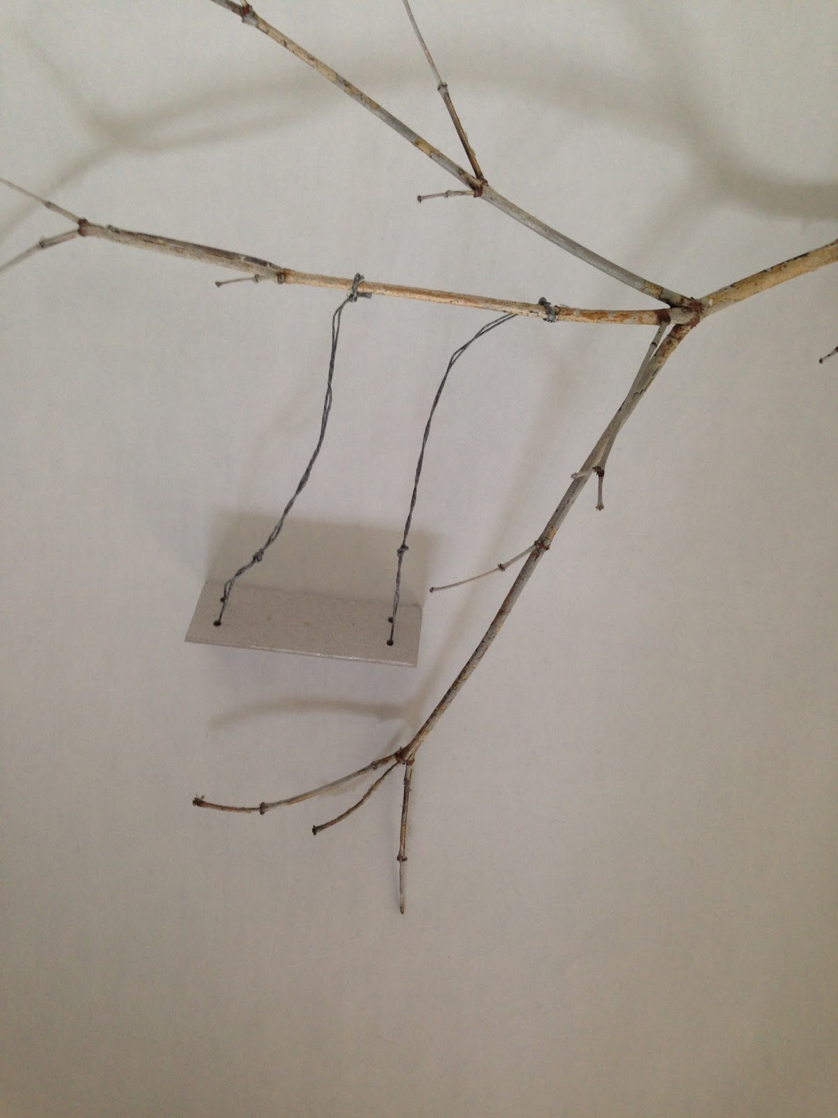
Initially I thought I would use Illustrator to draw the keyhole shape and add the photo of the swing and shadow in the hole, but decided to try to photograph the keyhole and swing together. I created a rough mock up of the keyhole shape cut from card (in 2 sizes) and the swing (card, waxed string, twig from the garden), to ascertain that the sizes were roughtly correct, and took some test shots. As these sizes worked, I then cut the keyhole from black card and experiemented with the positing of the light to cast an effective shadow. I tried to get the shadow to appear non-threatening and cheerful and evoke a feeling of warmth and sunlight.

My "studio" setup:


The swing and branch:


Some of my final shots before processing in photoshop:


I used a wide aperture (F2) to get the keyhole blurred but the swing in focus. The lamp was adjusted to make the shadow appear soft and less threatening.

Yellow was chosen for the only colour, because of it's connotation with sunlight, happiness, warmth and protection - the feelings that Mary has when in the Secret Garden.

I created several versions of the cover:

My favourite are the bottom two. However, I do quite like the top right design as it looks quite Penguin-esque. On the bottom left, I like the black and white with the bright yellow and the handwritten script. The typeface brings a more modern and friendly feel to the novel, and the yellow keeps the image from looking sinister. The bottom right cover has a photo of old script overlaid (suggested by Gemma!), and works well to bring another layer of interest and makes the image look more sunny. It contrasts well with the sans serif font, but the style of text could make the subject matter seem, incorrectly, for an older audience.

I made one final book cover which I think is the best because the typeface is friendly, but hints at a time when handwriting was more calligraphic, the yellow is sunny but not too orange, and the placement of the title is informal.  The author's name at the bottom is in Times New Roman which is easy reading for its target audience, but contrasts well with the title typeface. The white type looks interesting against the black and yellow. I think this is the best (of my covers) of a design which juxtaposes a shadowy photograph with a friendly feminine typeface, preventing the design from appearing ghostly.


23 September 2015

Paper challenge

With 30 minutes, we were tasked with creating a 3D form from a flat sheet of paper. I decided to cut out a sheep silhouette and represent the fleece being spun into fibre to create a hank of yarn:


20 September 2015

London Design Festival

Over the weekend I went to the V&A to listen to a couple of talks as part of London Design Festival.

The first was by one of the founders of Europa, who discussed the work they have been doing with infographics for Pick Me up at Somerset House, an industrial estate and for a local authority public space outside a library in Barkingside. Some of the items created were:

Screen printed posters consisting of 3 colours, which were then used as graphic elements on their own by printing one of the 3 coloured layers

Typefaces inspired by protest posters - scribbled infill, outlines

Billboards of the products manufactured by the industrial units

Modular signage and maps hung on a slatted grid frame

Floor signage and pictograms

Walking guide creating a sense of place for residents

The second talk was by Johanna Basford, illustrator of the adult colouring books Secret Garden and Enchanted Forest.


Johanna talked about her very analogue way of illustrating, and the long hours she worked to achieve her success. She also discussed her career path since leaving university and how she came to design best selling colouring book for adults, selling 7 million copies worldwide.

Both talks were very worthwhile and engaging.

11 September 2015

Online courses

Skillshare courses

Over the summer I subscribed to Skillshare who have a many useful courses for surface pattern design, amoungst other subjects. Skillshare courses are purchased via a monthly fee so I subcribed when they had a special offer on in August and September. I completed the following courses:

Introduction to surface pattern design: creating and mixing patterns (Jenna Fry)
Introduction to surface pattern design: learn AI: create patterns (Bonnie Christine)
Surface pattern design 2: design a collection (Bonnie Christine)
Design and bind your own creative portfolio (Bonnie Christine)
Pattern design 1: creating inspiring repeats (Elizabeth Olwen)
Pattern design 2: a creative look at a full collection (Elizabeth Olwen)

These courses consist of up to 20 modules, with lots of video content and are taught by lecturers (Jenna Fry), and established surface pattern designers.

7 September 2015

Museums and Shows

New Designers 2015

During the summer, I went to New Designers. I decided to visit during the first week as I really wanted to see the textiles and surface pattern designers. The volume and quality of the work on display was overwhelming, but inspiring too.

Fashion and Textile Museum

I visited the Fashion and Textile Museum in London which was featuring an exhibition about resort wear from 1900's to present day. It was interesting, but the museum is really small. Their next exhibition is going to be Liberty's of London which I will be going to.

Geffrye Museum

This museum in London is quite out of the way but had lots of interesting furniture and textiles from the homes of the middle classes from 1600-present. The 1950's room set was my favourite, with the mid-century modern furniture. Unfortunately lots of it looks very similar to what I grew up with in the 1970's. I think people kept their furnishings for much longer in those days.

Scarf samples printing

I found another printer called RA Smart (who I discovered when talking to a silk scarf seller in Borough) who sent me a whole batch of samples which are suitable for scarf printing as the design shows through on the reverse of the fabric. Other printers I have found were not able to provide this, even though they used the same method of printing, and said that they could, but their samples showed otherwise.


From the dozen or so fabric samples I received from RA Smart, I chose to try printing on 100% wool, 96gsm. I chose the wool because, unlike the silks I was considering, the weave is slightly uneven, providing some texture and shading to the design. I also prefer the feel, as it does not feel cold against the skin like silk. It will be interesting to compare them with similar prints I have on silk.

RA Smart's costs are much higher than other companies, with a separate price for printing, for the substrate and for file set up.  In one metre of fabric I have managed to get 2 full sized scarves plus 10 samples.

The designs I uploaded are shown below.